Year
2018
Services
Brand Identity
Print Materials
Packaging Design
Client
Fetching Fields
Industry
Pet Care, Retail
Credits
Artwork: Meg Gleason
Photography: Sarah Elliot
Copywriting: Diana Taggart

A modern pet wellness brand that plays well with sophistication.

In 2018, Fetching Fields emerged as a standout in the world of pet wellness, embodying a commitment to quality and the well-being of our furry companions. With a focus on sourcing the finest plant-based ingredients, Fetching Fields ensures that each product reflects purity and excellence, in line with the belief that our pets’ health deserves the same care and attention as our own.

With this ethos at its core, Fetching Fields embarked on a mission to redefine the pet product experience by merging contemporary design with conscientious craftsmanship. Inspired by the elevated aesthetics of modern lifestyle brands, Fetching Fields sought to seamlessly integrate its products into the curated spaces of today’s mindful consumers. This vision prompted our collaboration, tasking us with the creation of a brand identity and packaging that radiated refinement while retaining the friendliness and approachability inherent to the pet care industry.

Visual Identity

At the core of Fetching Fields’ visual identity lies a refined all-caps serif wordmark, subtly conveying elegance and refinement. The primary wordmark, stacked vertically, serves as the brand’s anchor with its timeless letterforms. Additionally, a secondary logo integrates the tagline “organic canine wellness,” underscoring the brand’s commitment to plant-based, human-grade ingredients. To add a touch of playfulness, a tertiary logo lockup features an illustrated Labrador, paying homage to the brand’s origins and inspiration.

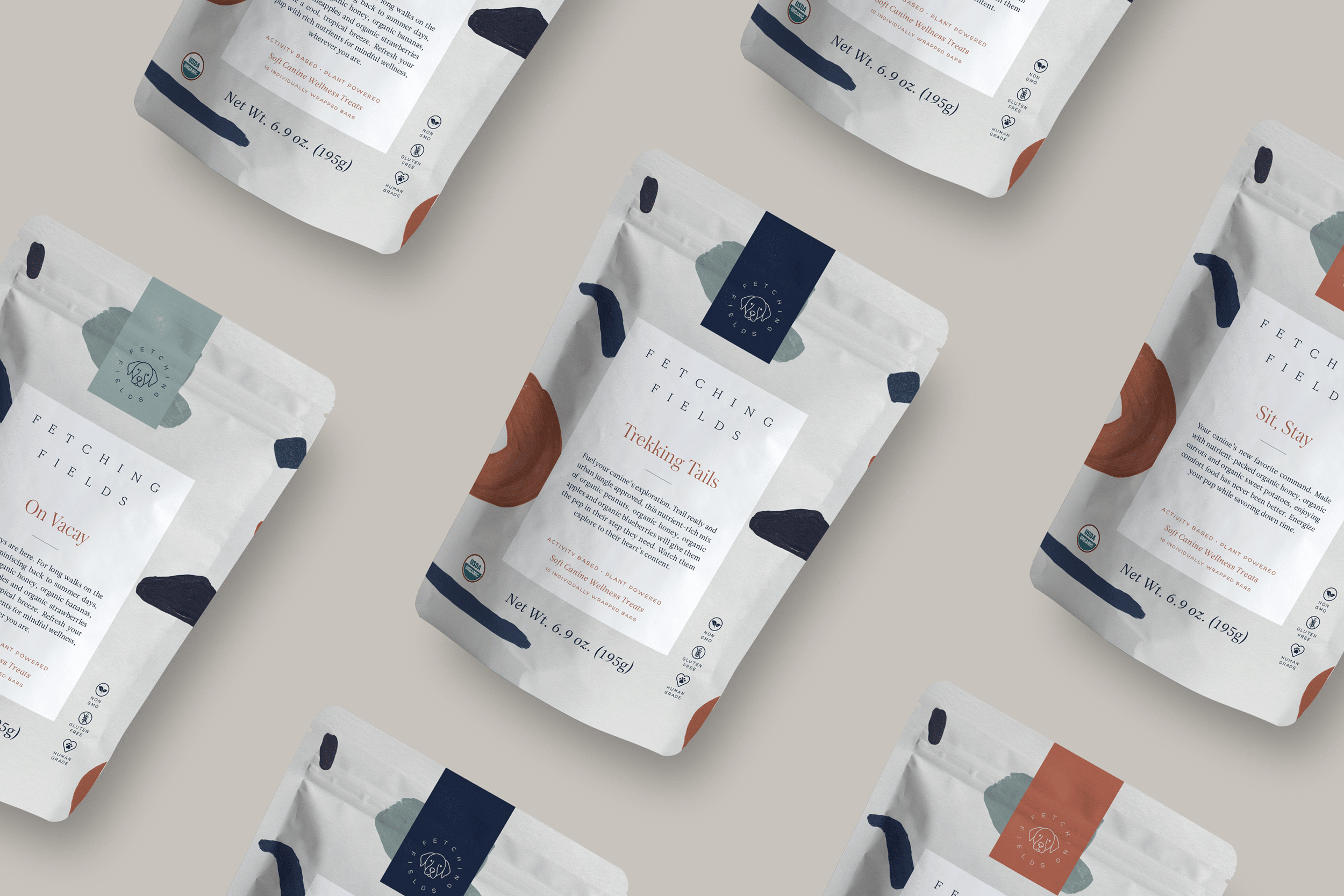
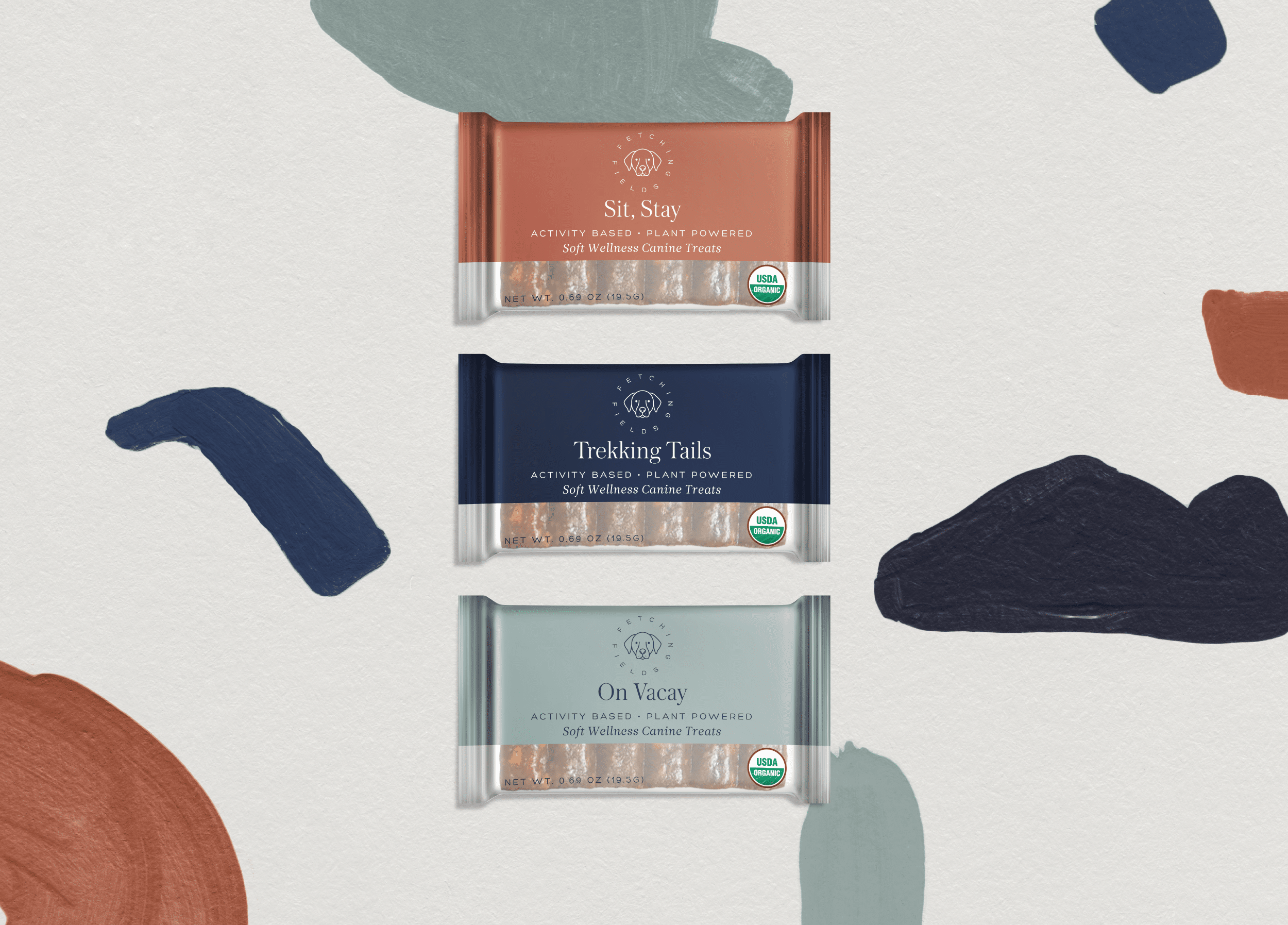
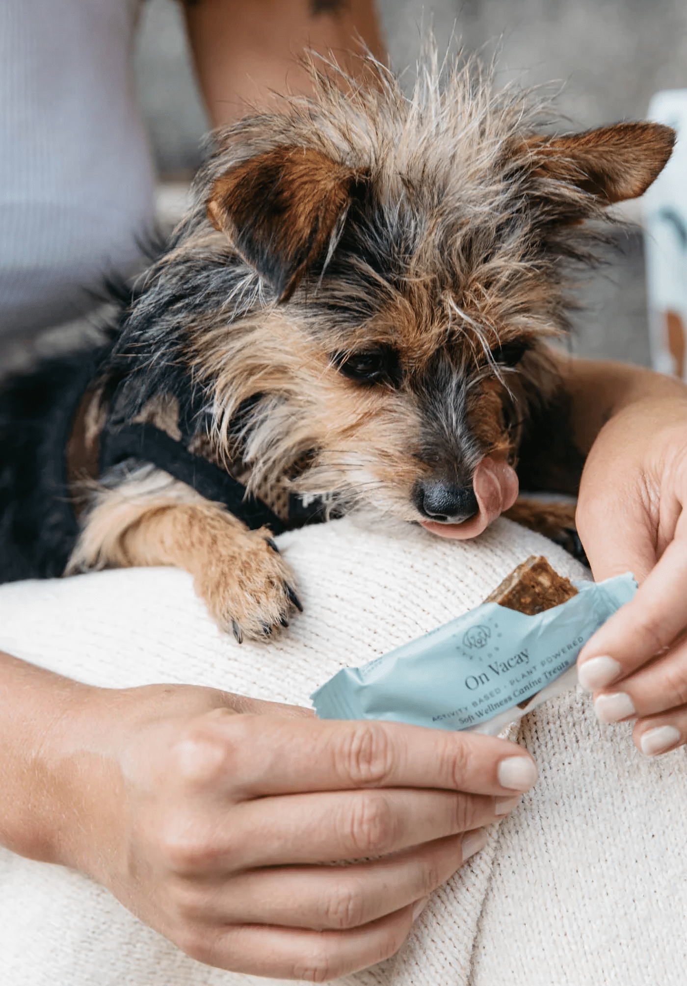
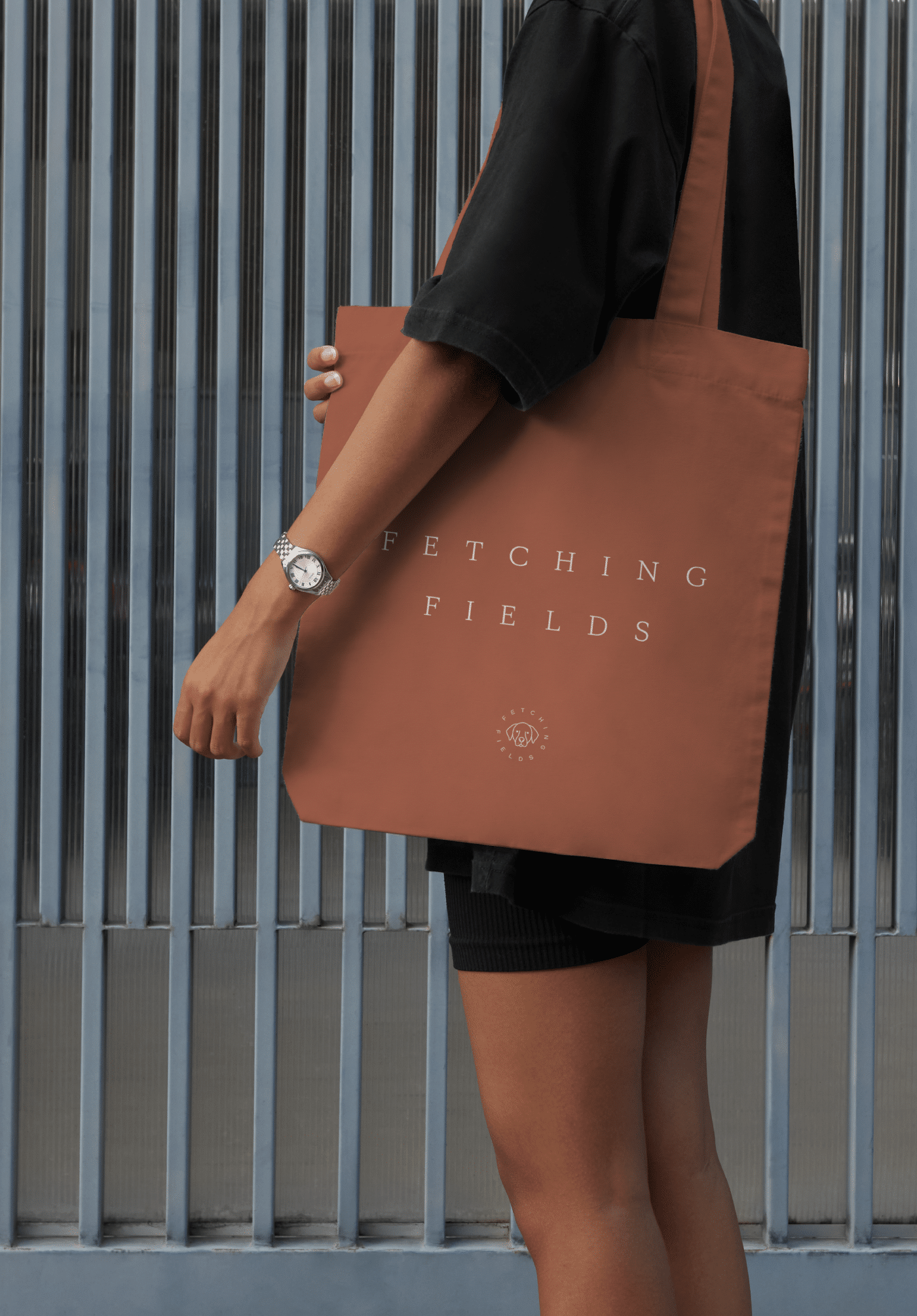
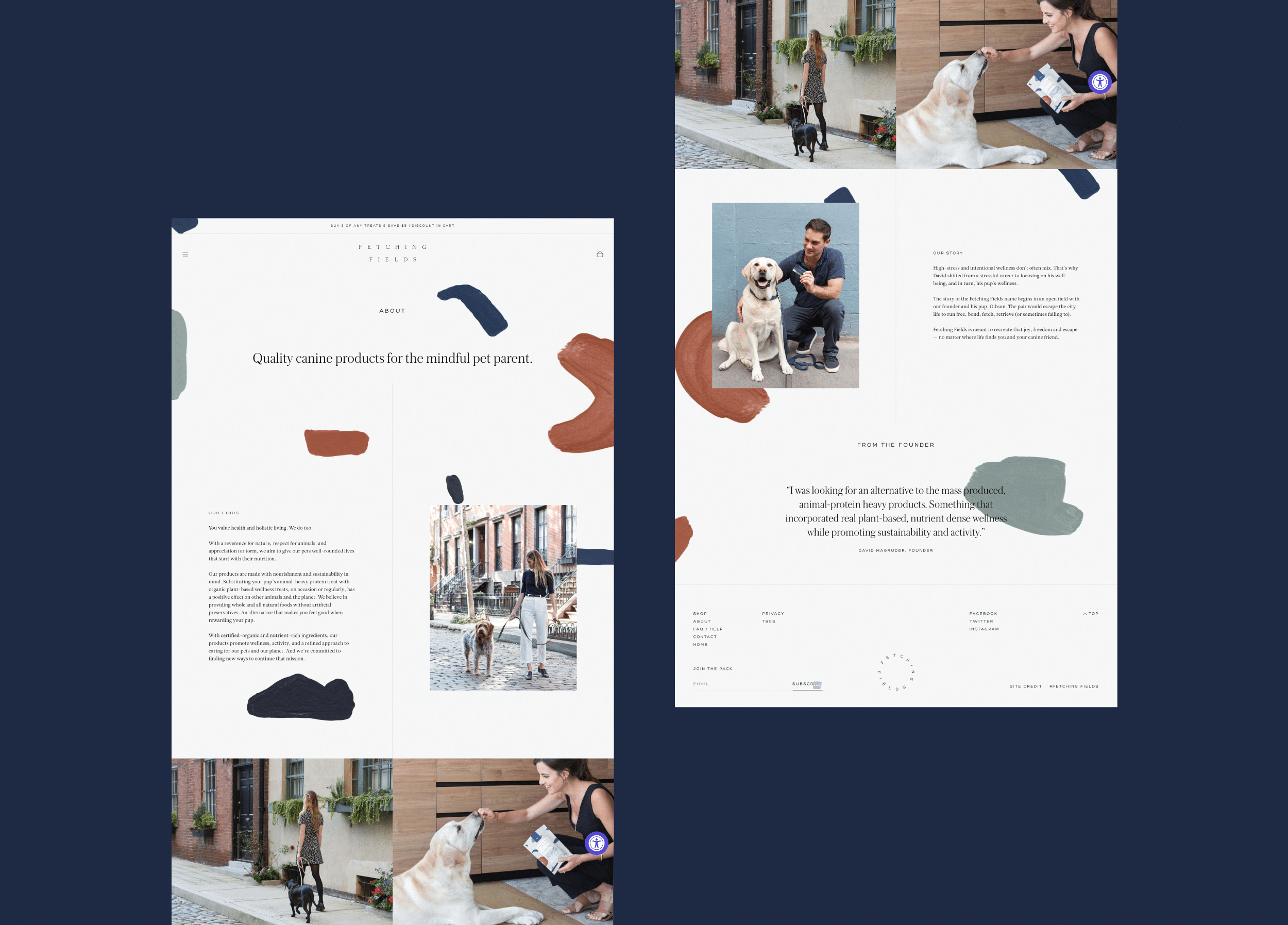
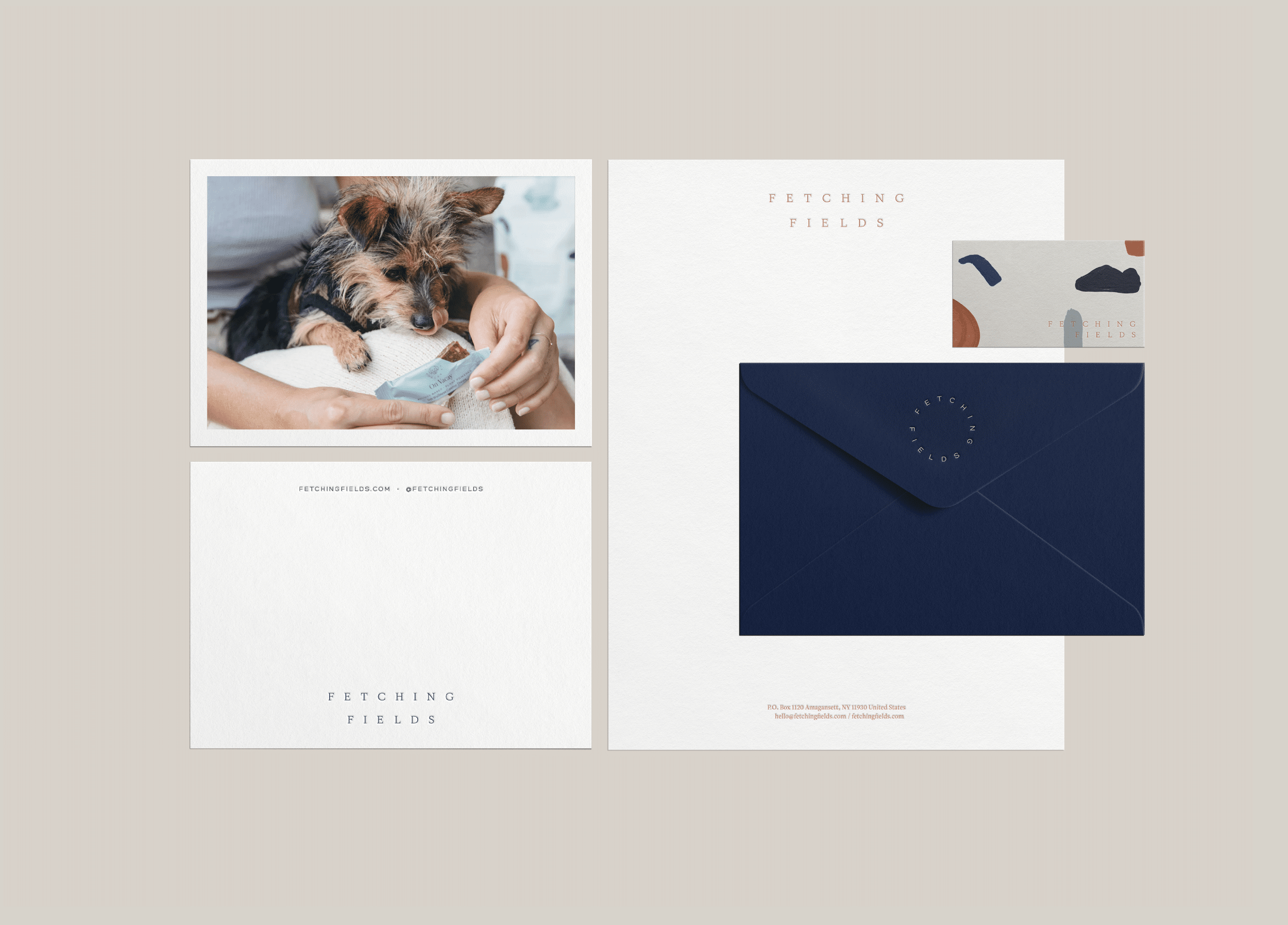
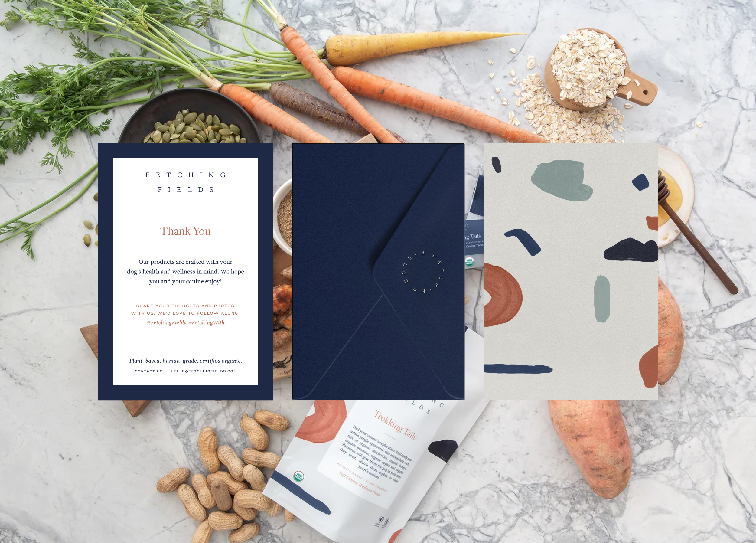
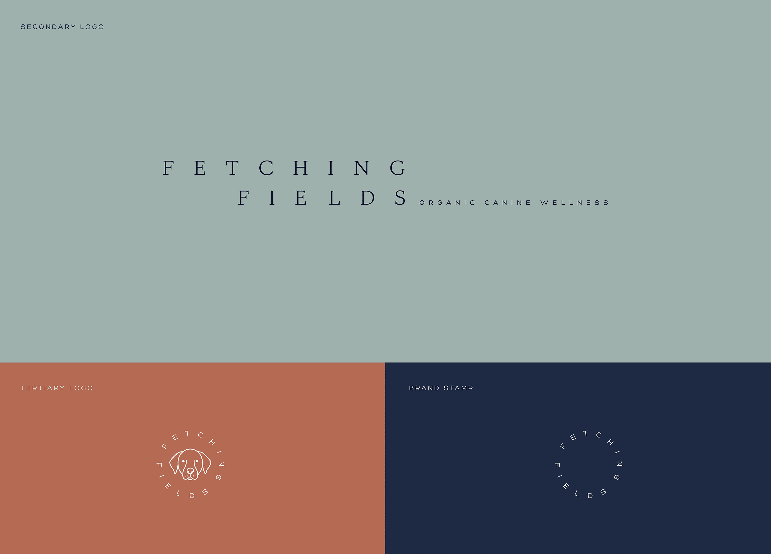
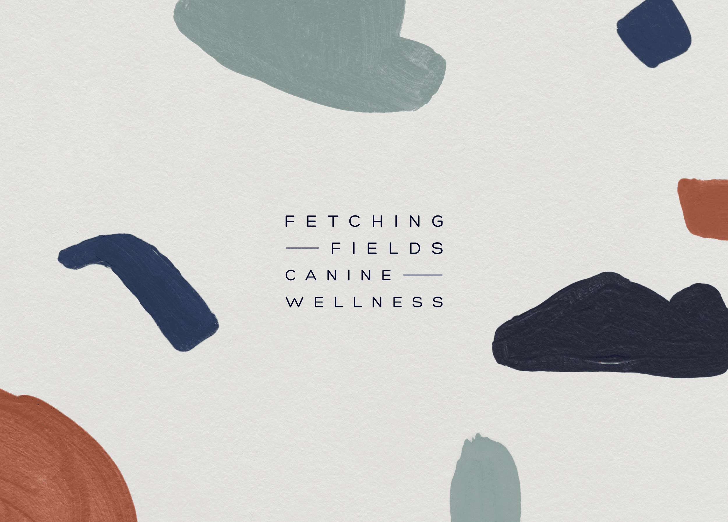
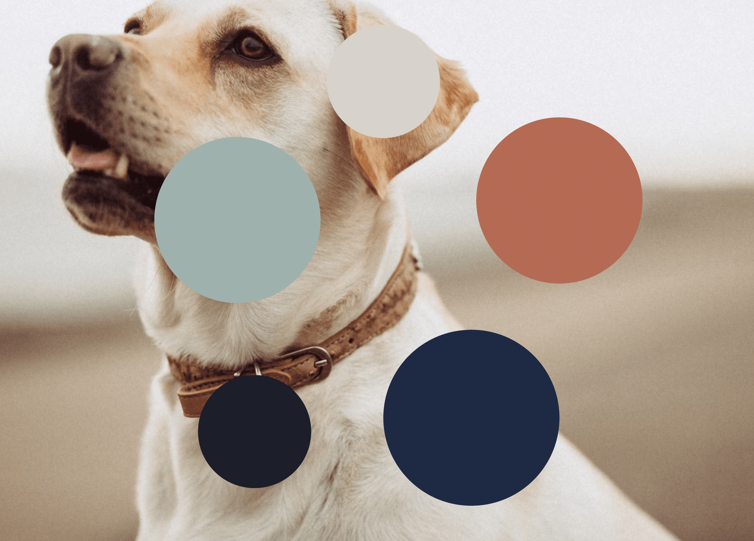
Color Palette & Brand Pattern

Complemented by a timeless color palette, including deep navy, warm gray, turquoise, and rust, the visual identity strikes a careful balance between sophistication and approachability. Furthermore, the hand-painted brand pattern adds a whimsical touch across various applications, ensuring a cohesive brand experience from digital platforms to product packaging.

Product Packaging

Designed with the discerning pet parent in mind, Fetching Fields’ product packaging elegantly showcases its core treats—Sit, Stay, Trekking Tails, and On Vacay—in individually wrapped compostable pouches. Each treat flavor is distinguished by a unique color from the brand palette, promoting transparency in ingredients and facilitating easy identification. From the pantry to the countertop, Fetching Fields’ packaging embodies sophistication and eco-consciousness, seamlessly integrating into its customers’ lifestyles.

Digital Experience

Fetching Fields’ digital platform reflects the brand’s commitment to quality and connection. Through a streamlined website design, customers are immersed in the world of Fetching Fields, where they can explore the range of products and learn about the brand’s dedication to organic canine wellness. From browsing to checkout, the digital experience embodies Fetching Fields’ values of authenticity, sophistication, and care, providing customers with a seamless journey.

Print Materials

From note cards to shipping boxes, each element of the Fetching Fields print collateral features the brand’s core visual identity—logos, color palette, and brand pattern. This cohesive approach creates a memorable brand expression while promoting sustainability through the use of recyclable and compostable materials. Whether a handwritten note or a thoughtfully packaged order, Fetching Fields’ print materials ensure a meaningful brand experience for customers, reflecting the brand’s commitment to quality and sustainability.

Related Projects

View all work