Drawing inspiration from Boxwood’s traditional design aesthetic, the warm, nurturing relationships they have with their clients and customers, and their origin story in a rural, California town that set the foundation for slow living, we crafted an elevated identity that feels both heritage and fresh.
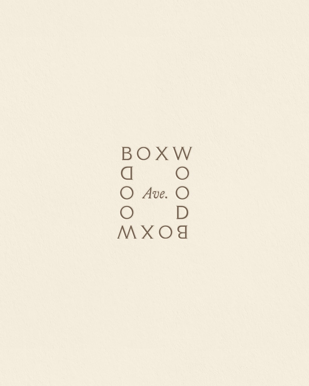
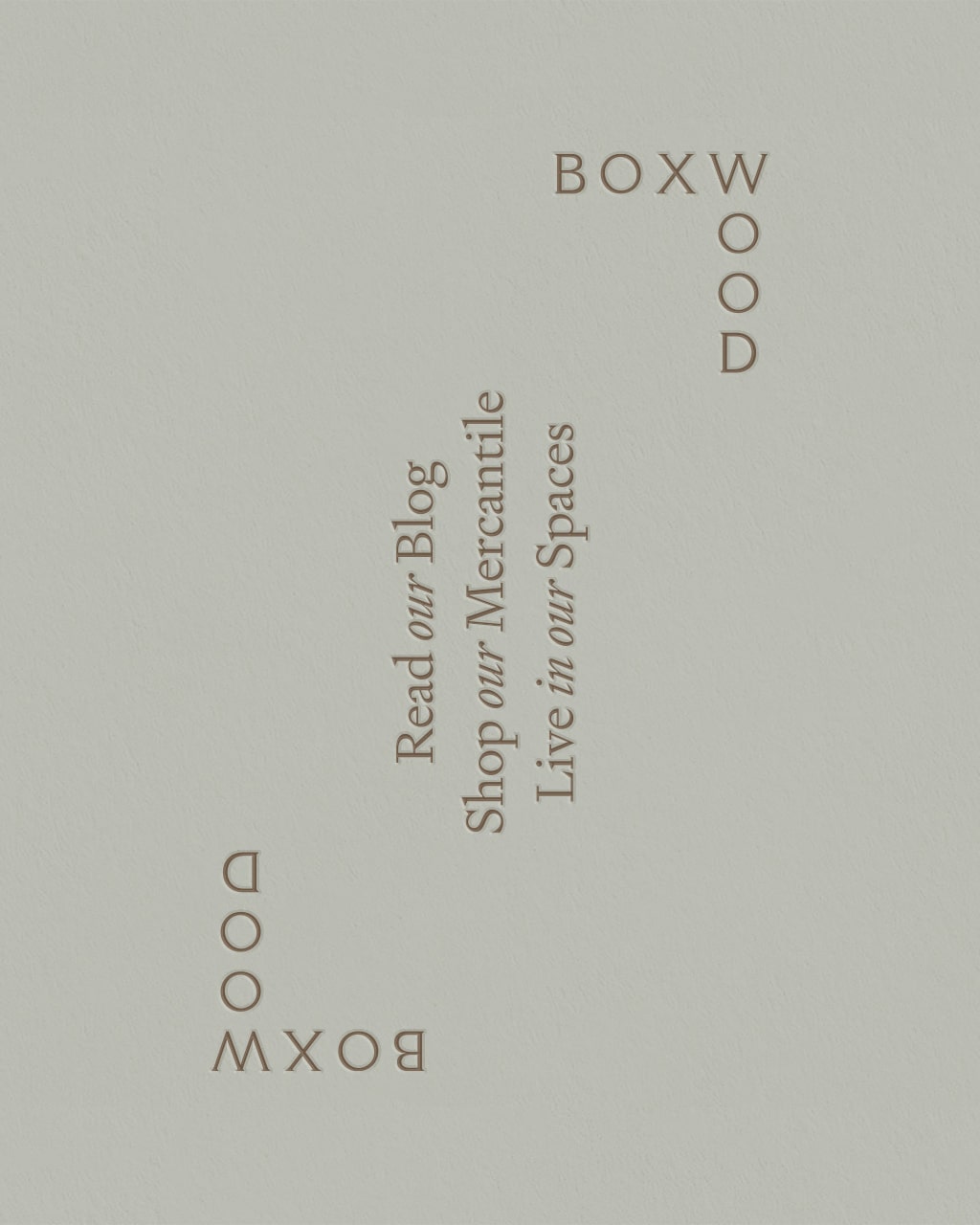
A beautiful Robin’s egg is at the core of the brand’s color palette, complemented by an earthy mushroom and storied parchment. The wordmarks feature Roman-style typography inspired by antique, hand typeset books, and were designed to tell a cohesive visual story across each of the brand’s verticals.
An elegant monogram reminiscent of old embroidery serves as the primary submark for the brand, while a secondary submark—intended for use throughout the mercantile print collateral—features an illustrated boxwood clipping.
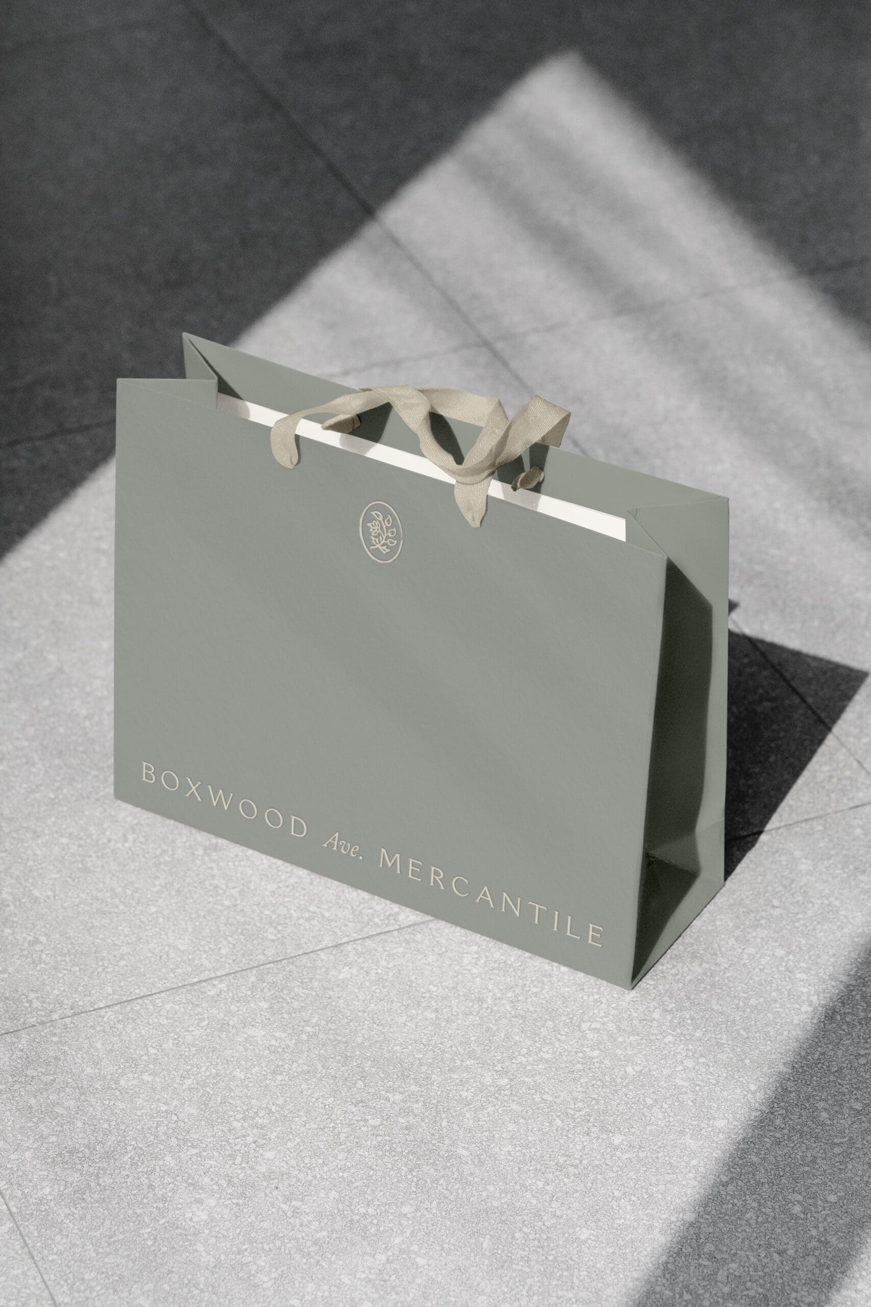
For Boxwood Avenue’s packaging suite, we incorporated textured stocks, foil stamping, and blind embossing to create an elevated, tactile experience that clients and customers can hold onto as keepsakes; reminders that there is luxury to be enjoyed in simplicity.
Every detail infused into this rebrand was intentional, leading to a finished product that feels coherent and flowing. This was made possible not through strategy and formula alone, but through a collective understanding of the story we set out to tell.
This project—with three verticals beneath one brand umbrella—had a lot of moving pieces that could have felt scattered without proper execution. However, we worked with the belief that all things can be held together by a story.
By starting with strategic brand narration, we ensure that each project arrives at an aligned ending that effortlessly communicates and unifies the brand’s values.
The journey may vary, but the origin and outcome is always the same.
Curious to learn more about Marbury’s rebranding process? Get in touch to start a conversation and determine if Marbury is the right fit for your story.
