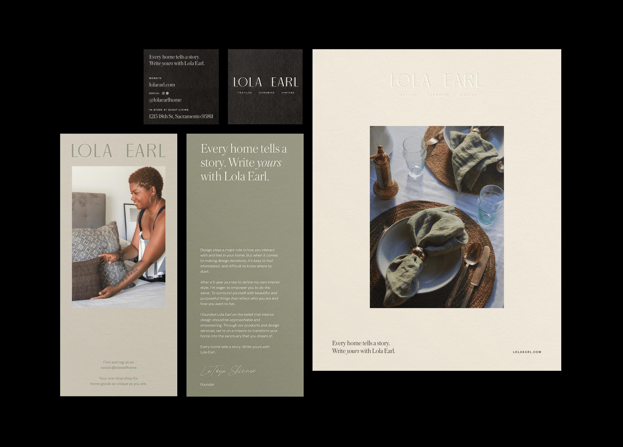
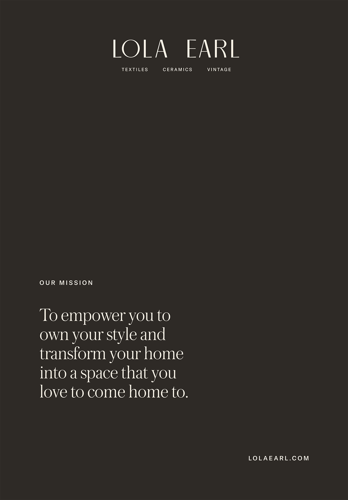
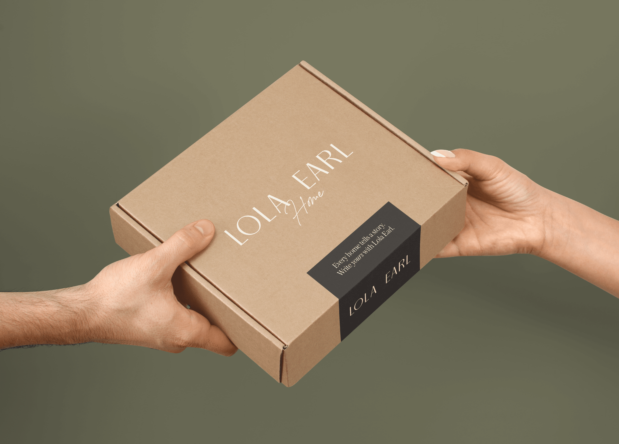
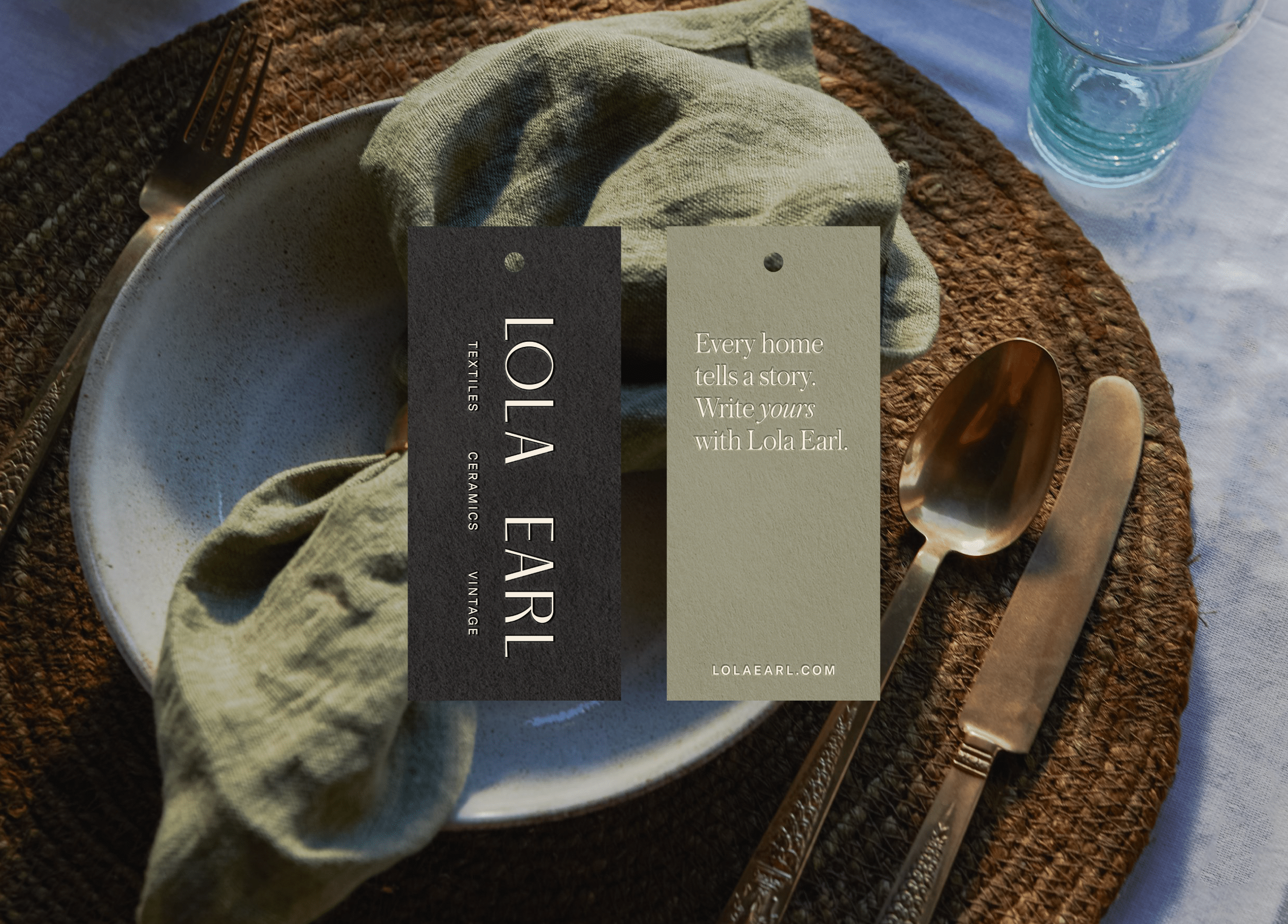
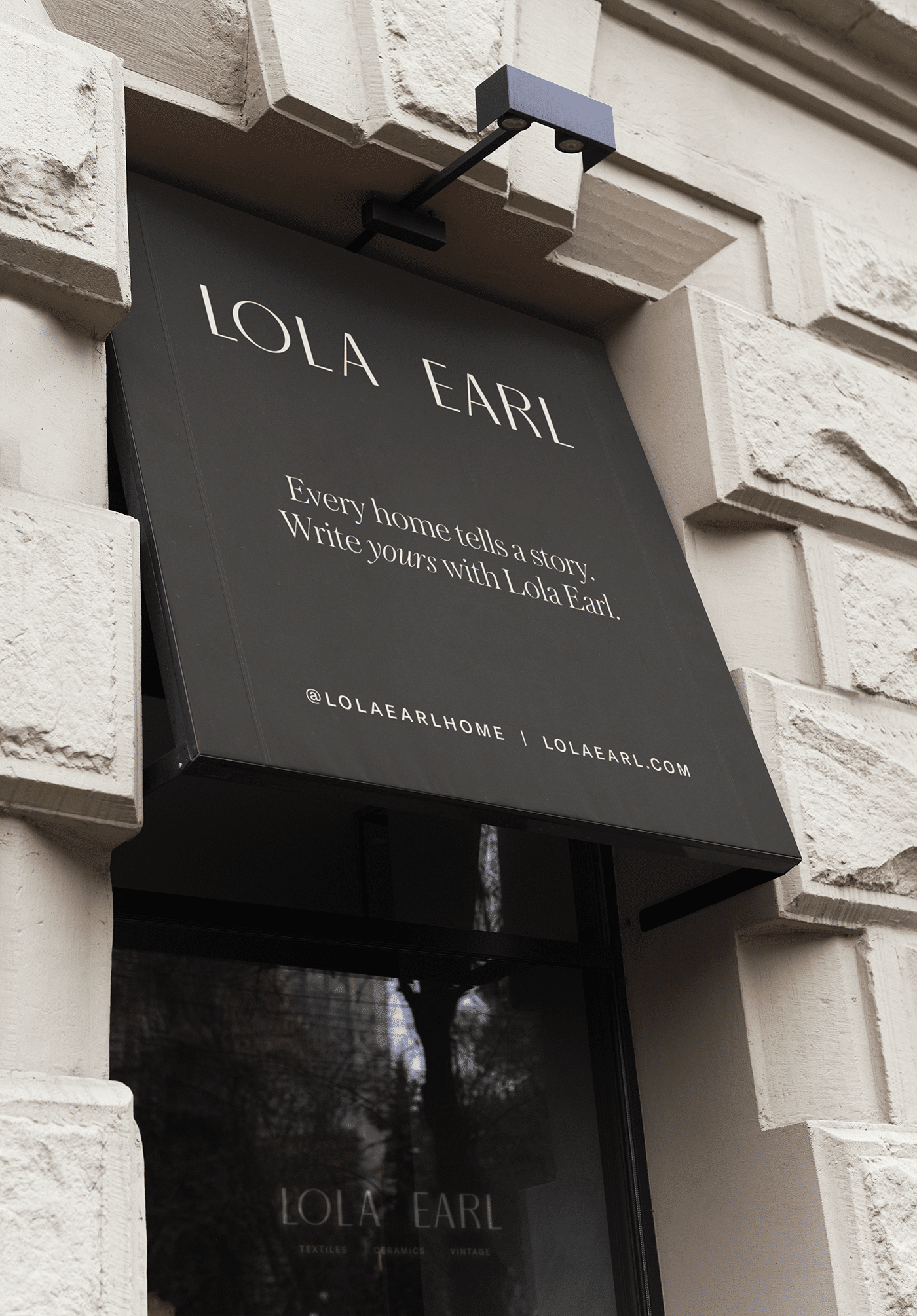
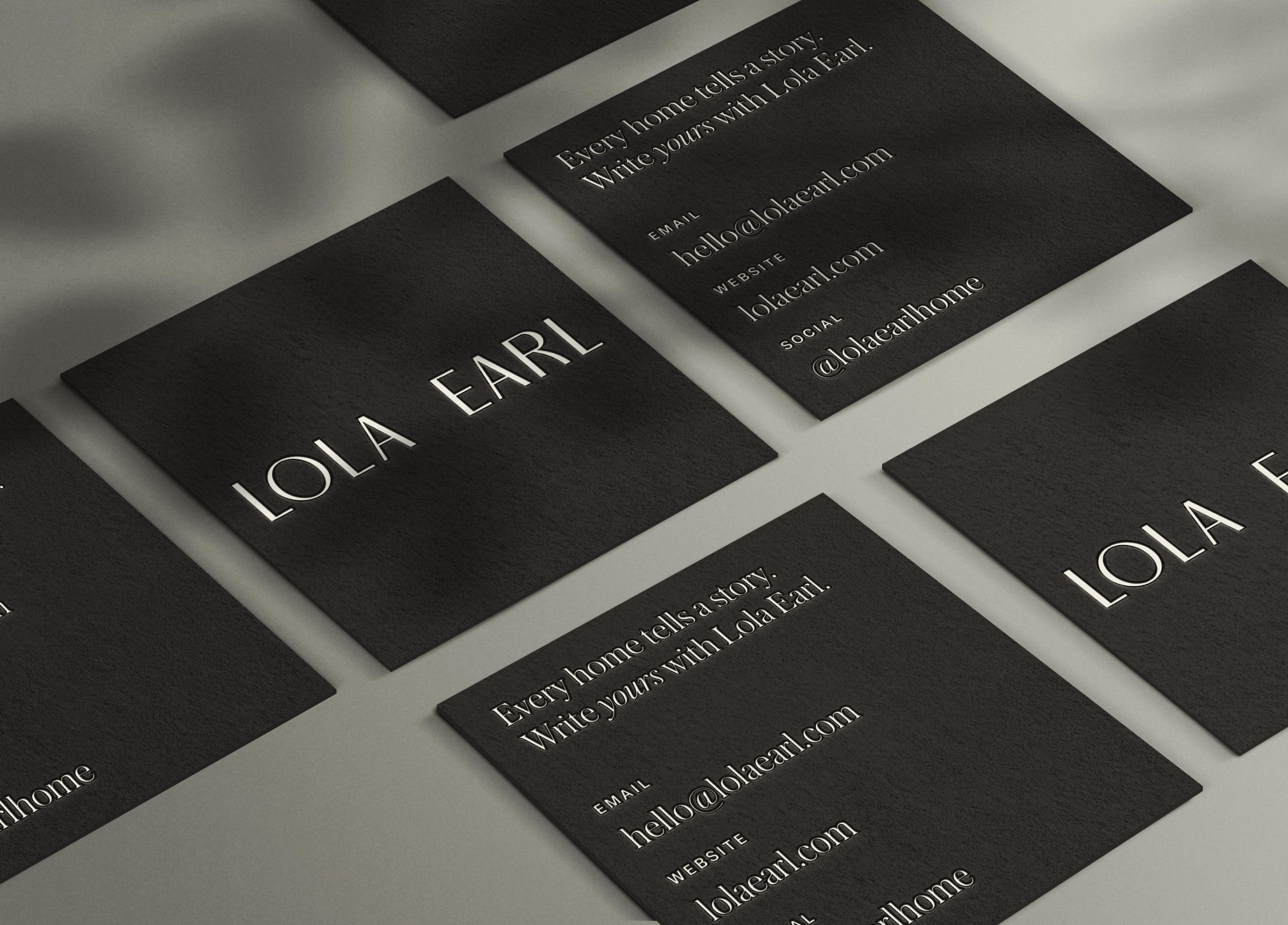
Year
2021
Client
Lola Earl
Services
Brand Strategy, Brand Identity, Print Materials, Packaging Design
Industry
Retail
Credits
Photography: Salthaus

A home goods brand that empowers dwellers to make their spaces a reflection of themselves.

Lola Earl emerged from a vision to redefine the concept of home as a sanctuary of personal expression. Founded in 2021, this nascent brand sought to imbue warmth, balance, and vintage charm into the homes of its customers, inviting them to weave their unique stories into their living spaces.

Collaborating closely with Lola Earl’s founder since its inception, we embarked on a journey to translate this vision into a tangible brand identity. Together, we crafted a rich and nuanced visual language that celebrates tradition while embracing modernity, laying the groundwork for Lola Earl to become a beacon of authenticity in the home goods industry.

The Wordmark

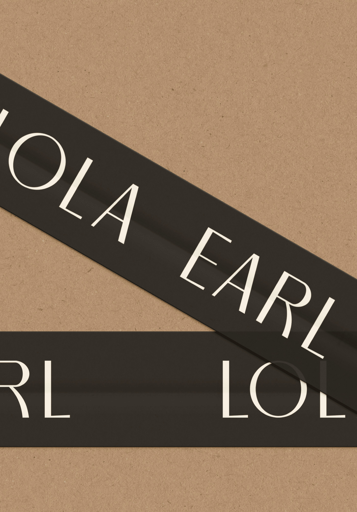
Lola Earl’s wordmark, characterized by elegant typography and deliberate spacing, embodies the brand’s identity with sophistication. The intentional gap between ‘Lola’ and ‘Earl’ prompts a moment of contemplation, echoing the brand’s ethos of curated storytelling within the home. Notably, the playful touch of the curved leg in the letter ‘R’ adds a sophisticated yet whimsical element, reminiscent of the graceful lines found in furniture and decor.

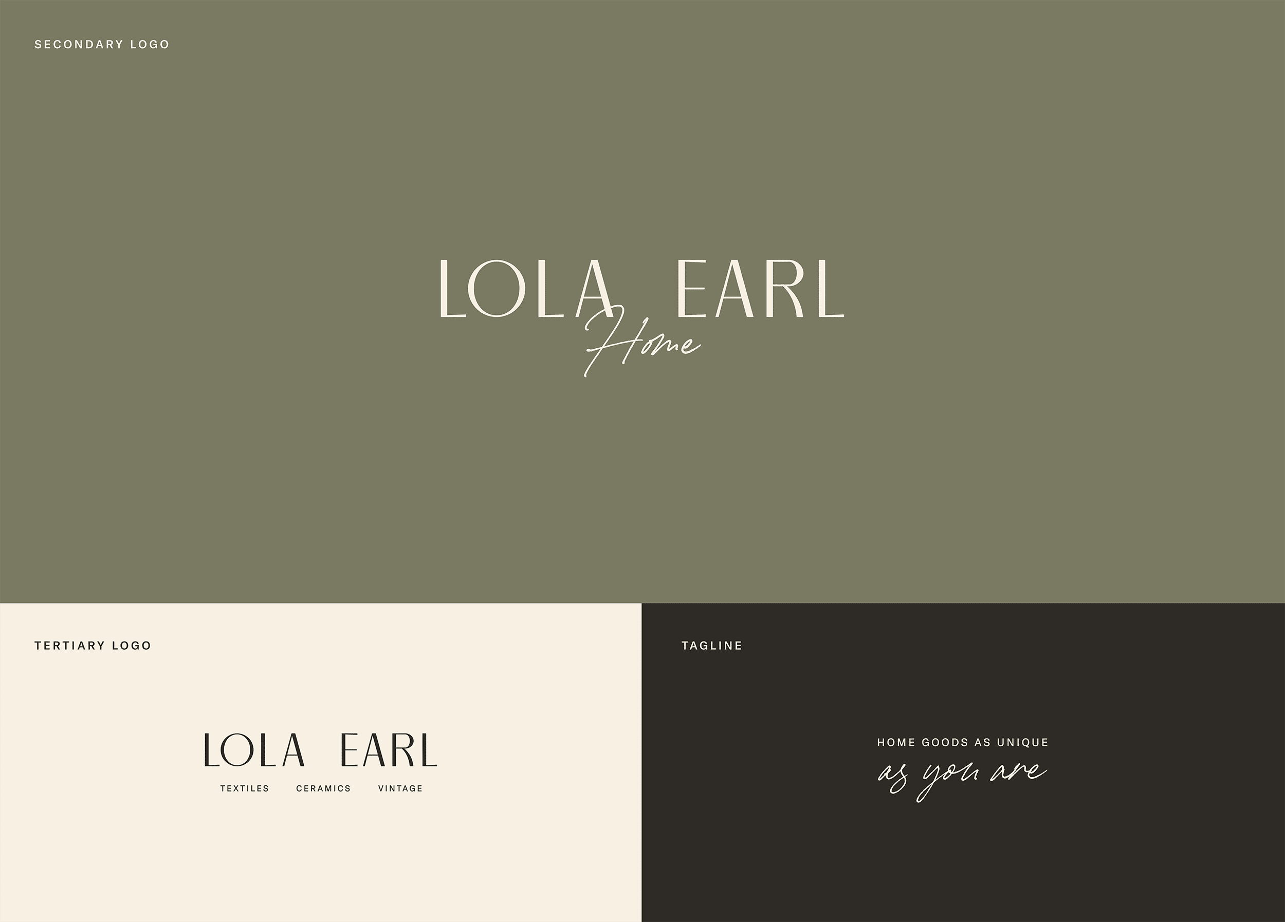
In a secondary version, the word ‘Home’ is delicately woven beneath ‘Lola Earl,’ centered and handwritten, emphasizing the brand’s dedication to personalization and narrative-driven spaces. A third iteration features the primary wordmark with a subheadline denoting the hero products—ceramics, textiles, and vintage goods—introducing depth and context to the visual identity.

Color Palette

Lola Earl’s palette reflects warmth and timeless elegance, drawing inspiration from natural elements and vintage textiles. Charcoal grounds with its deep tone, while Sage Green adds a refreshing accent. Complementing these are Beige and Cream, providing a soft, neutral backdrop enhancing versatility.

Typography

Lola Earl’s typography blends elegance with modernity, enhancing the brand’s visual identity with refined aesthetics. Austin News Headline exudes sophistication, paired with GT America for clarity and accessibility. Balto Book ensures readability across brand collateral, delivering detailed information with clarity.

Packaging Suite

Lola Earl’s packaging exudes elegance and warmth, mirroring the brand’s commitment to storytelling and authenticity. The wordmark takes center stage, appearing in various forms to maintain brand consistency and recognition across packaging materials. Additionally, the brand’s primary message, “Every home tells a story. Write yours with Lola Earl,” serves as a guiding principle, reinforcing the brand’s narrative-driven approach to home goods.

Print Collateral

Tactile details like blind embossed stickers, satin ribbon, and letterpress hang tags elevate the unboxing experience, inviting customers to engage with the brand on a sensory level. Bold packing tape featuring the brand’s color palette further reinforces Lola Earl’s visual identity, ensuring that every aspect of the packaging reflects the brand’s values of comfort, elegance, and authenticity.

Related Projects

View all work
Boxwood Avenue
Brand Strategy, Brand Identity, Print Materials, Packaging Design
Veda Coffee
Brand Strategy, Brand Identity, Print Materials, Packaging Design