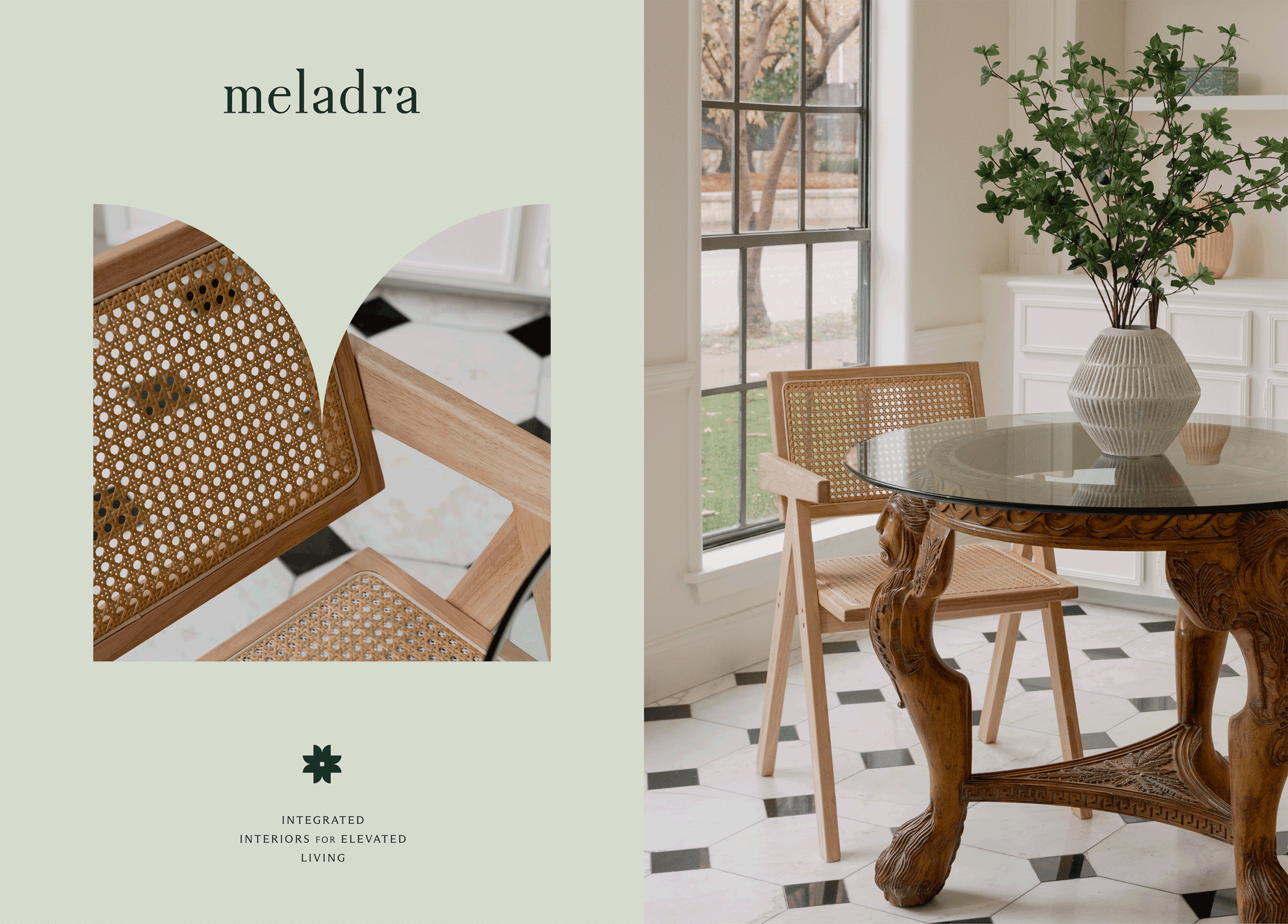
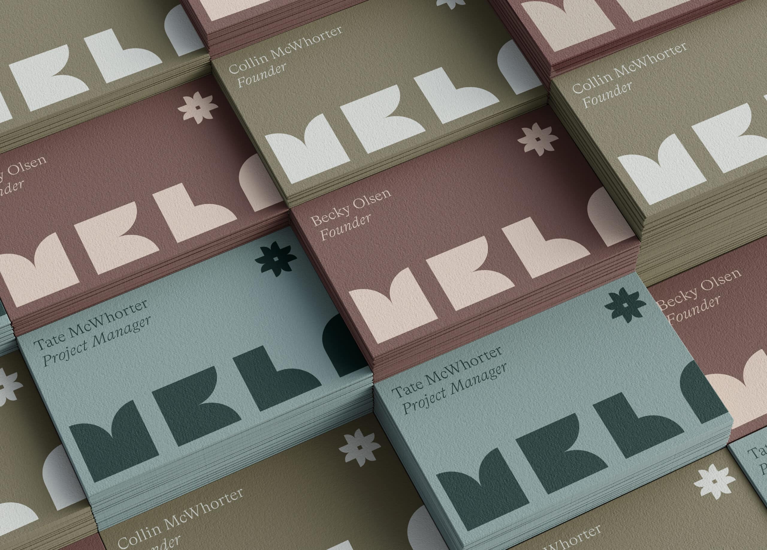
Year
2023
Services
Brand Strategy, Brand Naming, Brand Identity, Print Materials, Packaging Design
Client
Meladra Design
Industry
Interior Design

Elevating interiors with innovative artistry and a personal touch.

Meladra Design’s journey began with a vision firmly rooted in innovation, self-expression, and the artistry of interior design. Drawing inspiration from the picturesque landscapes of central Oregon, their foundation was laid on the belief that functionality and aesthetics can coexist harmoniously within the confines of a home.

As their portfolio expanded, it became evident that their brand identity needed to evolve to encapsulate their growth. In close collaboration with our clients, we embarked on a transformative journey to craft a visual language that not only embodied the essence of contemporary living but also etched its place in timelessness. Our intention was to set the stage for Meladra Design to scale beyond their local design scene and poise them for their next stage of evolution as designers.

Primary Wordmark

A lowercase serif wordmark encapsulates the essence of Meladra Design—friendly, spirited, approachable, and open. Lowercase letters forge a personal connection, striking a balance between warmth and professionalism. Customized top serifs and extended stems on the L and D symbolize precision, ambition, and innovation, while flat bottom serifs reflect the grounded, down-to-earth nature of the firm’s founders.

Secondary Wordmark

Inspired by the shapes often found in floor plans, the secondary wordmark features letters within a 1:1 square proportion. Playful elements like a door swing and chair in plan view infuse whimsy and creativity into the identity. The door swing symbolizes opportunity and the welcoming essence of the brand, while the chair represents comfort and the concept of “home.”

Submarks

Repurposing the shapes from the secondary wordmark, we crafted primary and secondary submarks to serve as tertiary symbols of the brand for smaller applications. The shapes have also been translated into repeating patterns to adorn digital and printed collateral with a touch of the brand’s creative spirit.

Typography

The typography suite enhances the brand’s visual communication with clarity and style. The selection of ABC Arizona Flare for subheadline and paragraph typefaces infuses unique character into Meladra’s copy. Bradford Light and Light Italic headline typefaces exude elegance and sophistication, leaving a lasting visual impact that aligns with Meladra Design’s ethos.

Color Palette

The color palette, inspired by Central Oregon’s landscape and rooted in the brand’s core values of boldness, versatility, and innovation, blends warmth and personalization. Clay grounds the palette, while olive embraces adaptability. Teal brings serenity and emerald sparks creativity. Nude adds timelessness, and celadon establishes a tranquil connection to nature.

Related Projects

View all work