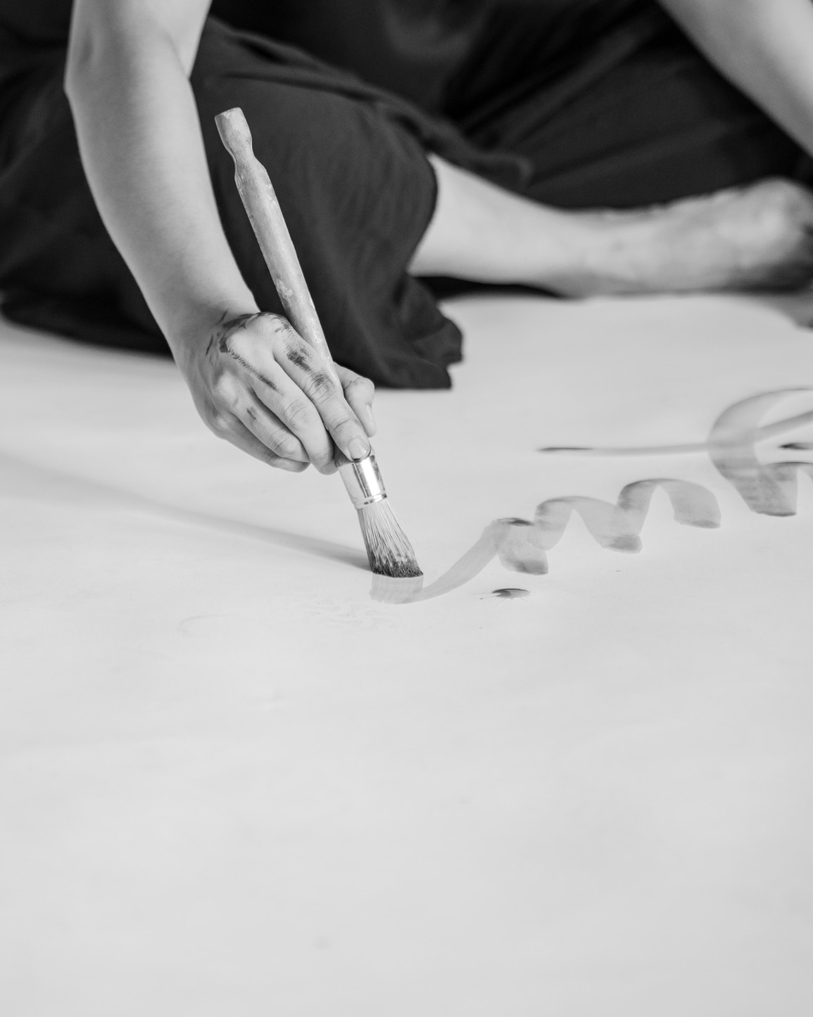
That’s the amazing thing about design (and being designers) — we have the ability to evoke a world of emotions through the decisions we make.
Typography is among the most important of those decisions. It’s one of our favorite tools to employ because you can say so much with it. As our audience reads the words we write, they’re also digesting the way we write it. Not just the tone of our message but the shape of the words on the screen. All of it comes together to create a nuanced narrative in their mind.
Here is a breakdown of type styles and the qualities they can evoke to the viewer.
Serif: Traditional, Stable, Reliable, Respectable, Timeless, Formal
- Old Style: Originally created between the late 15th and mid-18th centuries, these early roman types are characterized by curved strokes whose axis inclines to the left, and little contrast between thick and thins.
- Transitional: Usually vertical strokes, vertical stress, more pronounced contrast than in Old Style designs, and oblique and bracketed serifs.
- Modern: Little or no bracketing on the serifs, vertical axis on curved strokes, dramatic contrast between thick and thin strokes, ball-shaped stroke terminals.
- Slab: Heavy serifs with very little or no bracketing, virtually no contrast in stroke weight.
- Glyphic: Emulate lapidary (relating to stone and gems and the work involved in engraving, cutting, or polishing) inscriptions rather than pen-drawn text, have minimal stroke weight, and use triangular serif shapes.
Sans Serif: Modern, Clean, Sensible, Straightforward, Universal
- Grotesque: A spurred uppercase “G”, minimal contrast on the strokes.
- Neo-Grotesque: More legible and plain, but have similar features to the older Grotesques.
- Geometric: Have round “O”’s, are based on simple geometric shapes, and have no contrast between strokes.
- Humanistic: Based on the proportions of Roman-style capitals, were created to be more legible, have more contrast than other sans serifs and have a calligraphic influence.
Script: Elegant, Feminine, Personal, Formal, Sophisticated, Stylish
- Formal: Flowing loops and flourishes and letterforms that are generally connected.
- Casual: A brush-like appearance with stronger strokes and letterforms that are sometimes connected.
- Calligraphic: Emulate hand-lettered calligraphy and generally have high contrast.
- Blackletter: Very formal, based on handwritten calligraphy, and have a strong contrast on strokes.
- Handwriting: Casual and mimic modern handwriting.
Monospaced: Mechanical, Simple, Legible, Casual, Friendly
- Non-proportional — every letter takes up the same amount of horizontal space on the page or screen. There are serif and sans serif varieties.
Display: Friendly, Unique, Expressive, Amusing
- Vary widely in their appearance and include both practical and novelty fonts suitable for headlines and titles.
Each of these styles offer a range of opportunities and options for us to explore as designers. We can combine, mix and match, contrast, or eliminate from this list in order to land on a typesuite that feels imaginative and relevant to the brand we’re designing. The possibilities are endless.
Next time you’re experimenting with typography, come back to this post and use it as a reference. Allow this list to inspire, excite, and simplify your design process.