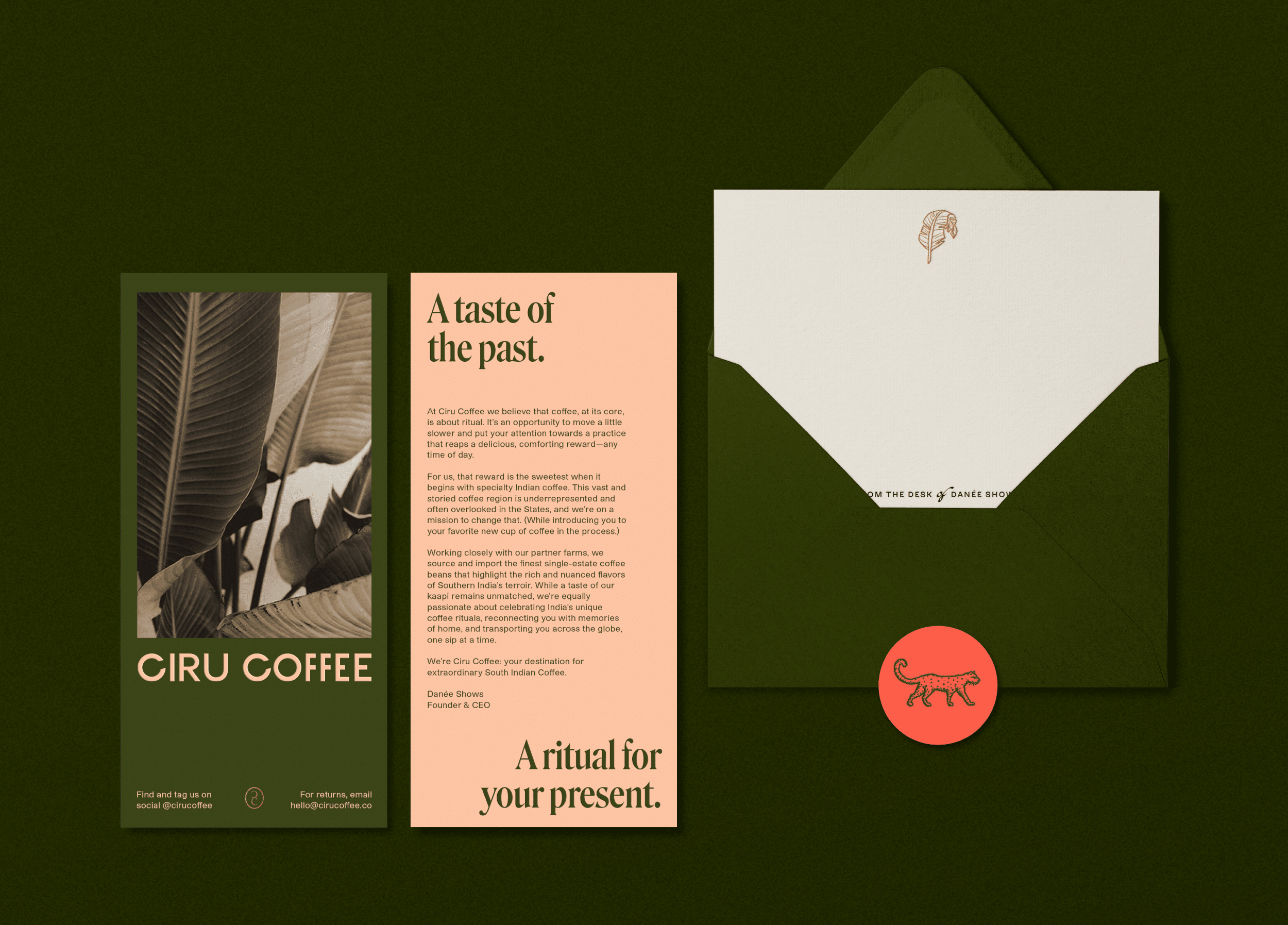
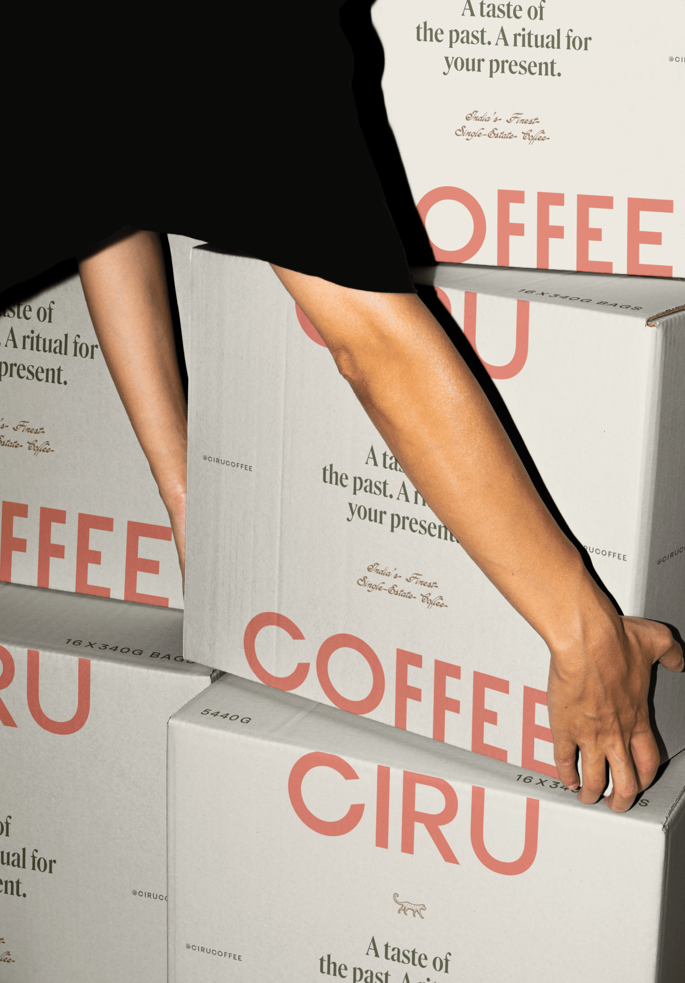
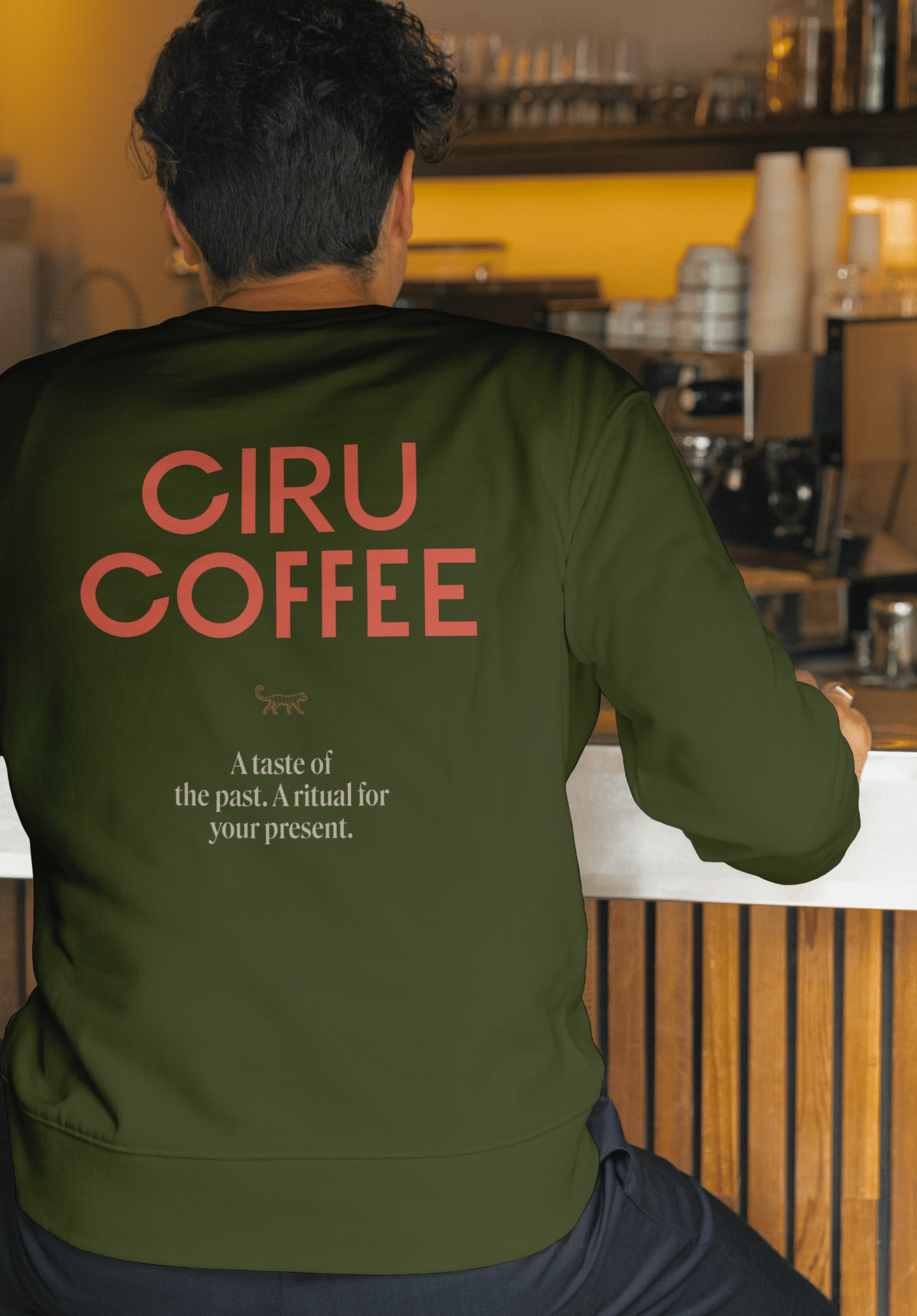
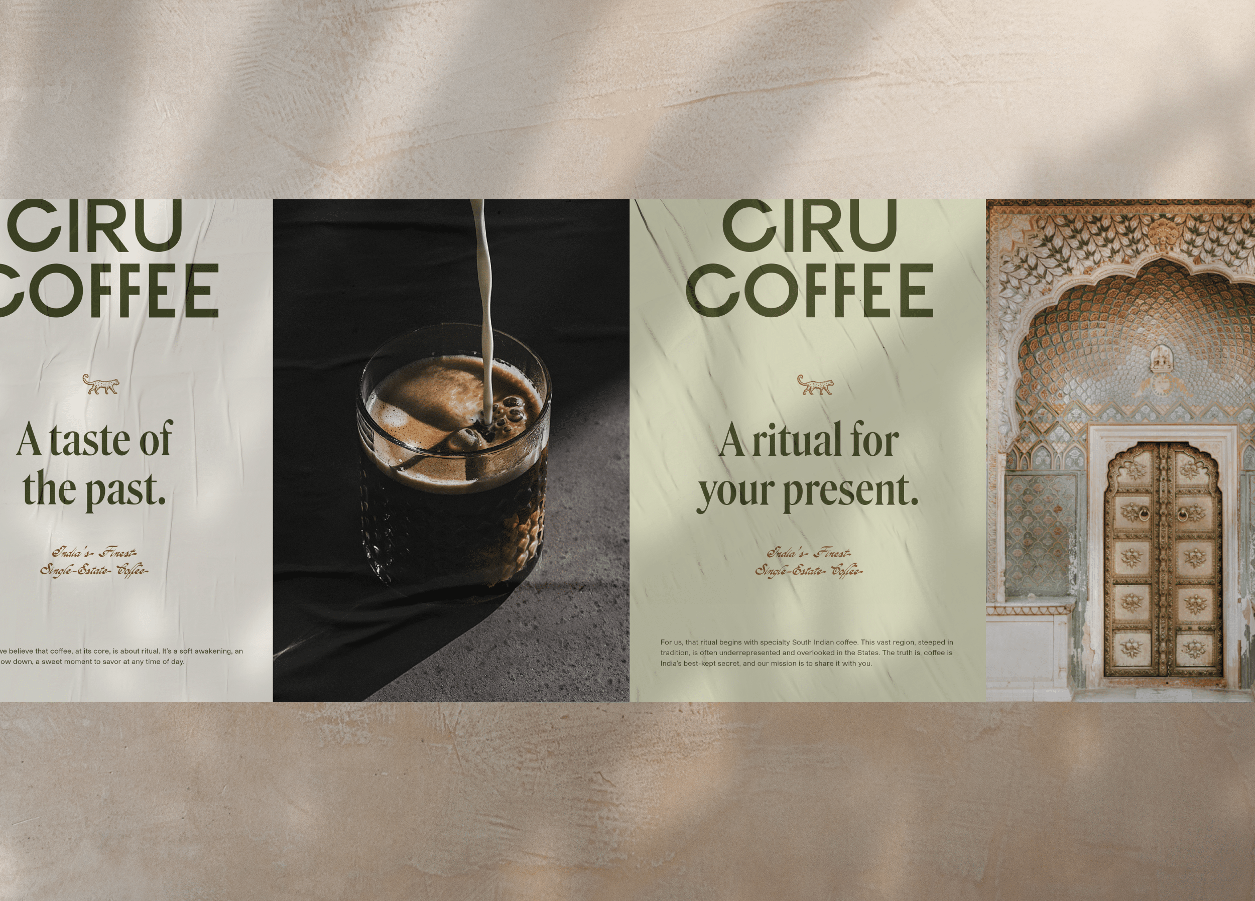
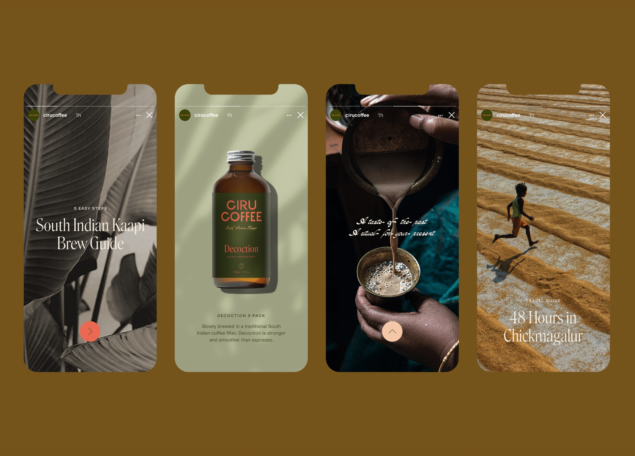
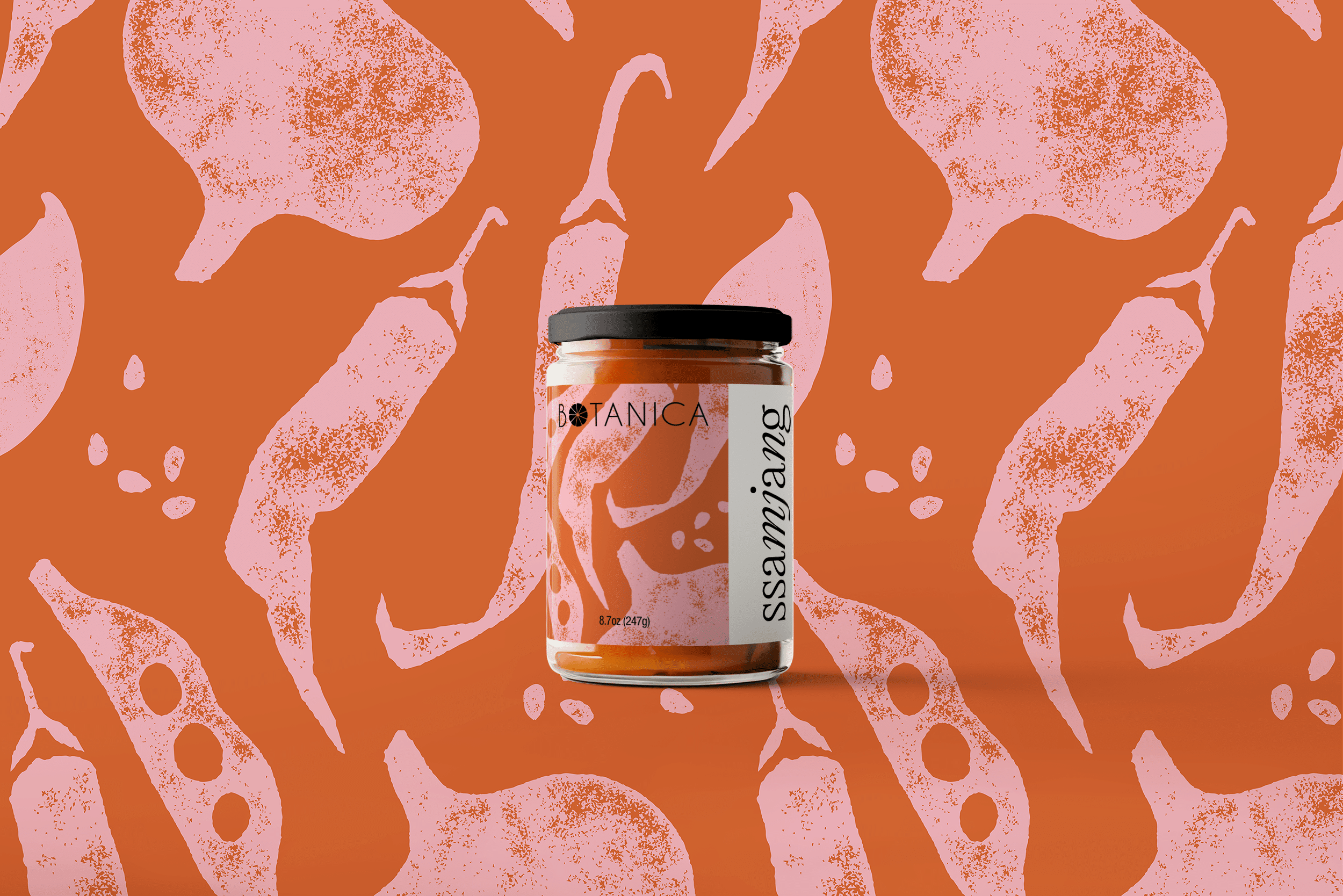
Year
2021
Services
Brand Strategy, Brand Identity, Print Materials, Packaging Design
Client
Ciru Coffee
Industry
Retail, Food & Beverage

A coffee brand that juxtaposes tradition and modernity.

Ciru Coffee began its journey as Ministry of Kaapi, an e-commerce-driven brand offering specialty South Indian coffee, with a loyal following of customers across the United States. Founded by Danée Shows, the brand’s core mission was to bring the ritual of South Indian coffee to a wider audience. But as the brand grew, Ciru Coffee sought a rebrand that would extend its reach, moving beyond its established DTC presence to wholesale retail opportunities across the U.S.

Ciru Coffee’s goal is to celebrate India as a quality coffee-producing region, while also preserving and sharing the traditional ritual of South Indian filter coffee (kaapi). Our rebranding strategy revolved around their commitment to high-quality, sustainable practices, authenticity, and inclusivity. Rather than fitting into the American third-wave coffee scene, Ciru sought to carve out its own space, building a brand that honors the tradition of South Indian coffee while offering a fresh and elevated presence in the market. The aim was to communicate the cultural significance and distinctiveness of their offerings to a broader audience, while ensuring accessibility and an approachable voice for coffee lovers of all backgrounds.

Visual Identity

The visual identity for Ciru Coffee blends the brand’s rich heritage with a modern, approachable feel. For the primary wordmark, we selected a bold, all-caps custom sans serif typeface, focusing on balanced proportions to create a unique yet harmonious design. The repeating “C’s” in Ciru are slightly rotated, which adds a playful element to the otherwise refined wordmark, while the varying arm lengths of the “e’s” bring a touch of whimsy to the identity. The custom brand icon incorporates two serif “C’s” within an oval, bridging the modern wordmark with a traditional emblem to honor the origins of South Indian coffee.

The color palette draws inspiration from both the vibrant, colorful facades that India is known for and the natural hues of the coffee farms. Bold, eye-catching shades of vermillion, salmon, and bronze are contrasted by grounding tones of moss green, eucalyptus, and off-white. These colors not only represent the vibrancy of Indian culture but also evoke the warmth and earthy tones associated with South India’s coffee-growing regions. The palette ensures Ciru’s coffee stands out while maintaining a sense of authenticity.

Product Packaging

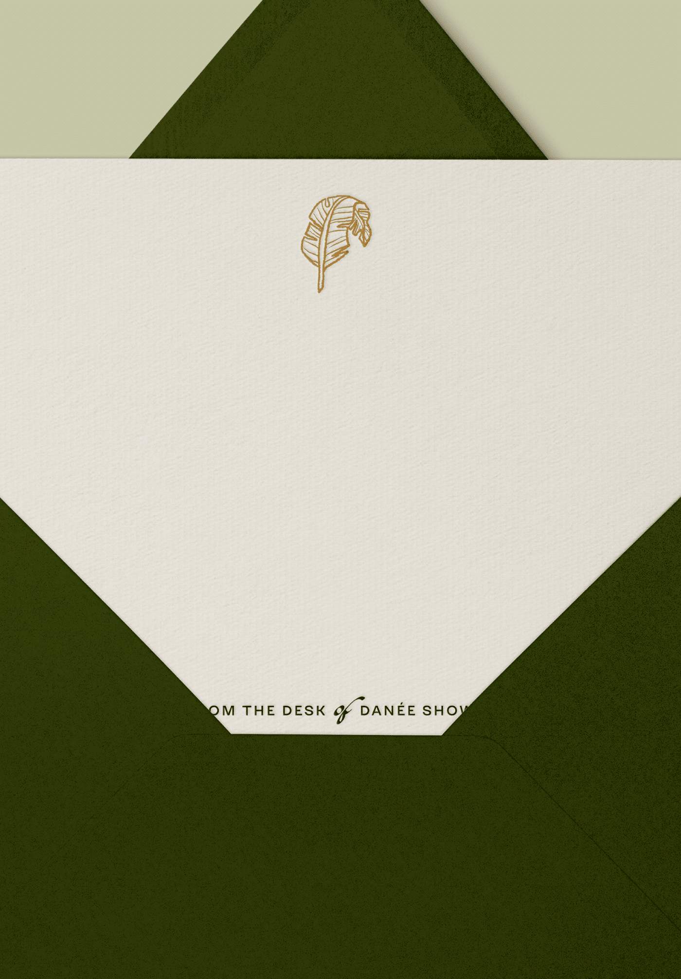
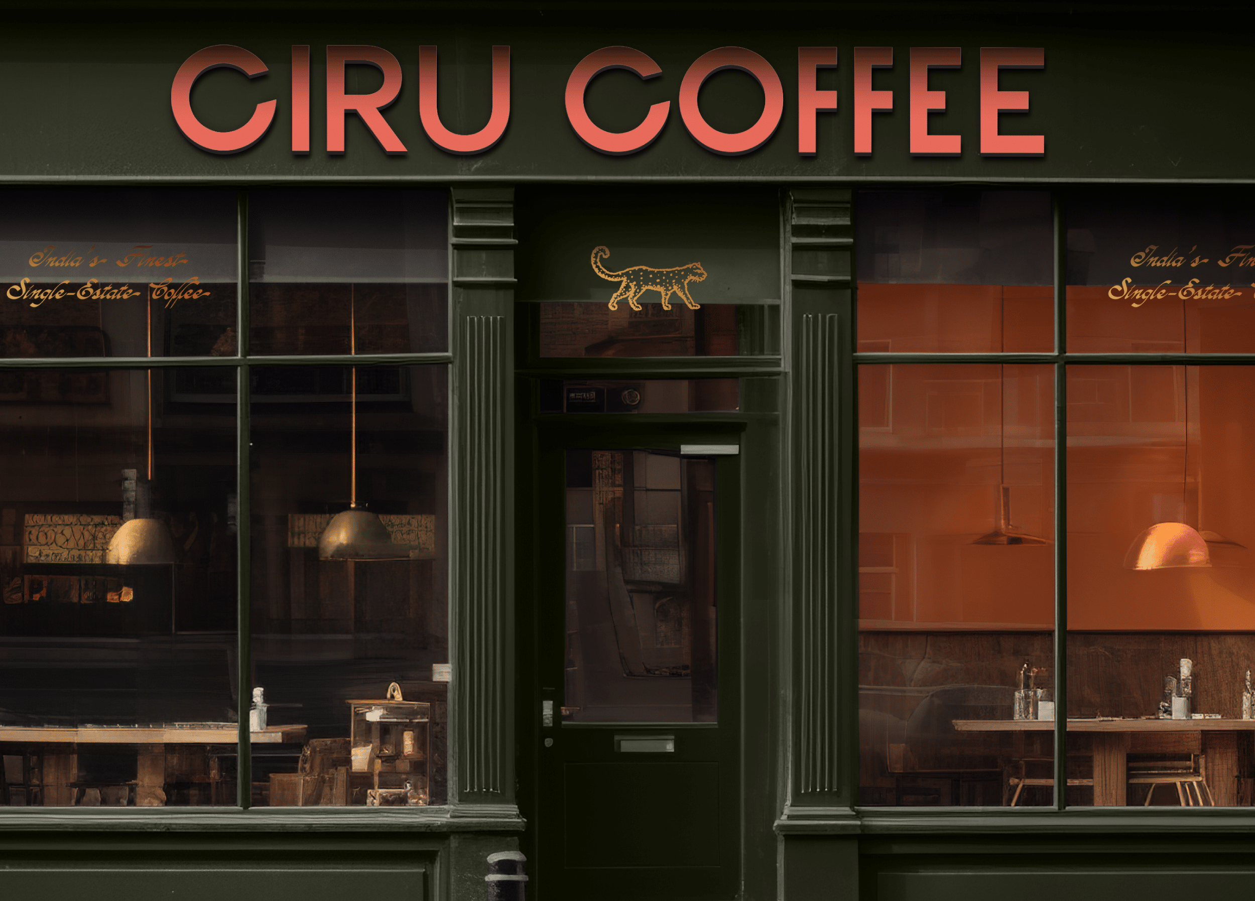
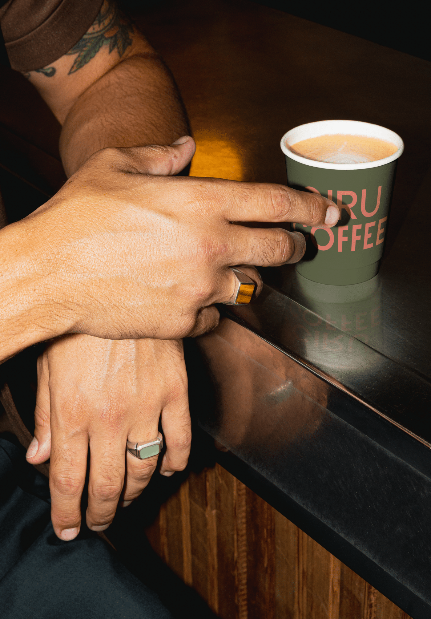
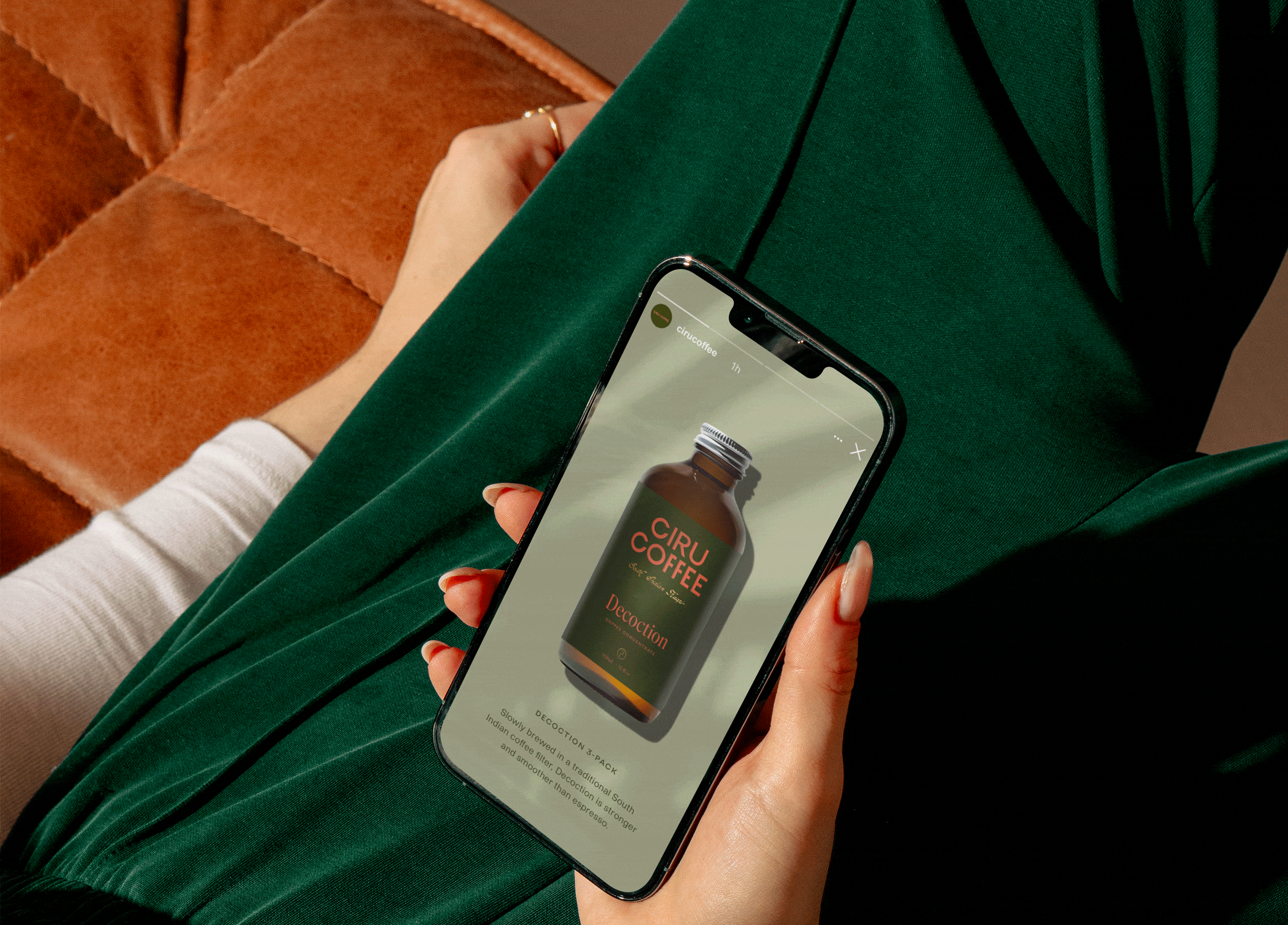
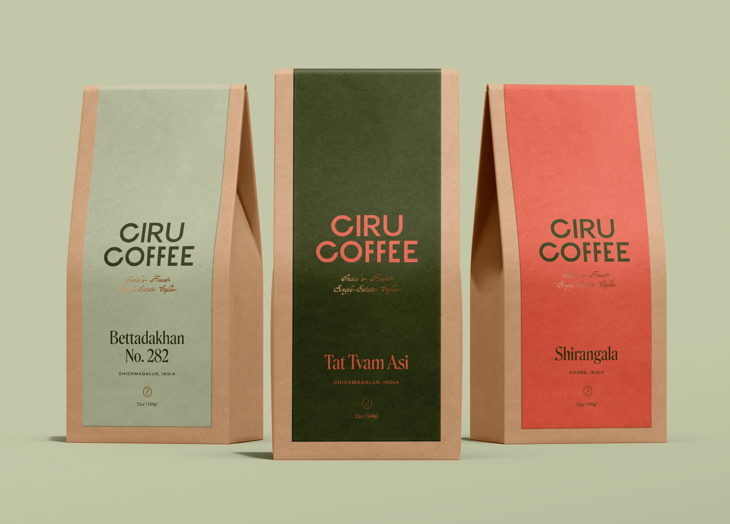
The product packaging reflects Ciru Coffee’s elevated yet accessible brand vision. We selected compostable kraft bags for the coffee beans, each featuring a custom sticker that wraps around both the front and back. The color palette is used strategically, assigning a two-color combination to each coffee variant, creating a visually engaging experience for consumers while ensuring that every bag has its own personality on store shelves. Gold foiling accents bring in a touch of tradition, while ensuring the packaging feels modern and premium. The labels for the decoction (coffee concentrate) bottles mirror the coffee bags in design, ensuring a cohesive retail presence.

Print Materials

Ciru Coffee’s print materials serve as an extension of the brand’s story, designed to deepen the connection with customers. A buck slip, included in all online orders, features rich, sepia-toned imagery alongside the vibrant color palette, introducing new customers to the story behind Ciru Coffee and its mission. This print piece not only speaks to the heritage of the coffee but also connects customers to the brand’s origins.

For a more personalized experience, a stationery set for Danée was created, featuring a custom illustrated feather printed with gold foil, echoing the style of the leopard illustration used throughout the packaging. This set was designed for handwritten notes to customers and partners, emphasizing the brand’s commitment to thoughtful customer service.

OOH & digital Experience

Ciru Coffee’s outdoor and in-store visuals were crafted to carry the refreshed brand identity beyond the digital and retail environments. We utilized the brand’s vibrant color palette and unique illustrations in signage and in-store displays, ensuring that Ciru Coffee made a statement wherever it appeared. These visuals not only enhance the customer’s experience but also help build brand recognition as Ciru expands into new retail spaces.

The digital experience for Ciru Coffee includes social media templates and content that are aligned with the brand’s voice and identity. The focus is on creating educational, approachable content around South Indian filter coffee, the brand’s products, and the rituals that define their coffee. Through engaging posts and how-to guides, Ciru Coffee aims to build a strong online community while reinforcing its presence in the specialty coffee market.

“Marbury’s work is stunning and speaks for itself, but the process of working with them is what makes all the difference. They dive deep, every detail considered, their dedication palpable. I felt truly understood and supported every step of the way. Above all, though, they were gracious and patient while I took us on a few left turns, then magically tied everything together into something beyond my wildest dreams.”

Danée Shows, Founder of Ciru Coffee