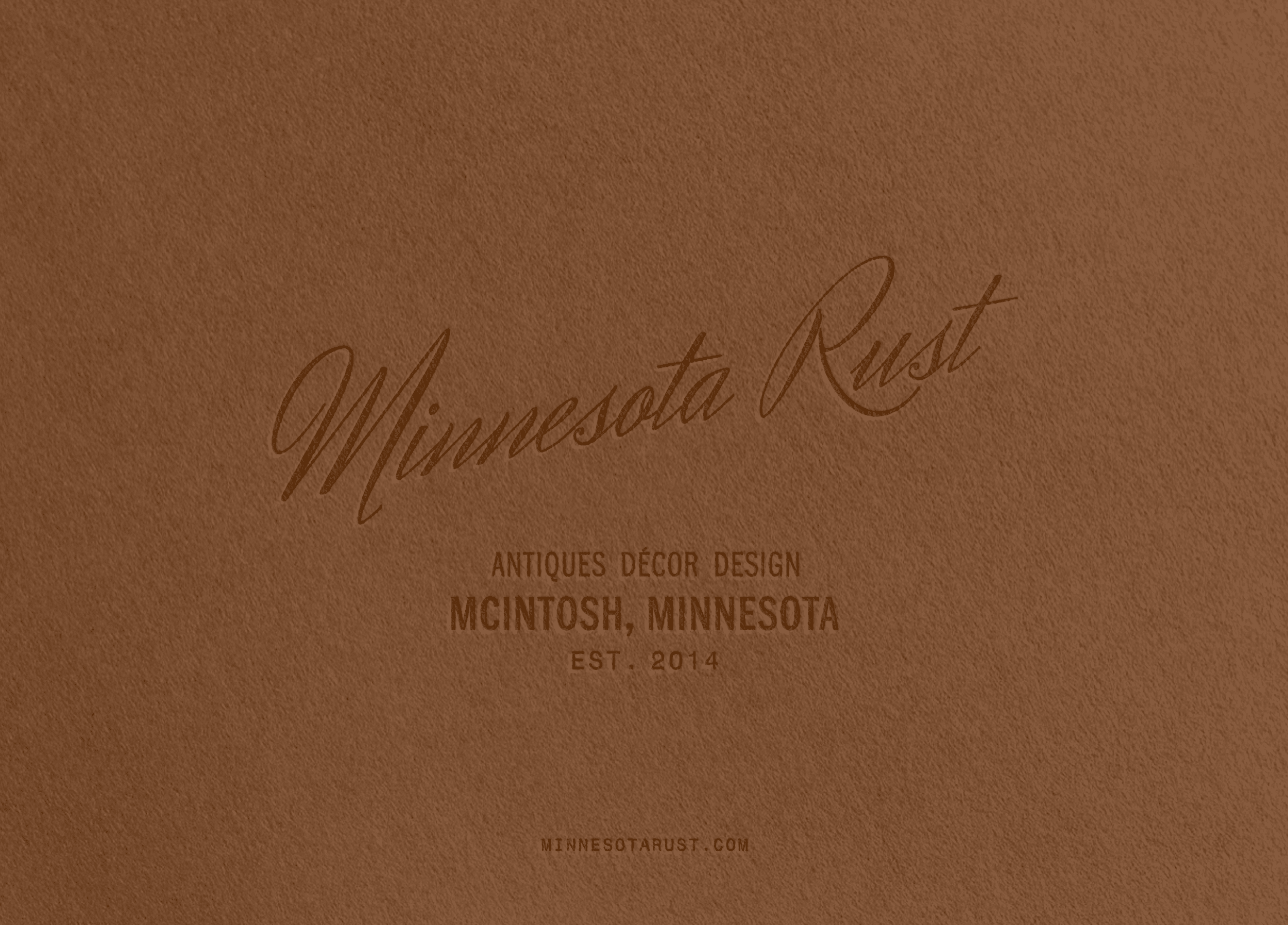
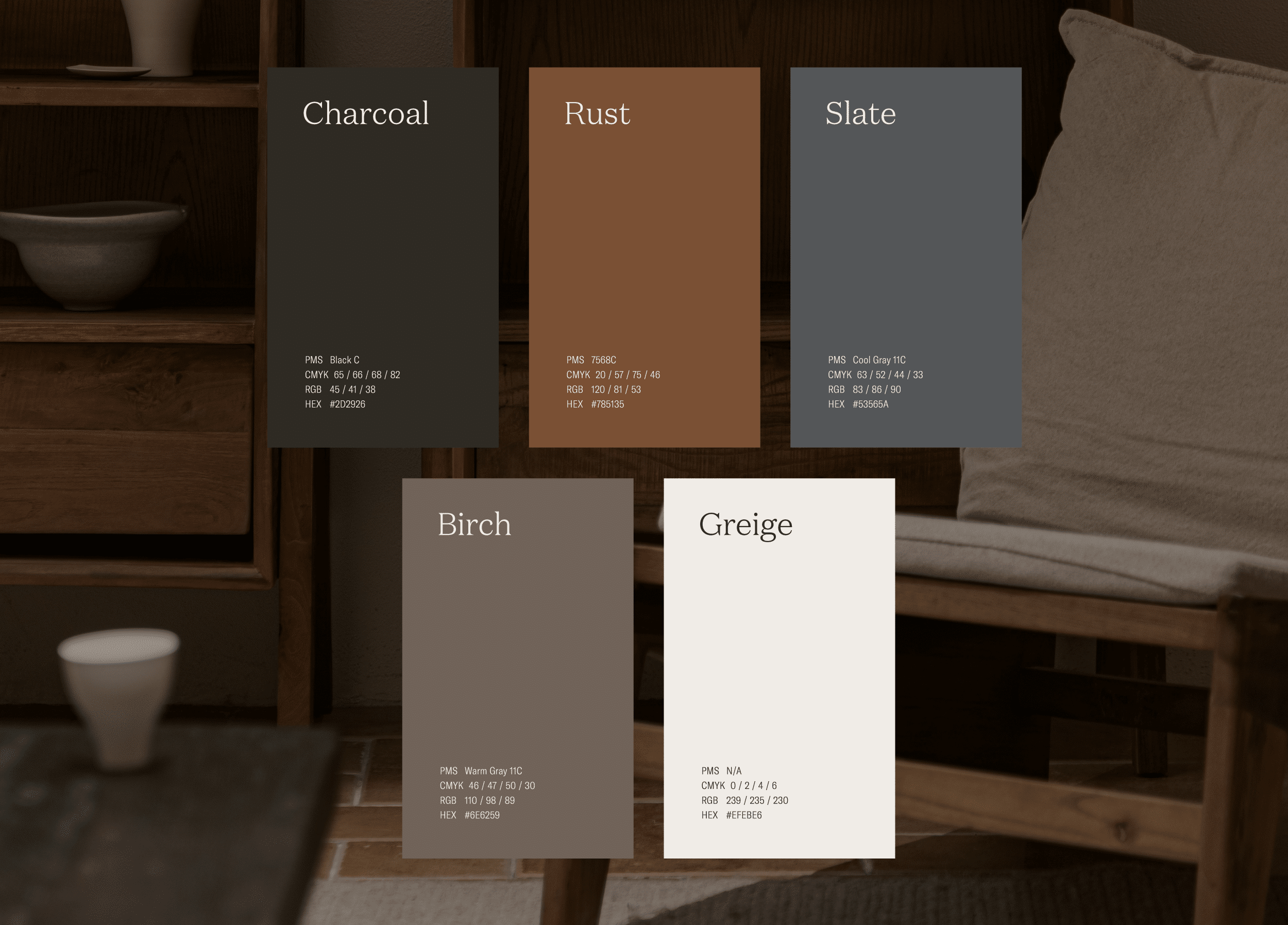
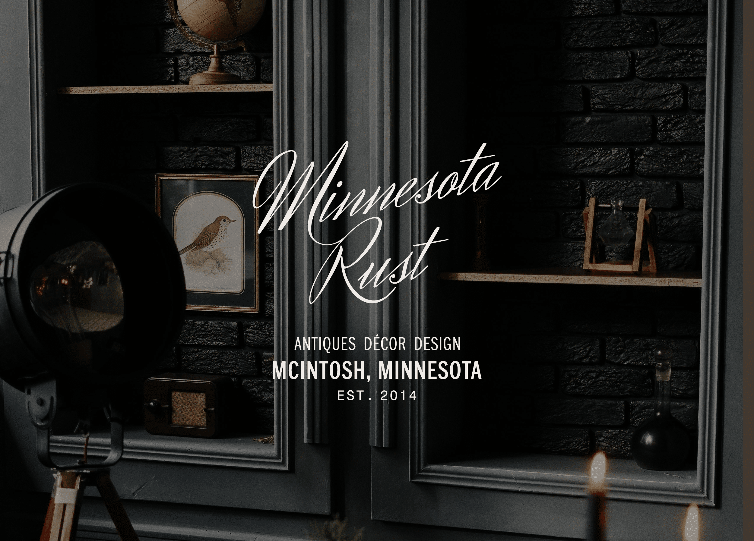
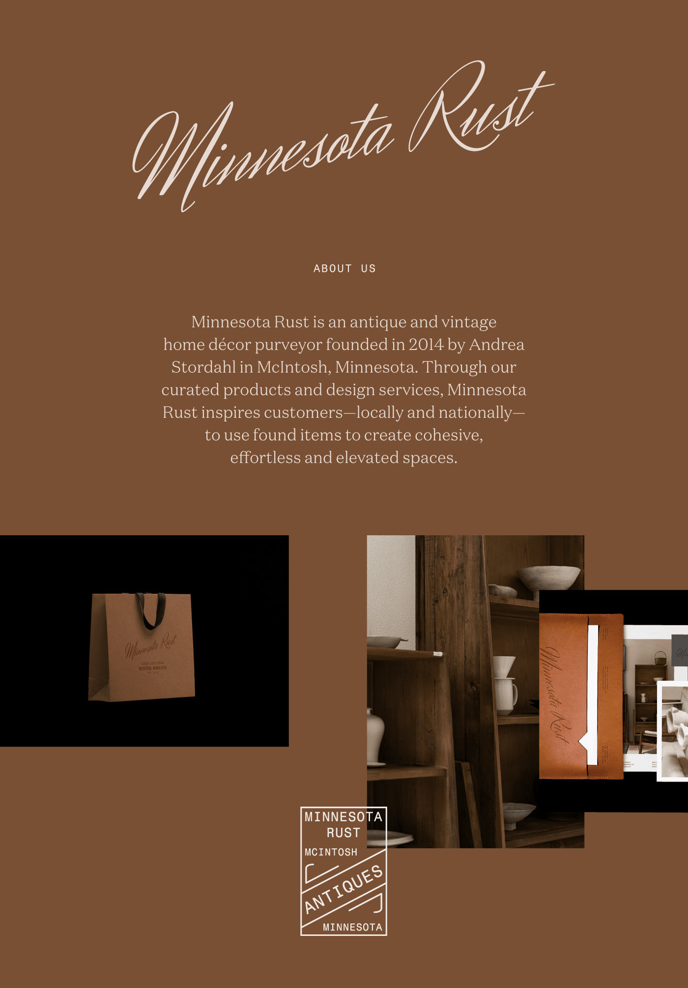
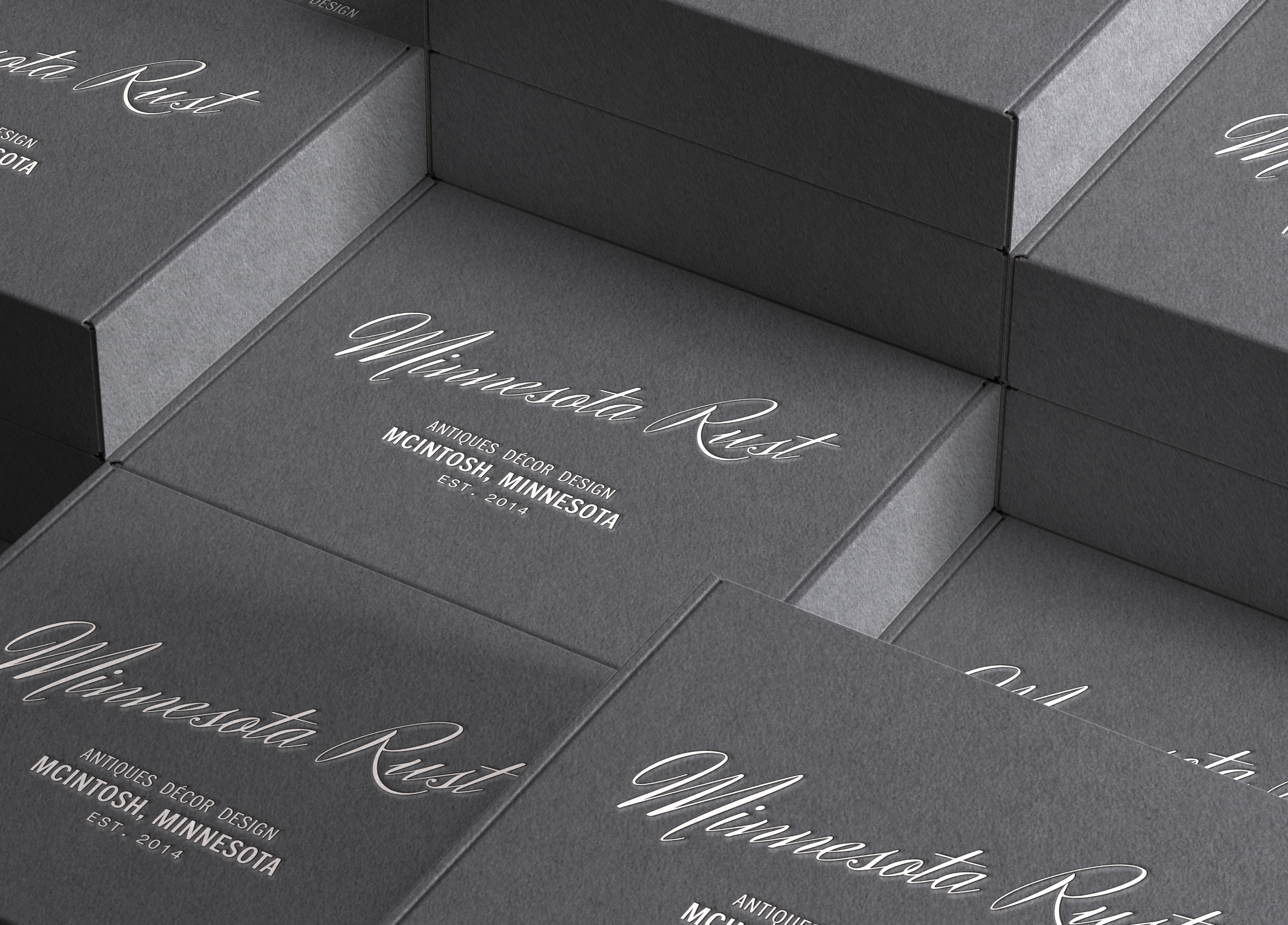
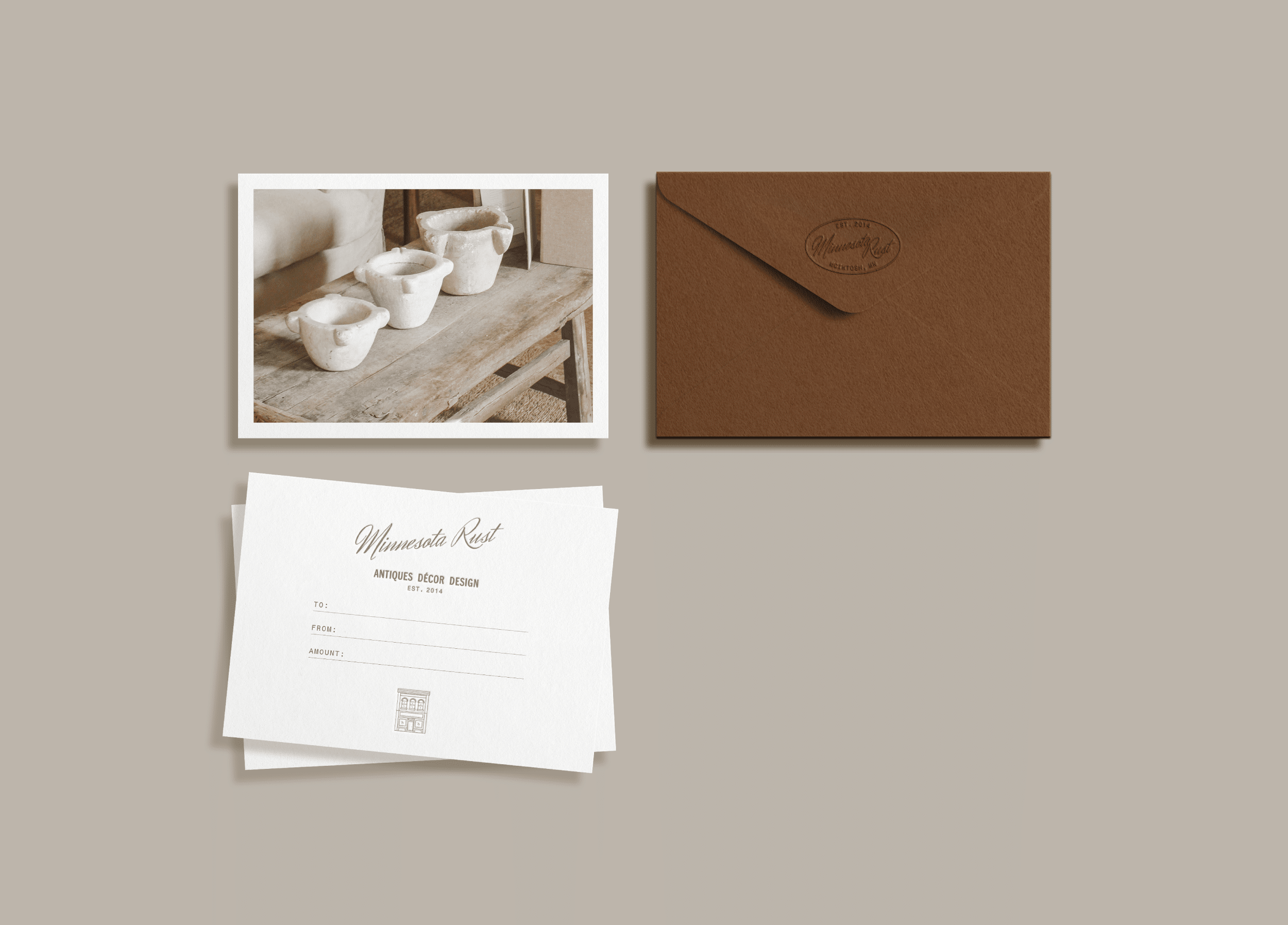
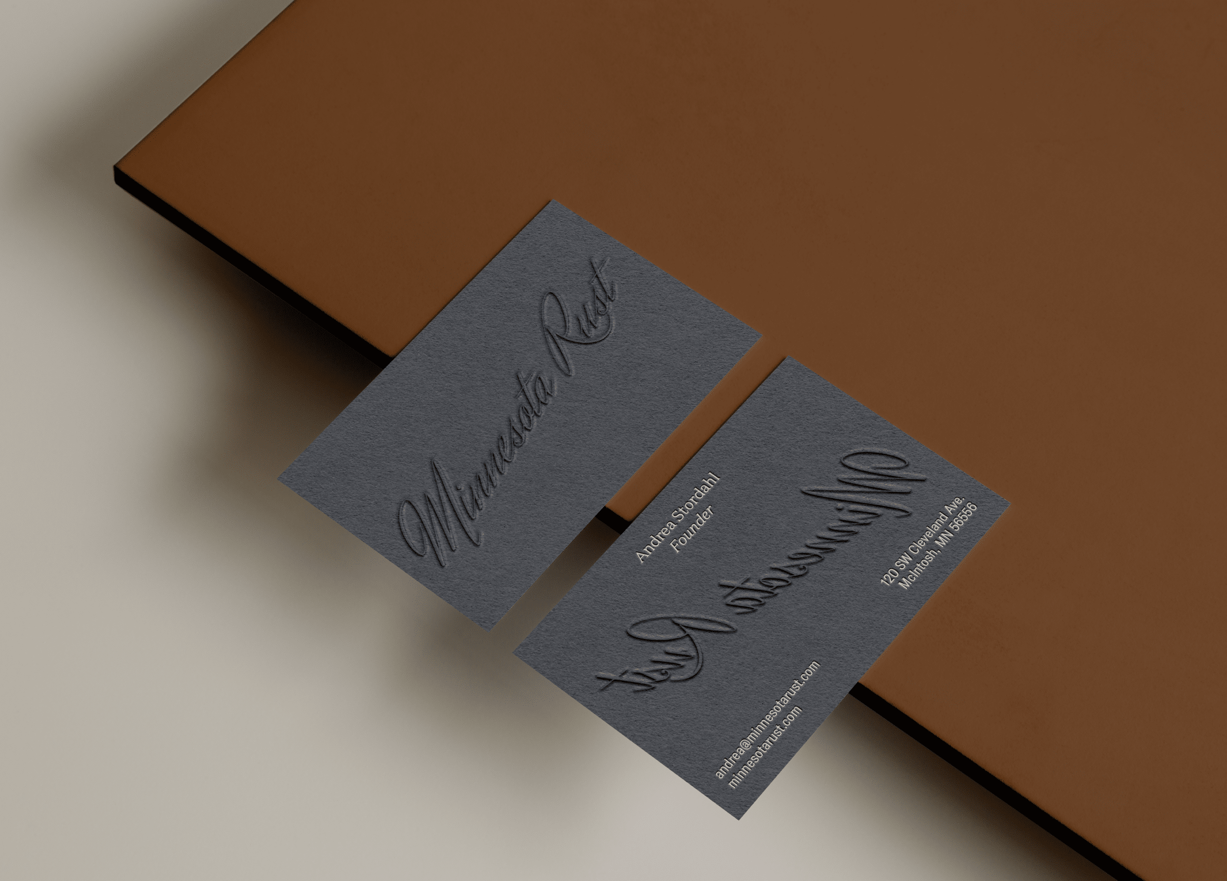
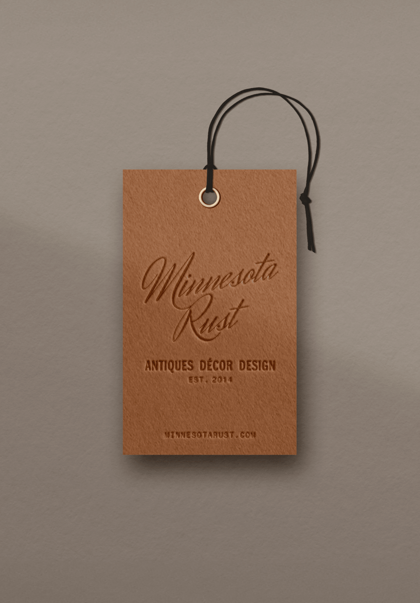
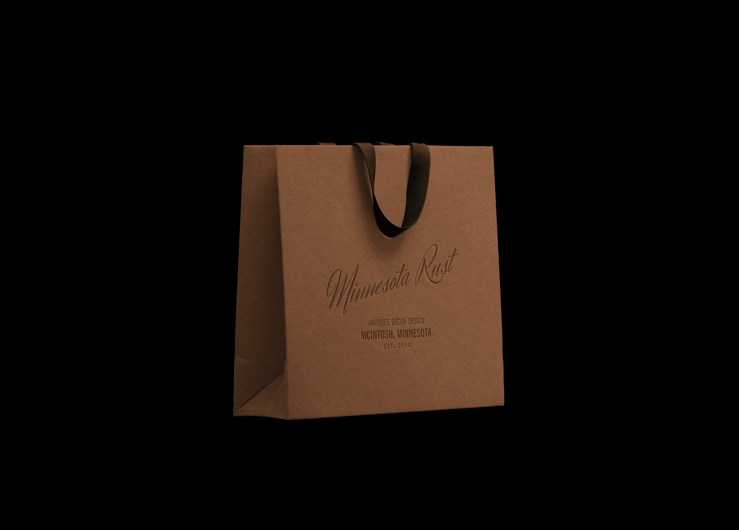
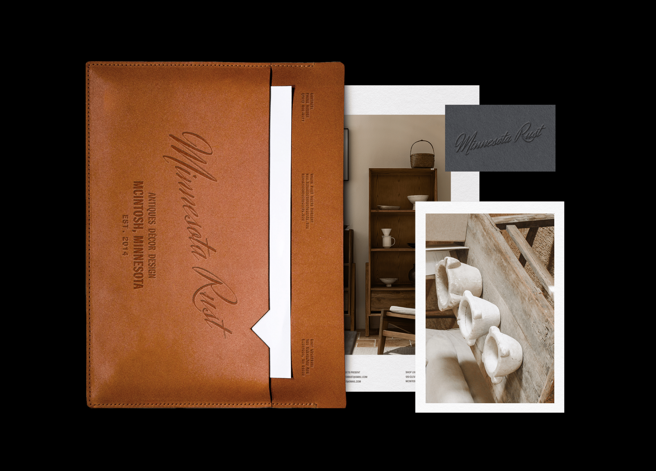
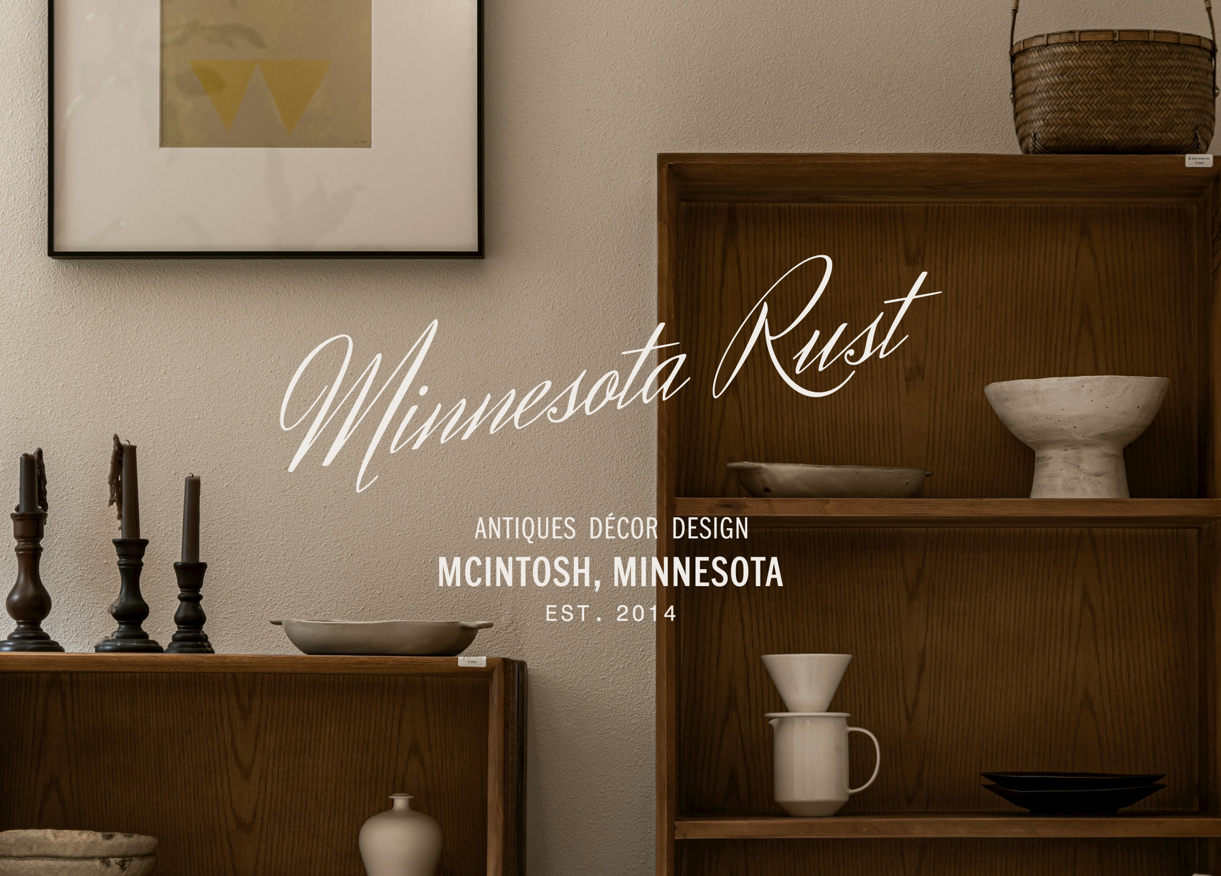
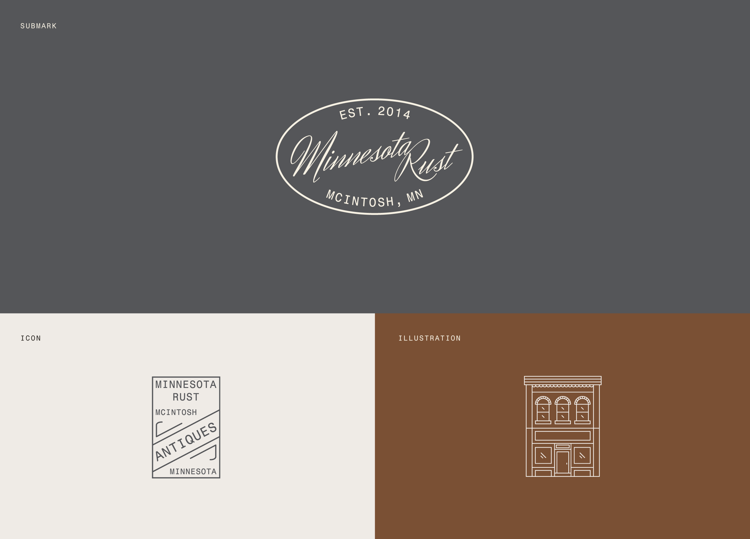
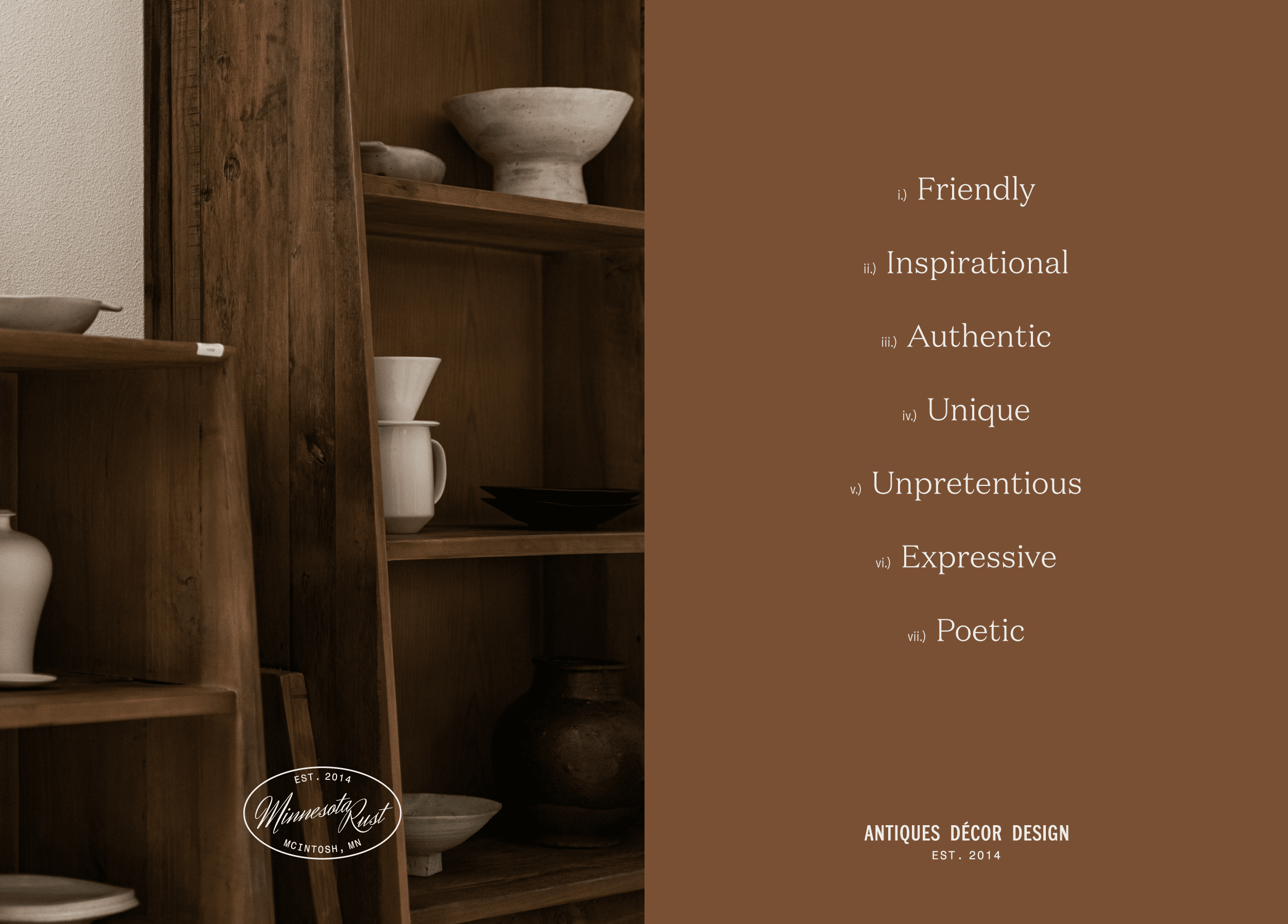
Year
2021
Client
Minnesota Rust
Services
Brand Strategy, Brand Identity, Print Materials, Packaging Design
Industry
Retail

Vintage finds that beckon shoppers both near and far.

Nestled in the heart of McIntosh, Minnesota, amidst the rolling landscapes and rustic charm, Minnesota Rust beckons to those seeking vintage treasures that transcend time and place. Established in 2014, Minnesota Rust is more than just a retail destination; it’s a curated haven of nostalgia and authenticity. With a focus on offering solely found furnishings and home décor from across the United States, Minnesota Rust embraces a narrative deeply rooted in tradition and storied craftsmanship.

Brand Identity

Minnesota Rust’s brand identity exudes warmth and authenticity, echoing the timeless qualities inherent in its handpicked products. Vintage American typography and brand icons inspired by antique furniture makers’ marks evoke a sense of history and tradition, inviting customers into a world of discovery and storytelling. Keywords like “timeless,” “trustworthy,” and “authentic” underscore the brand’s commitment to offering unique and inclusive experiences for all who walk through its doors.

Color Palette

Drawing inspiration from the neutral tones that characterize Minnesota Rust’s curated collection, the color palette exudes a subdued, aged aesthetic. Rust, the namesake hue, infuses warmth into the palette, while Slate bridges the gap between blue and grey, reminiscent of the galvanized metal accents found throughout the store. These colors not only reflect the brand’s name but also embody its ethos of timeless elegance and understated charm.

Typography

A harmonious blend of modern and traditional elements defines Minnesota Rust’s typography. The elegant serif heading font harkens back to old newspaper headline typefaces, evoking a sense of nostalgia and sophistication. Paired with a clean, approachable sans-serif body font, the typography mirrors the condensed styling of the logo fonts, creating a cohesive visual identity that resonates with the brand’s narrative of timeless craftsmanship.

Print Collateral

In the realm of print collateral and packaging design, Minnesota Rust places a premium on tactility and authenticity. Reflecting the rich patinas and aged textures of its curated collection, fibrous stocks in the brand’s core colors take center stage. Touches of leather further enhance the tactile experience, mirroring the materiality of the brand’s products and inviting customers to immerse themselves in the stories woven into each vintage find.

“Before I hired Marbury, I felt extremely overwhelmed… choosing to work with Jessica was exactly what I needed to put me at ease. She made the entire rebranding process fun, insightful, and easy—I wouldn’t change a thing.”

Andrea Stordahl, Founder of Minnesota Rust

Related Projects

View all work
Boxwood Avenue
Brand Strategy, Brand Identity, Print Materials, Packaging Design
Noe Studio
Brand Strategy, Brand Identity, Print Materials, Website Design