A restorative membership devoted to rest, regeneration, and holistic expression.
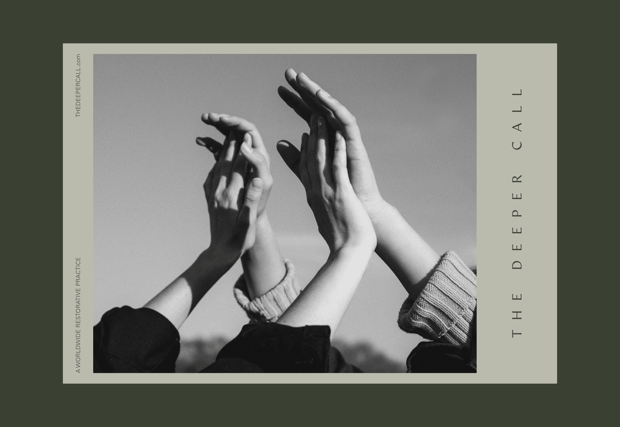
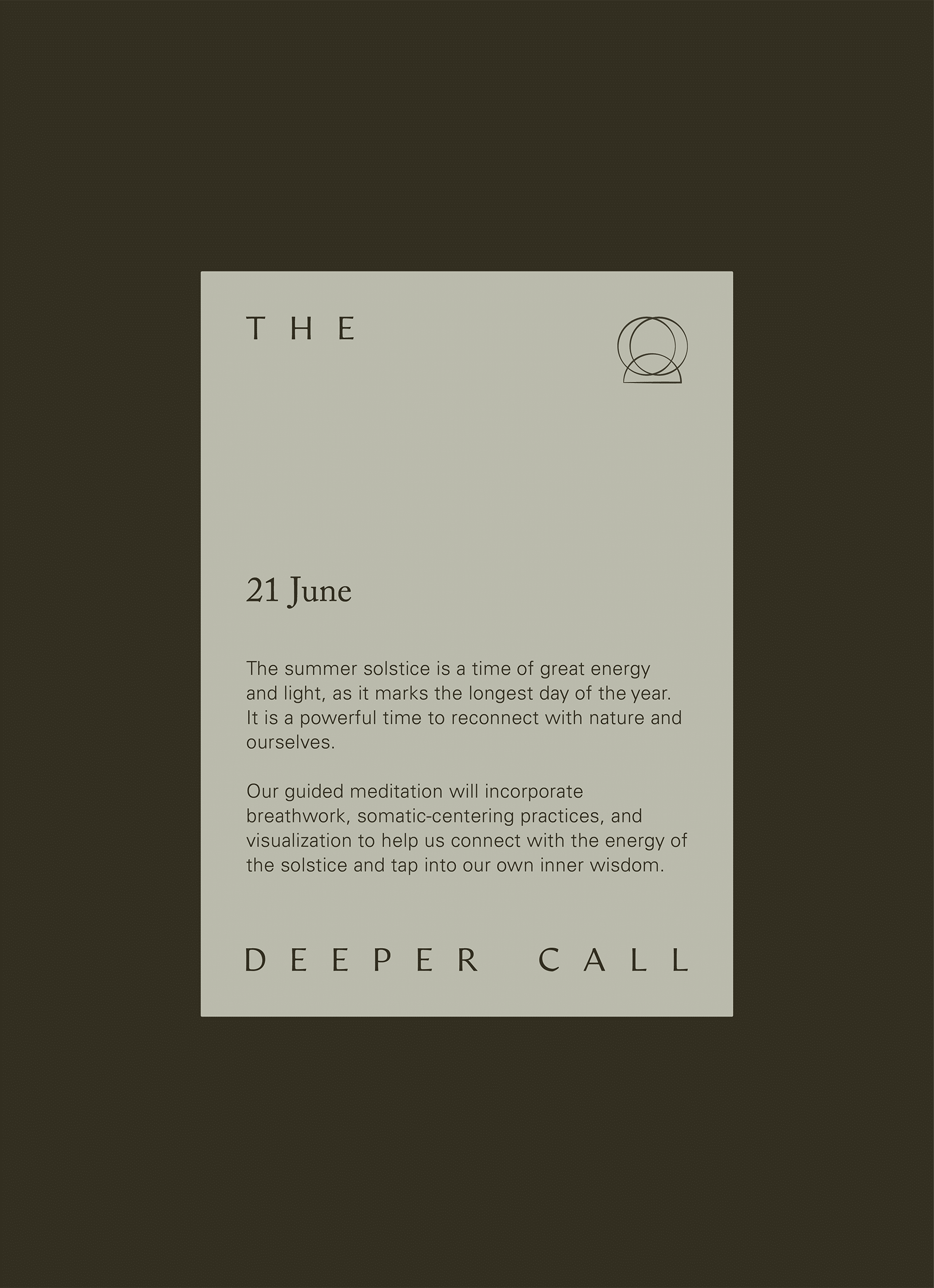
Envisioned by wellness educator and practitioner Ashley Neese, The Deeper Call is a membership space for the soul in search of rest. With an expansive range of offerings, from breathwork to bodywork, this container lends itself to deep transformation and radical healing in a collective setting. Each practice unfolds to bring you home to your wholest expression, reigniting what was once forgotten.
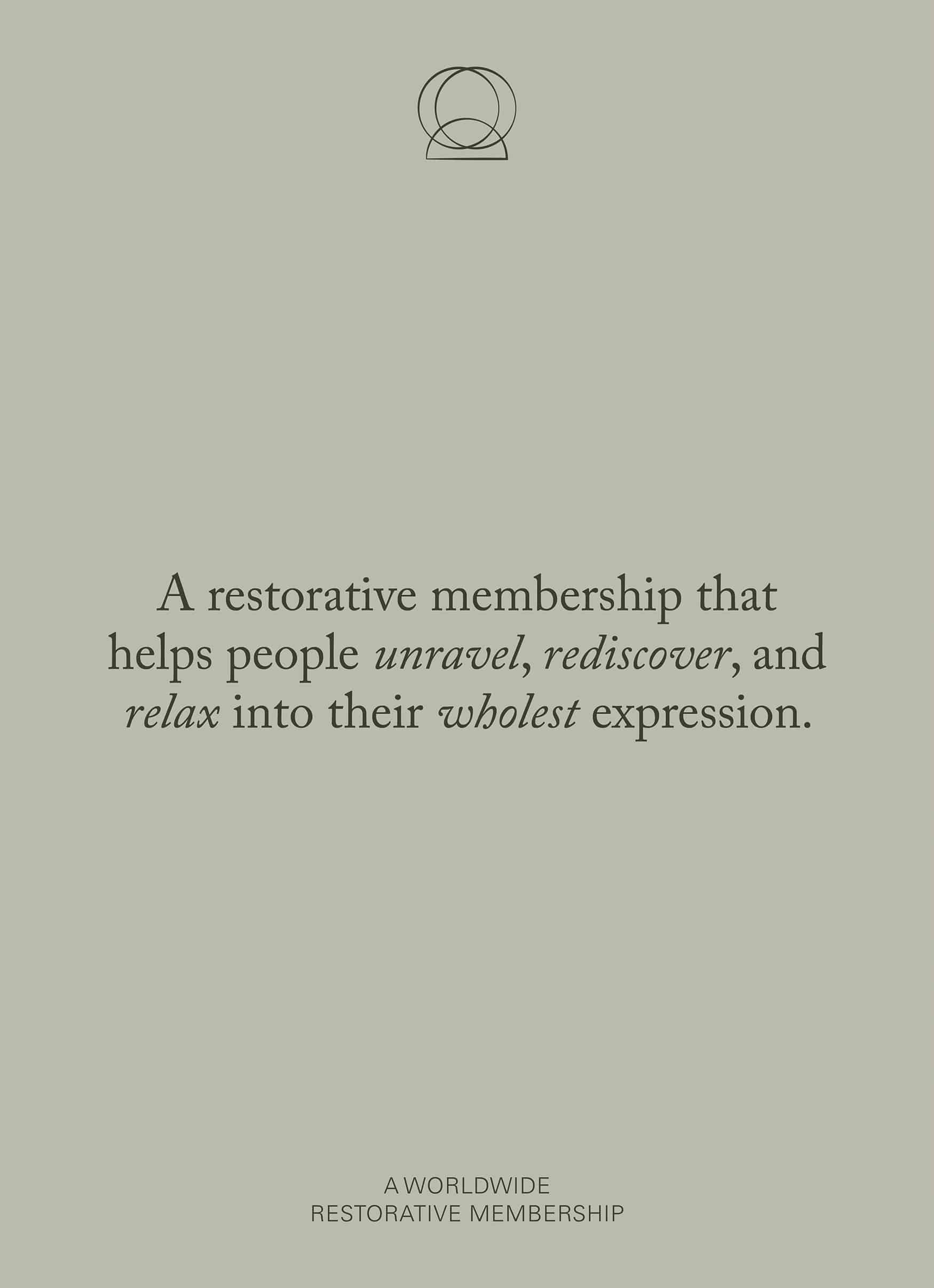
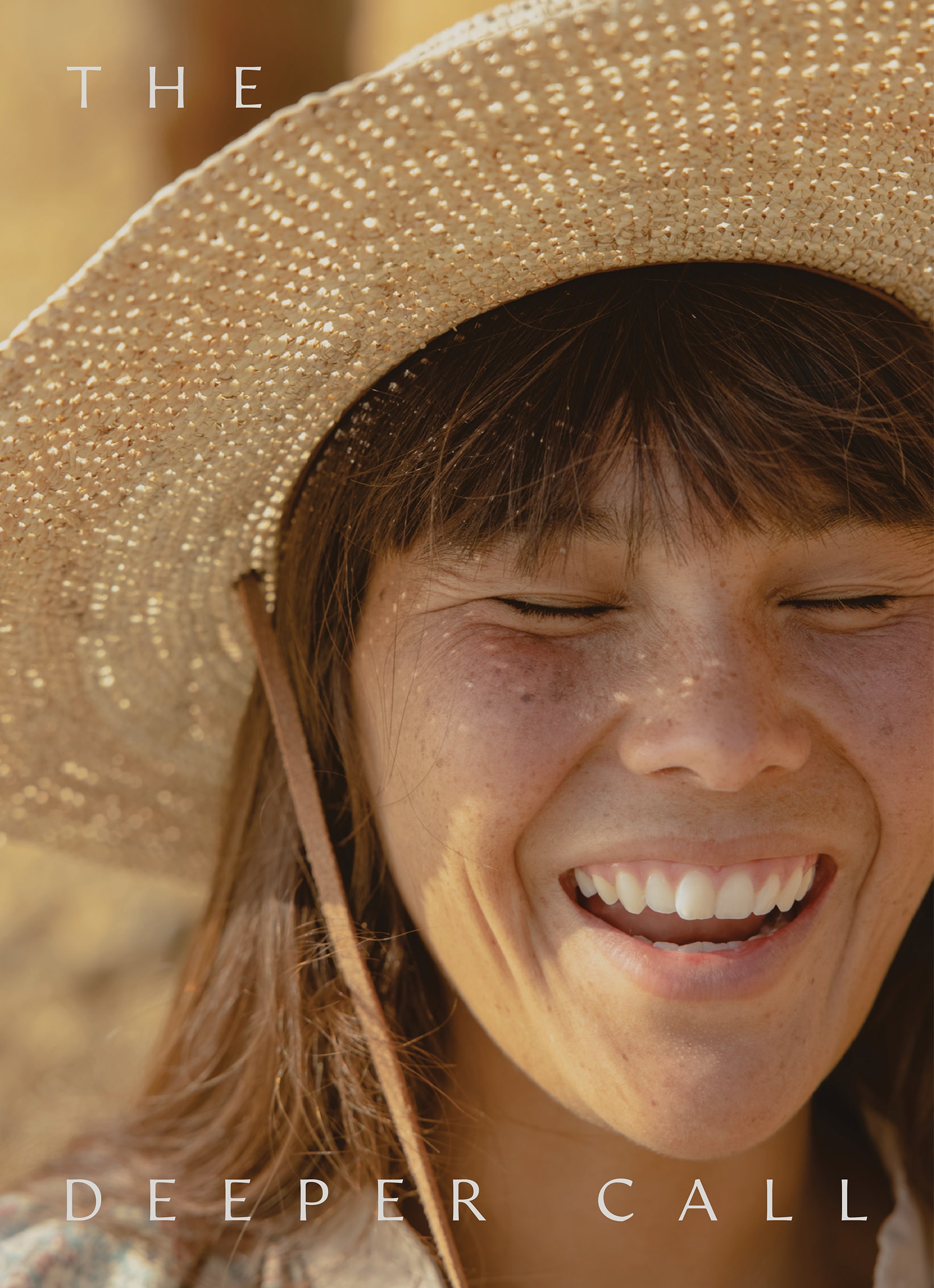

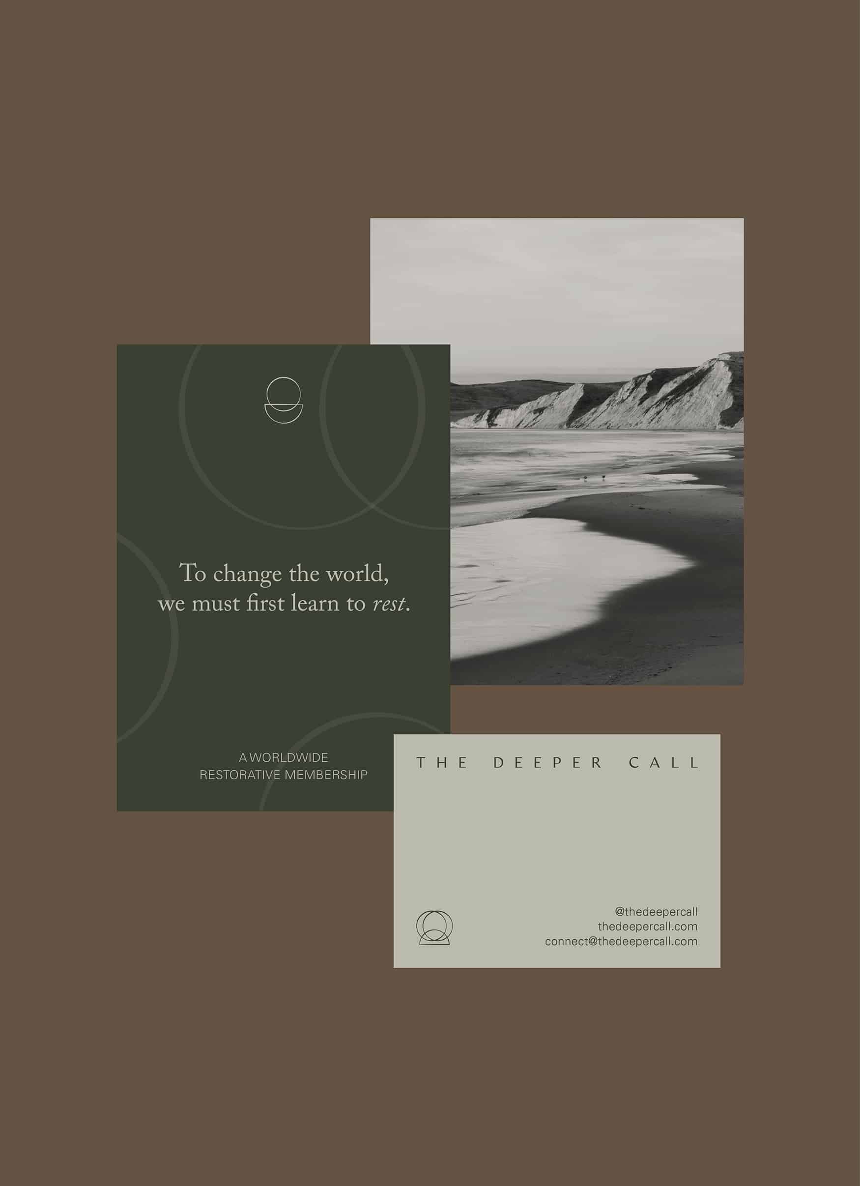
Color Palette & Patterns
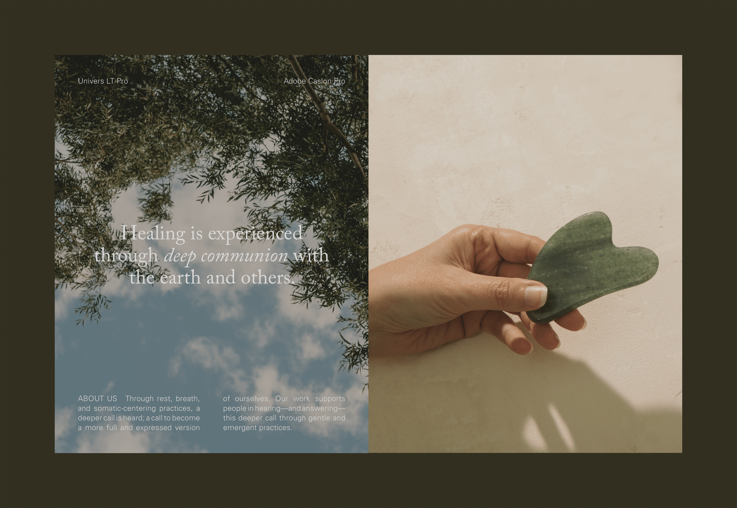
For the brand’s color palette, we drew inspiration from nature’s life-giving resources like algae, bark, mist, and soil to evoke a grounding, comforting, and tranquil feel to the viewer.
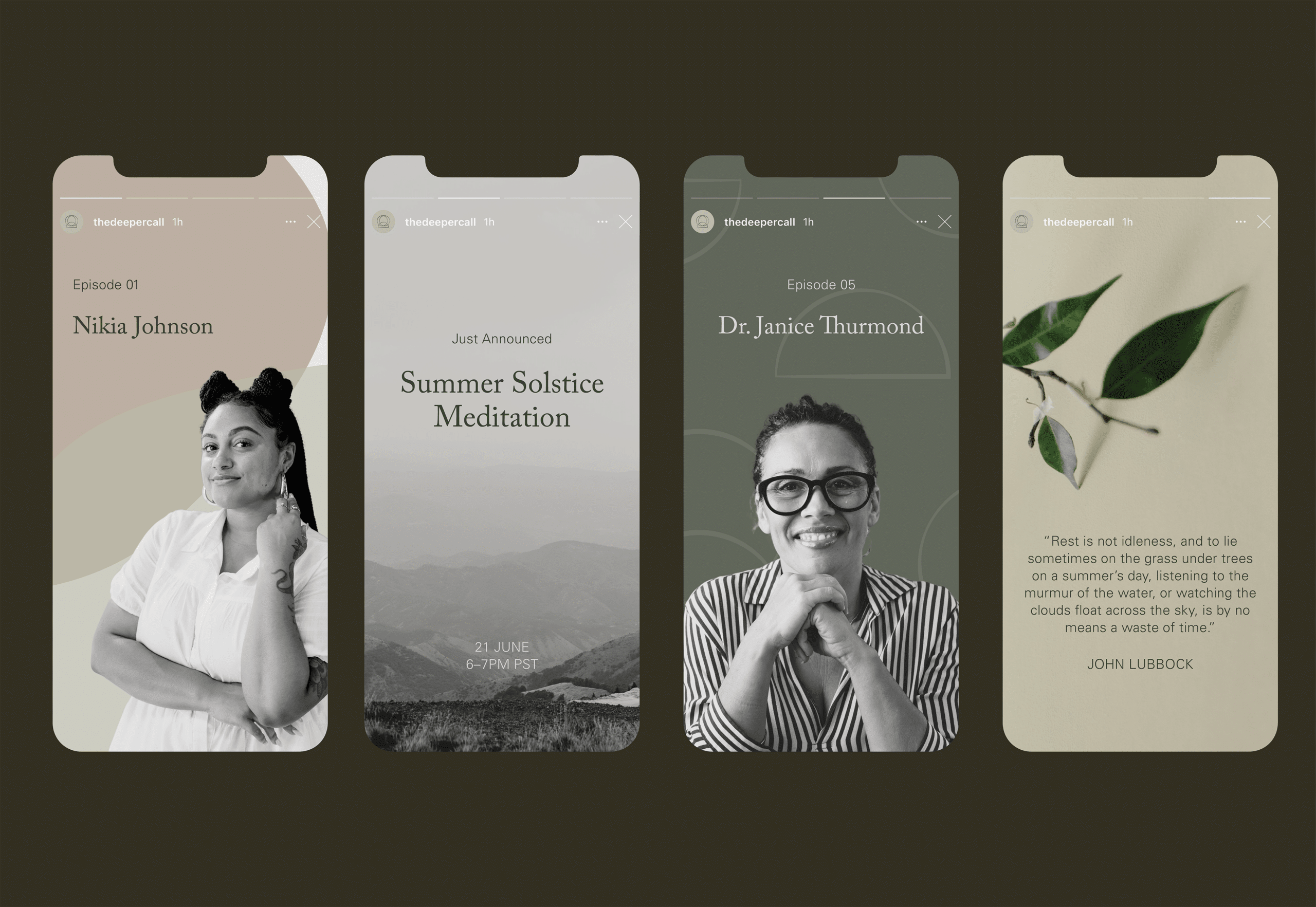
The primary brand pattern is made up of a collection of organic shapes that mimic river rocks layered over each other to symbolize interconnectedness and transparency—two qualities at the core of the brand. These shapes also serve as vessels for imagery throughout the identity system.

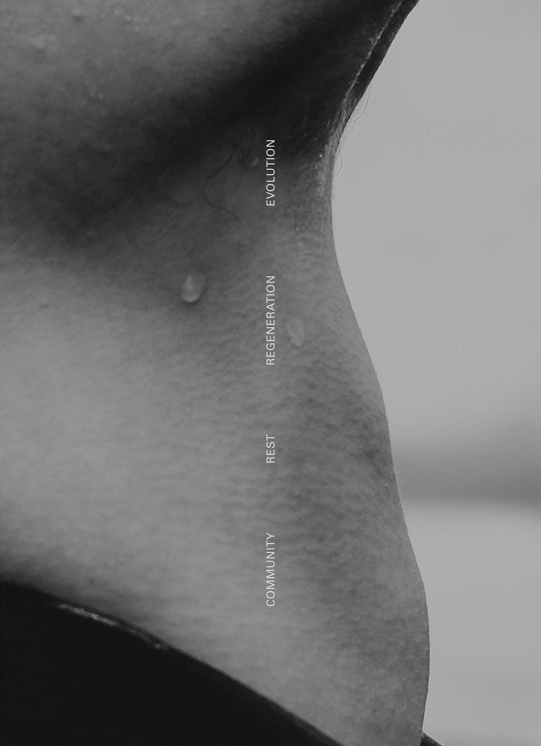
Submarks
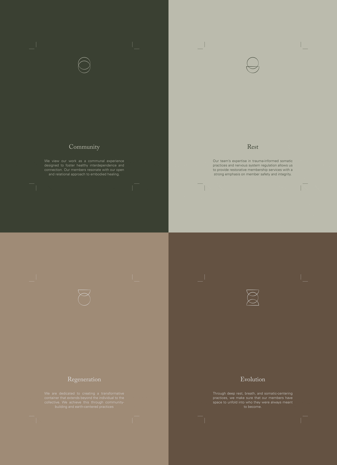
We developed a suite of symbols based on the brand’s core values of community, rest, regeneration, and evolution that appear abstract at first glance but hold a deeper meaning upon further examination.
The community mark features interlocking rings that symbolize lasting connection as well as a nod to the classic infinity symbol. The regeneration mark captures a feeling of motion with a circle falling from the half-circle anchor above it. The evolution mark is a composition that resembles the process of mitosis. The rest mark is the inverse of regeneration where the shapes instead create a feeling of calm and steadiness.
Each symbol features an imperfect and varying line weight to illustrate a presence of hand or human touch. These submarks have also been disassembled to create a secondary brand pattern.

“Marbury has the rare capacity to uncover the nuance in each of the projects we have worked on, which has resulted in elevated, timeless design that still feels fresh. The entire team works on the smallest details to the big picture, designing in ways that can grow with your product or business—that is such a gift in this industry.
Rather than feeling like I need to reinvent or rebrand each year, I can rest in the trust that my visual identities will remain strong and have the flexibility to grow with me. I look forward to continuing working with Marbury and trust them with any project that I dream up next.”
Ashley NeeseFounder of The Deeper Call
