A meaningful mercantile proves all things can be held together by a story.
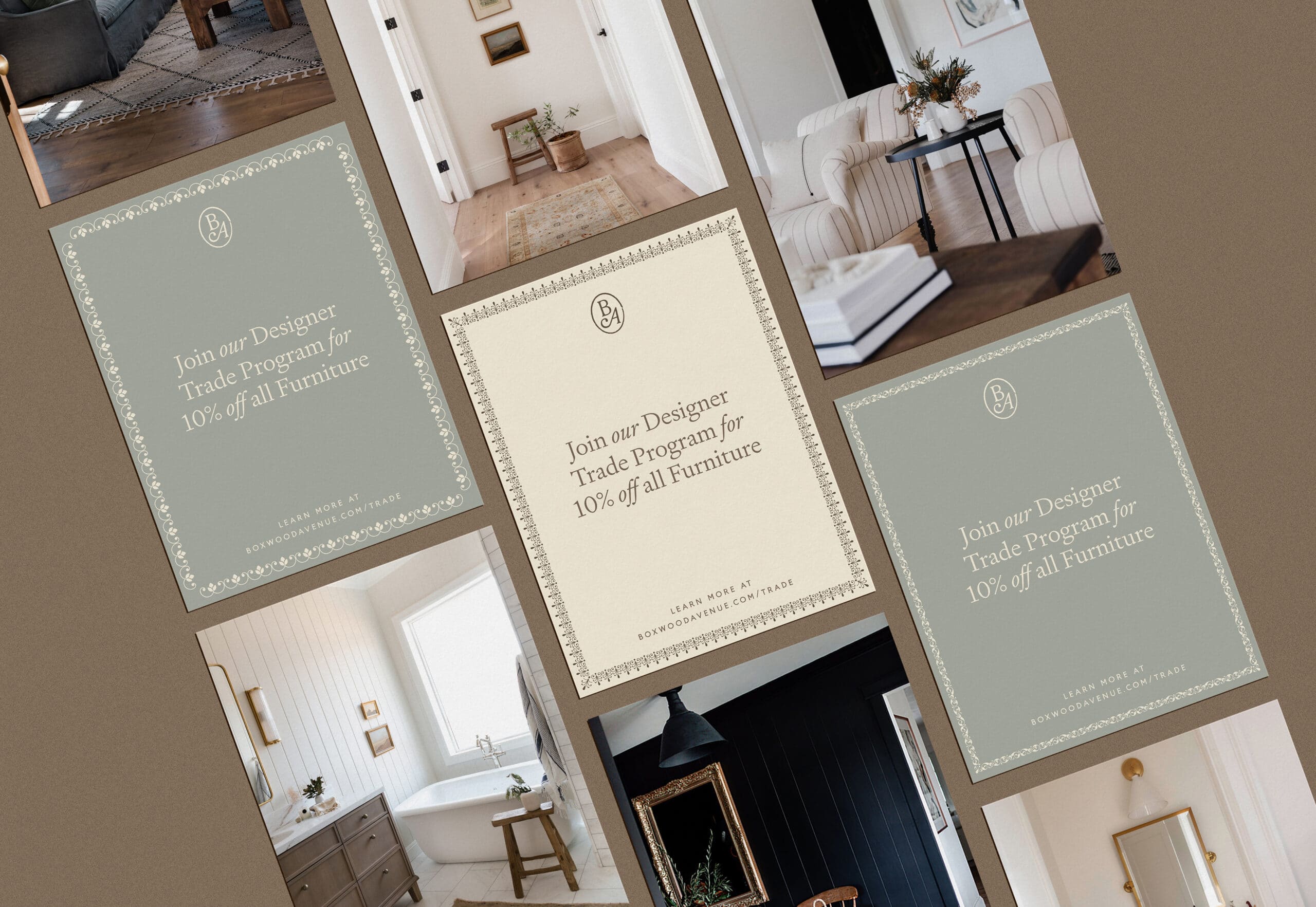
Boxwood Avenue’s origin story setting of a rural California town not only provided a charming backdrop but also established a strong foundation for their brand’s new narrative. As their business expanded, it became clear that their brand identity required refinement to reflect their growth. We worked closely with their team to craft a rich and adaptable visual language that embodies the essence of slow living, ensuring that it would endure as a lasting legacy.
Wordmark
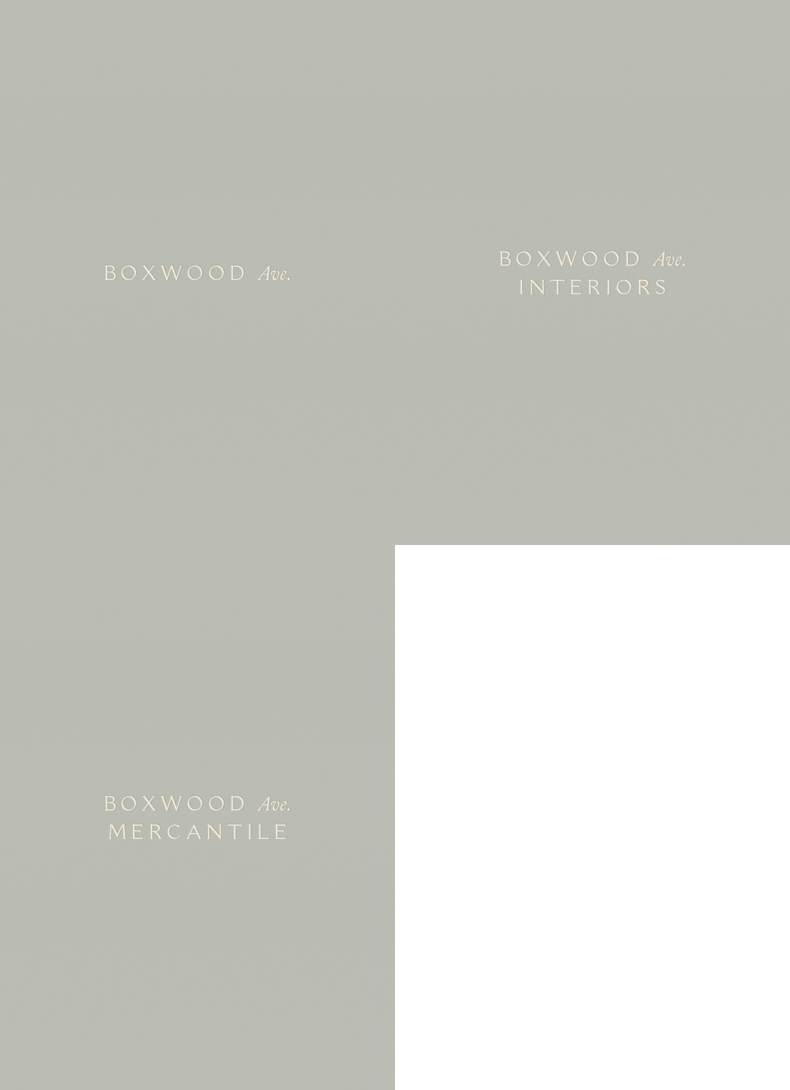
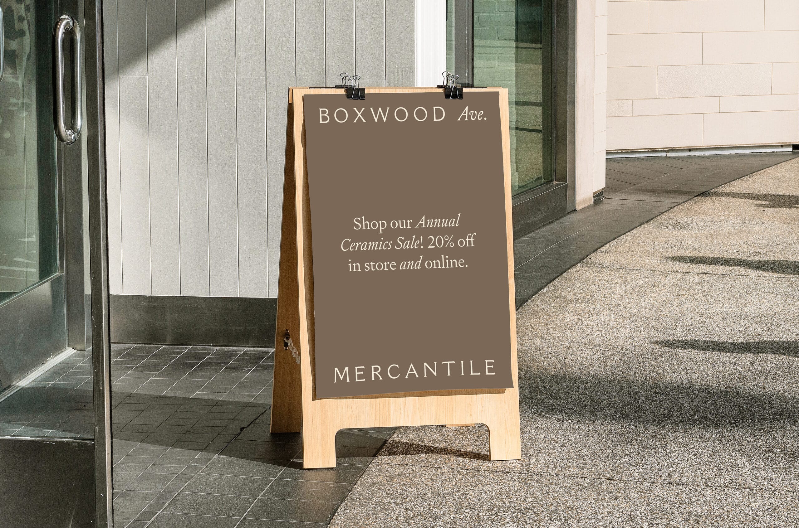
With three verticals beneath the Boxwood Avenue brand—an interior design studio, a brick-and-mortar shop, and a lifestyle website—we sought to develop an identity system that flowed seamlessly between each entity.
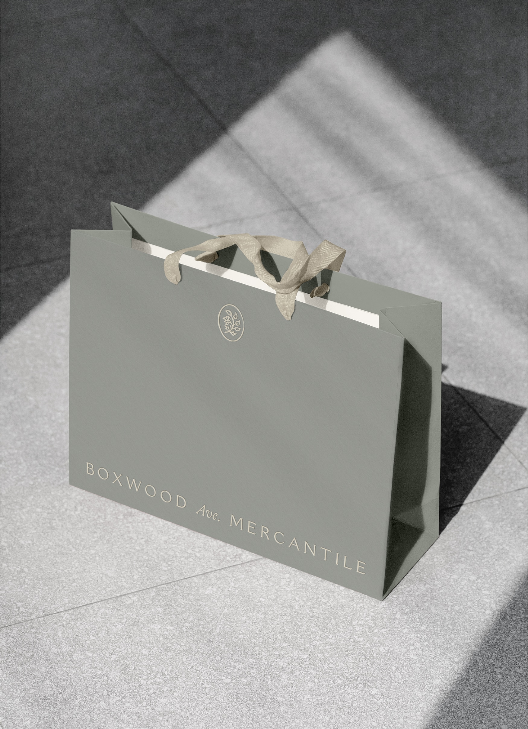
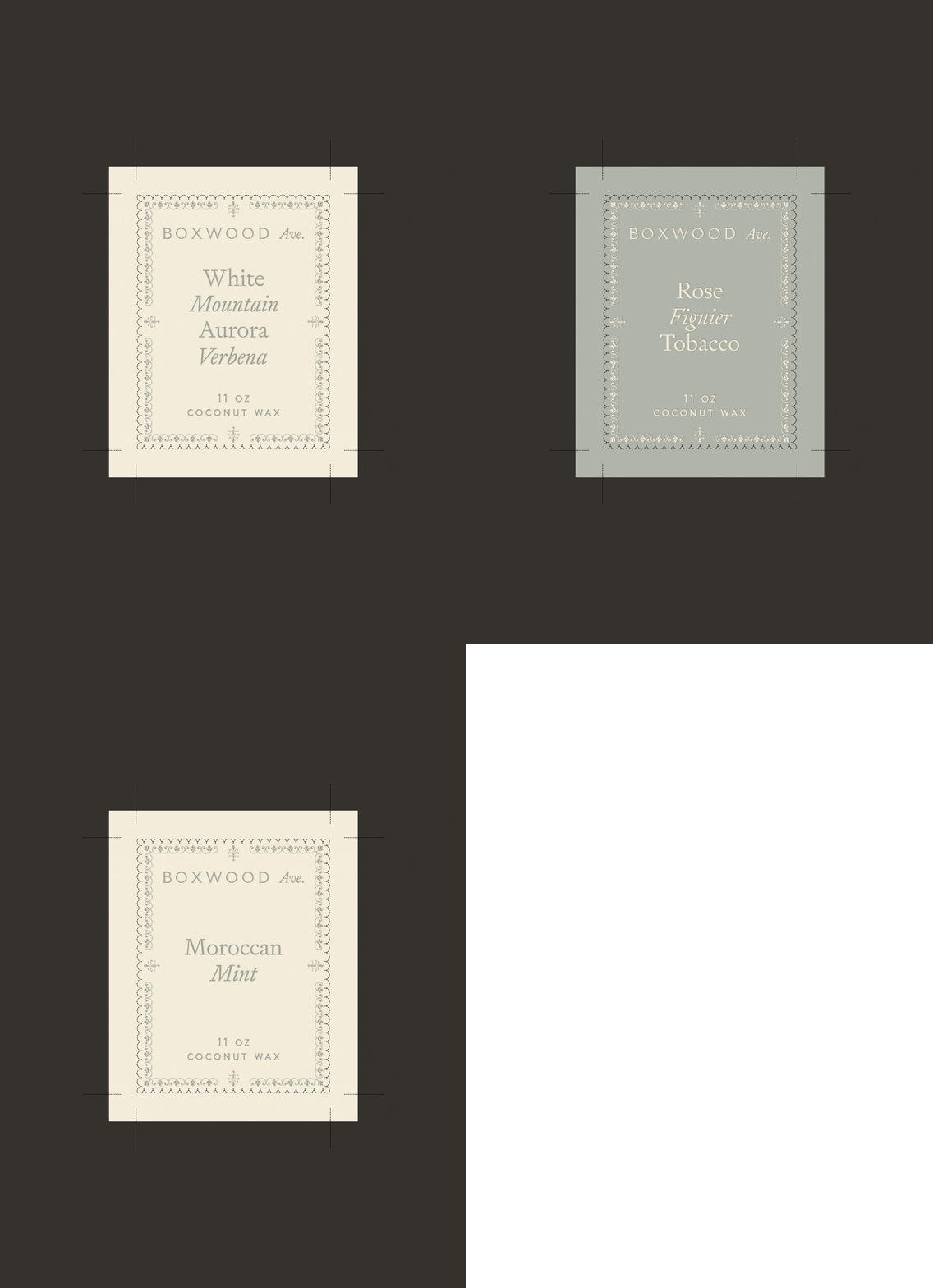
A customized, all-caps, Roman-style typeface was selected as the foundation for each wordmark to mimic the feeling of typography found in old, hand-typeset books to create a feeling of nostalgia and timelessness. To soften the all-caps lettering, we incorporated an elegant, italicized abbreviation of avenue to serve as a consistent bridge.
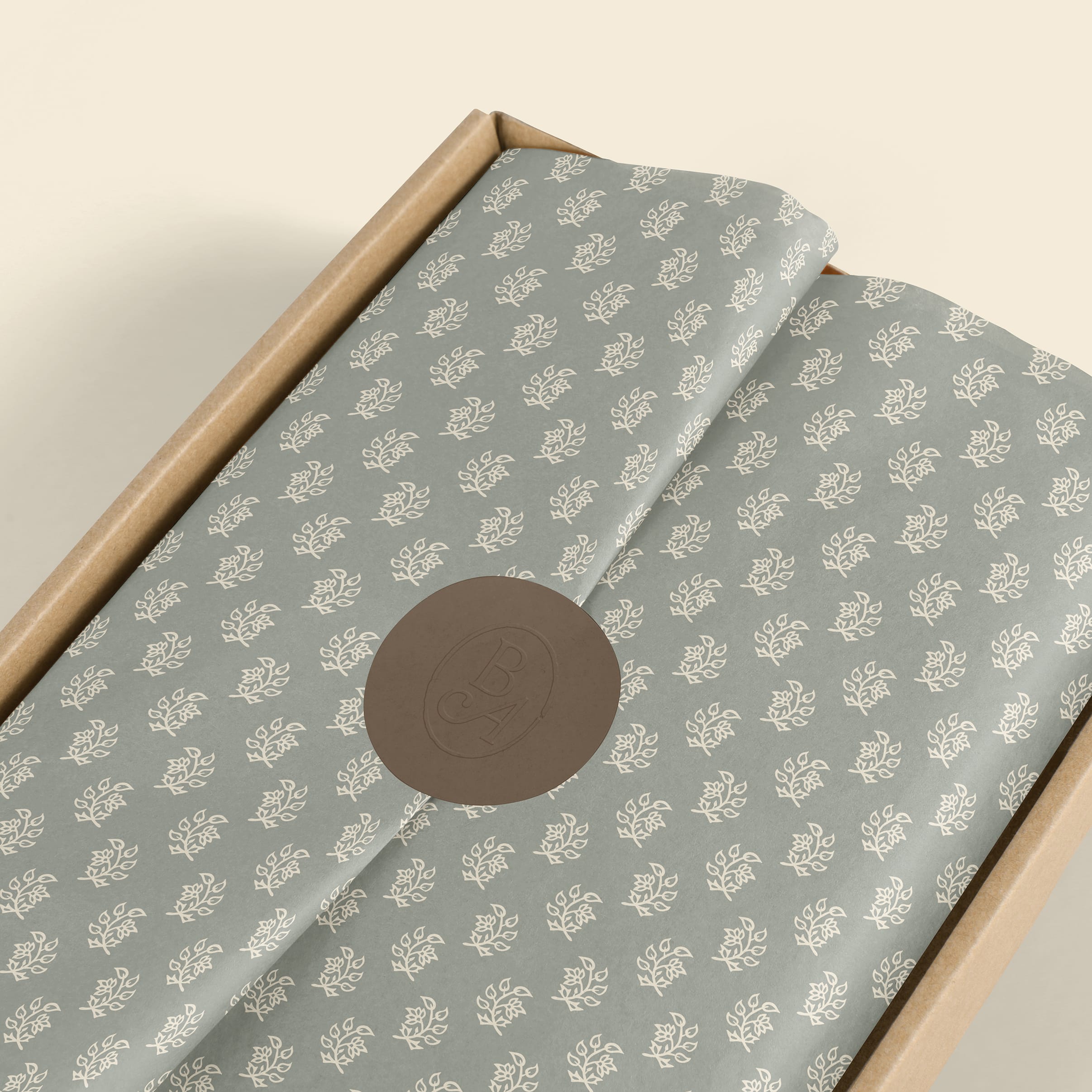
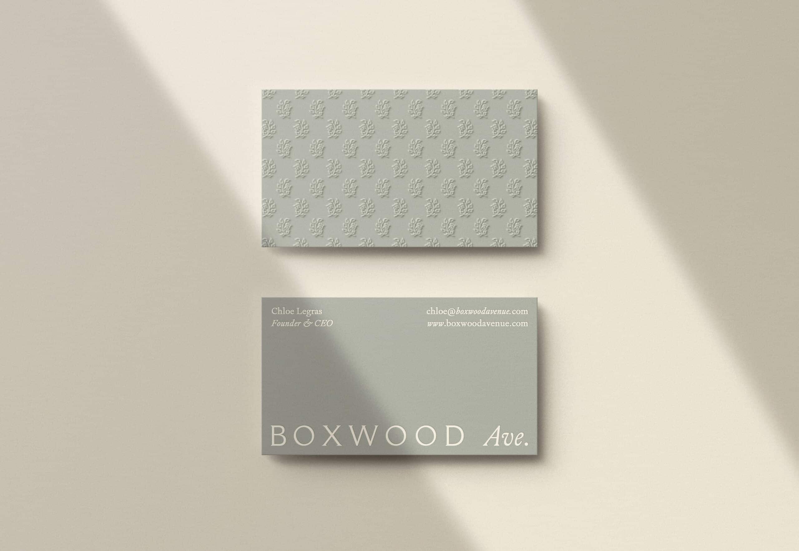
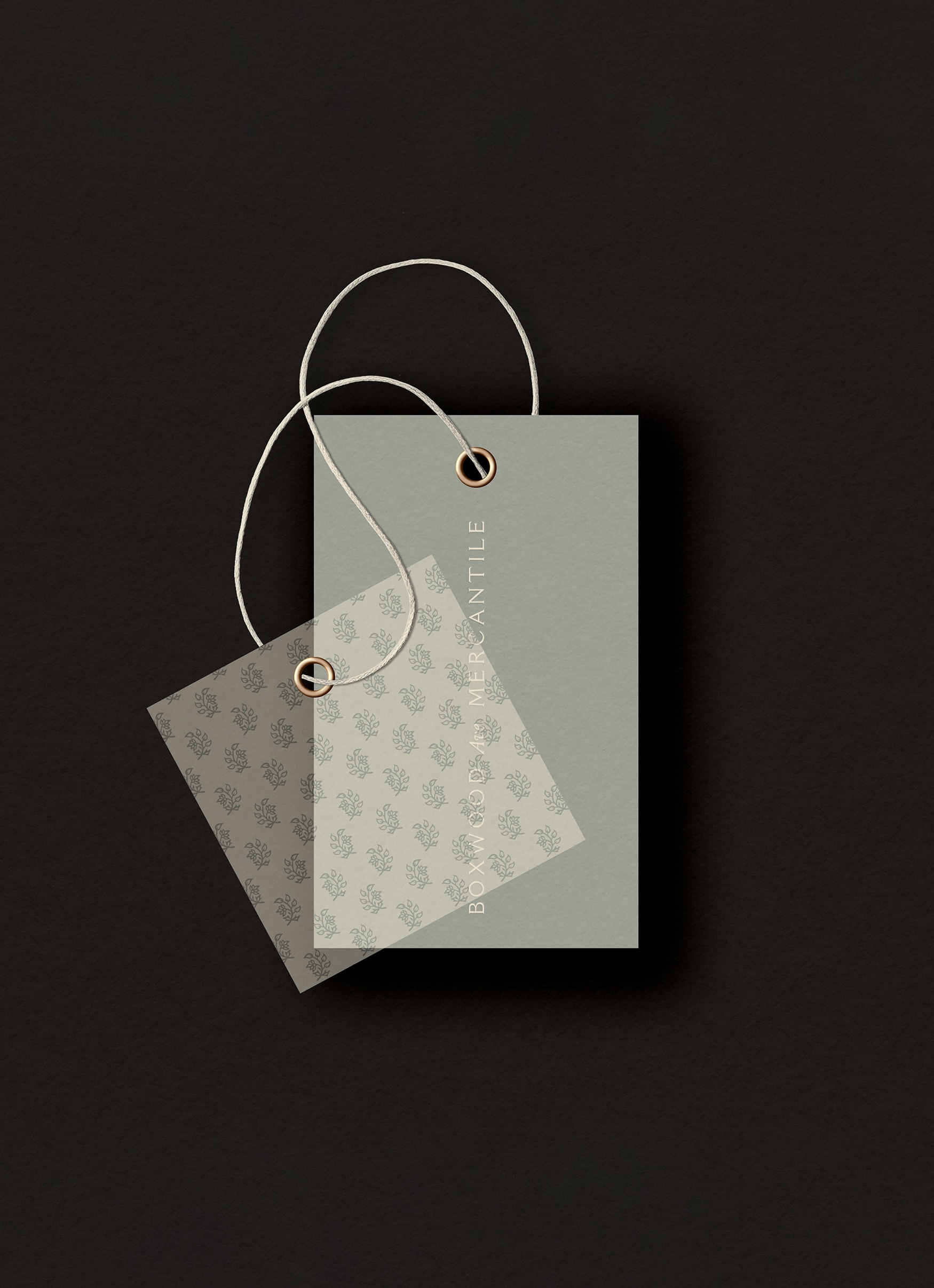
One of the brand’s primary submarks features a boxwood clipping illustrated in the style of an old woodblock print. This element has also been translated into a pattern repeat for use throughout the identity system, shown here on custom tissue paper for Boxwood Avenue Mercantile.

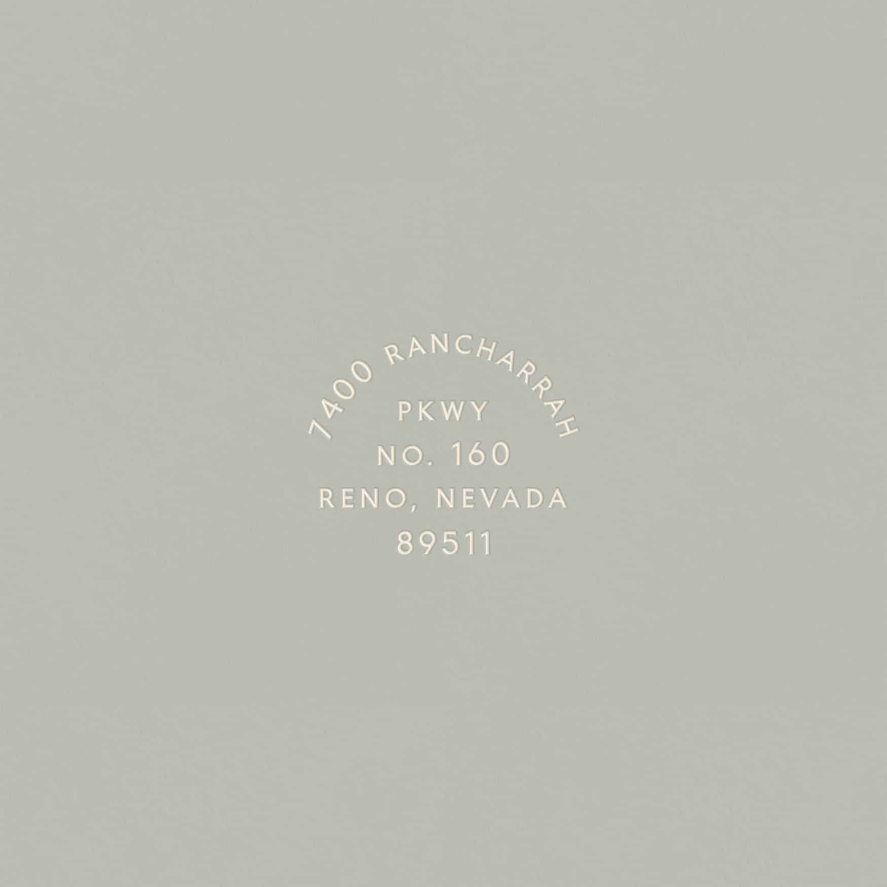
An address stamp designed for Boxwood Avenue Mercantile that can be adapted to future brick-and-mortar locations. (Right) A rearranged and reflected wordmark serves as a secondary submark for the brand and doubles as a vessel for copy.


“Marbury has an extraordinary talent for visual storytelling. I still pinch myself that we had the opportunity to work alongside them to give life to the heart and soul of Boxwood Avenue. They crafted a visual identity that embodies the essence of luxury simplified. I absolutely cherish our time together.”
Chloe MacKintoshFounder of Boxwood Avenue

