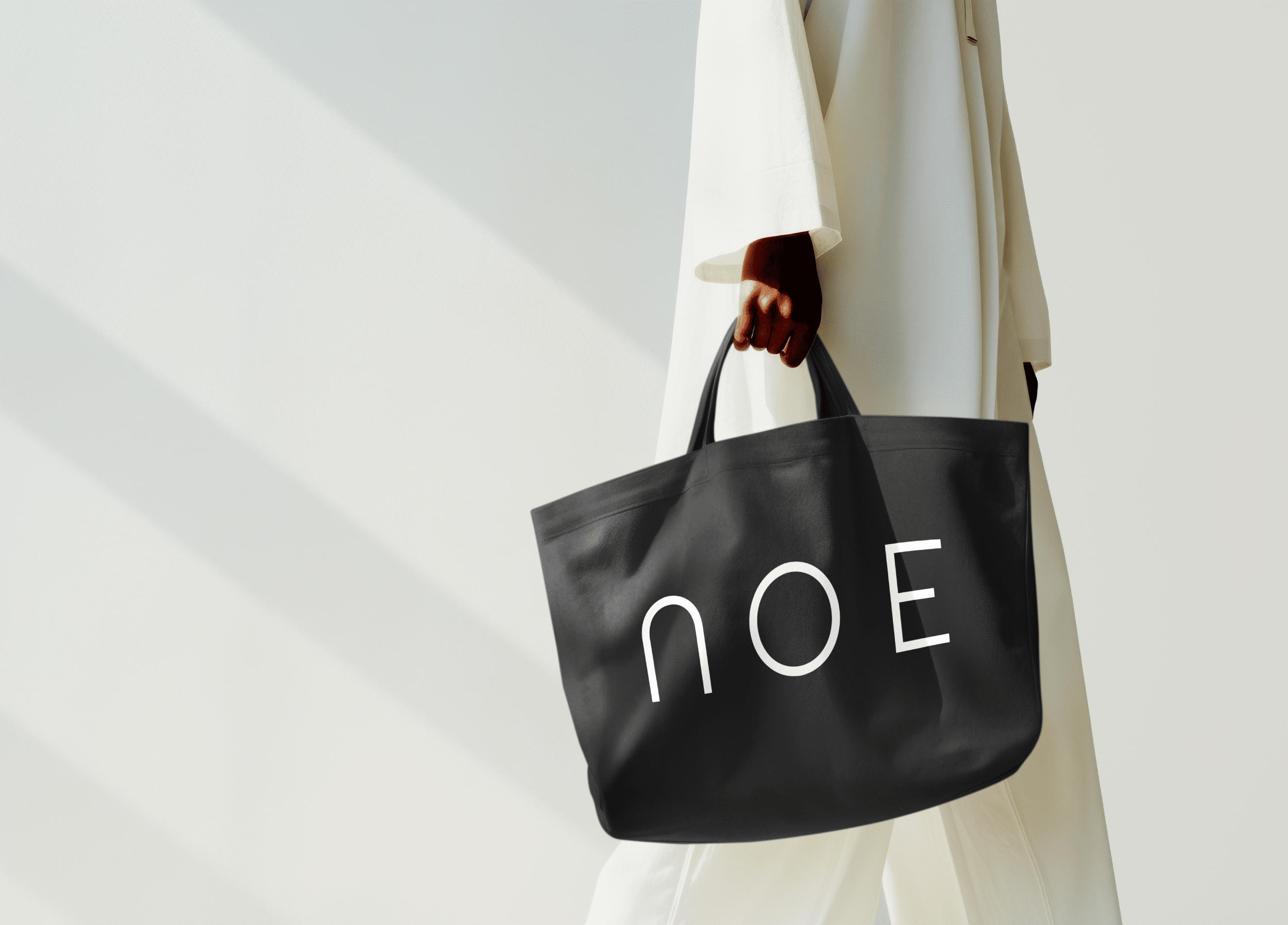
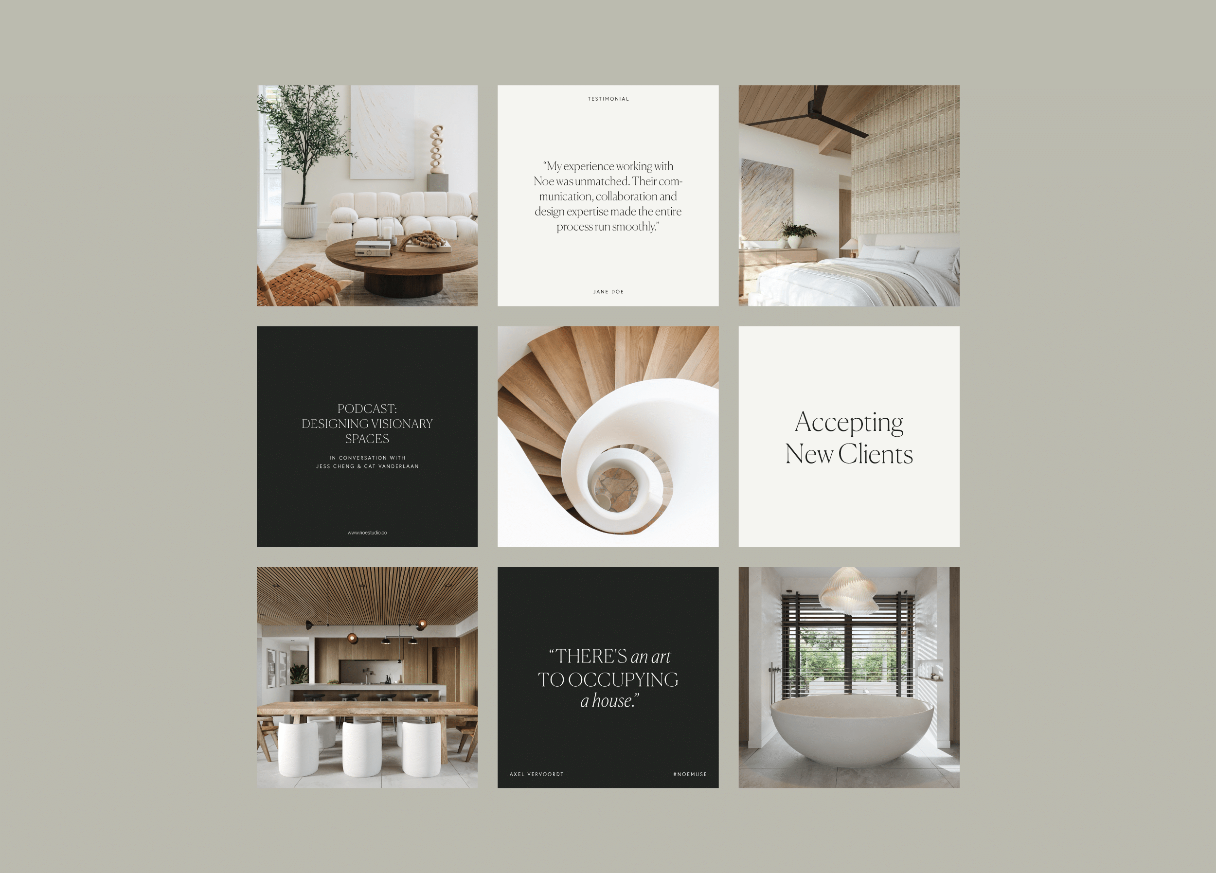
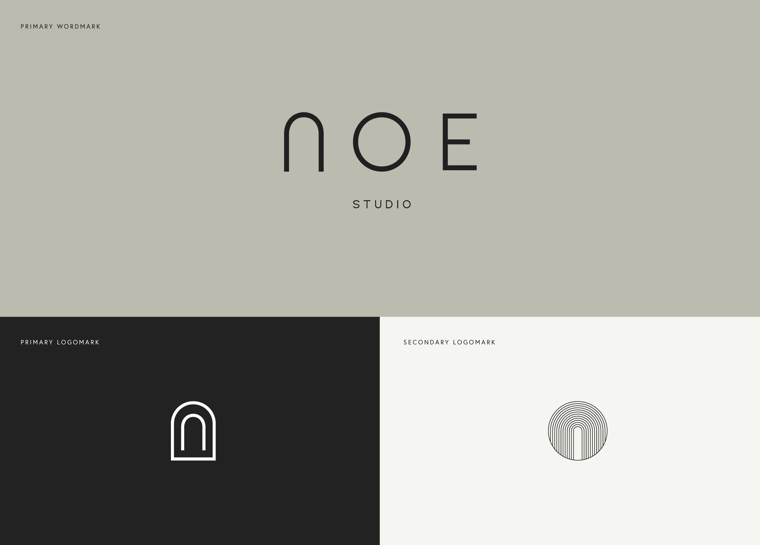
Year
2021
Services
Brand Strategy, Brand Identity, Print Materials, Website Design
Client
Noe Studio
Industry
Interior Design
Credits
Website Development: La Playa Studio

A design studio that creates holistic spaces from the outside in.

Founded in 2020 by Jess Cheng and Cat VanderLaan, Noe Studio was born out of a shared vision to create spaces that are not only functional but also elevate the sensory experience of their environments. With 20 years of combined expertise in high-end hospitality, residential, and commercial interior design, the duo envisioned a brand that would reflect their commitment to holistic design—spaces that are both purposeful and inviting.

When Noe Studio approached us to reimagine their brand, the goal was clear: craft an identity that resonates with their design philosophy while positioning them as a professional, approachable studio capable of delivering high-quality, balanced spaces for private homeowners and boutique commercial businesses. With a minimalist aesthetic, Noe’s work was at the center of our design process—every element had to complement their unique approach to space-making, without overwhelming it.

Visual Identity

The Noe Studio wordmark is refined and minimalist, offering a subtle backdrop that allows the studio’s work to take center stage. The ‘N’ in “NOE” is inspired by the shape of an arched entryway, symbolizing a welcoming portal into the home—a representation of openness, comfort, and approachability. To complement the wordmark, we created two brand icons that reflect the fluidity and layering that define Noe Studio’s design philosophy. The first icon features the elongated ‘N’ from the wordmark enclosed within a clean-lined arch, symbolizing the layering of materials and spaces. The second icon, made of thinner lines, creates cascading, N-shaped curves that form a symmetrical ripple, enclosed within a circle to reflect the rhythm established by the wordmark.

The color palette was inspired by the natural materials Noe Studio uses in its designs. Earthy tones of soft pebble, timeless ivory, and off-black evoke warmth, grounding, and permanence. These colors, reminiscent of the coastal mists of Honolulu, bring a sense of calm and comfort to the brand, reflecting the studio’s balanced approach to design.

Print Materials

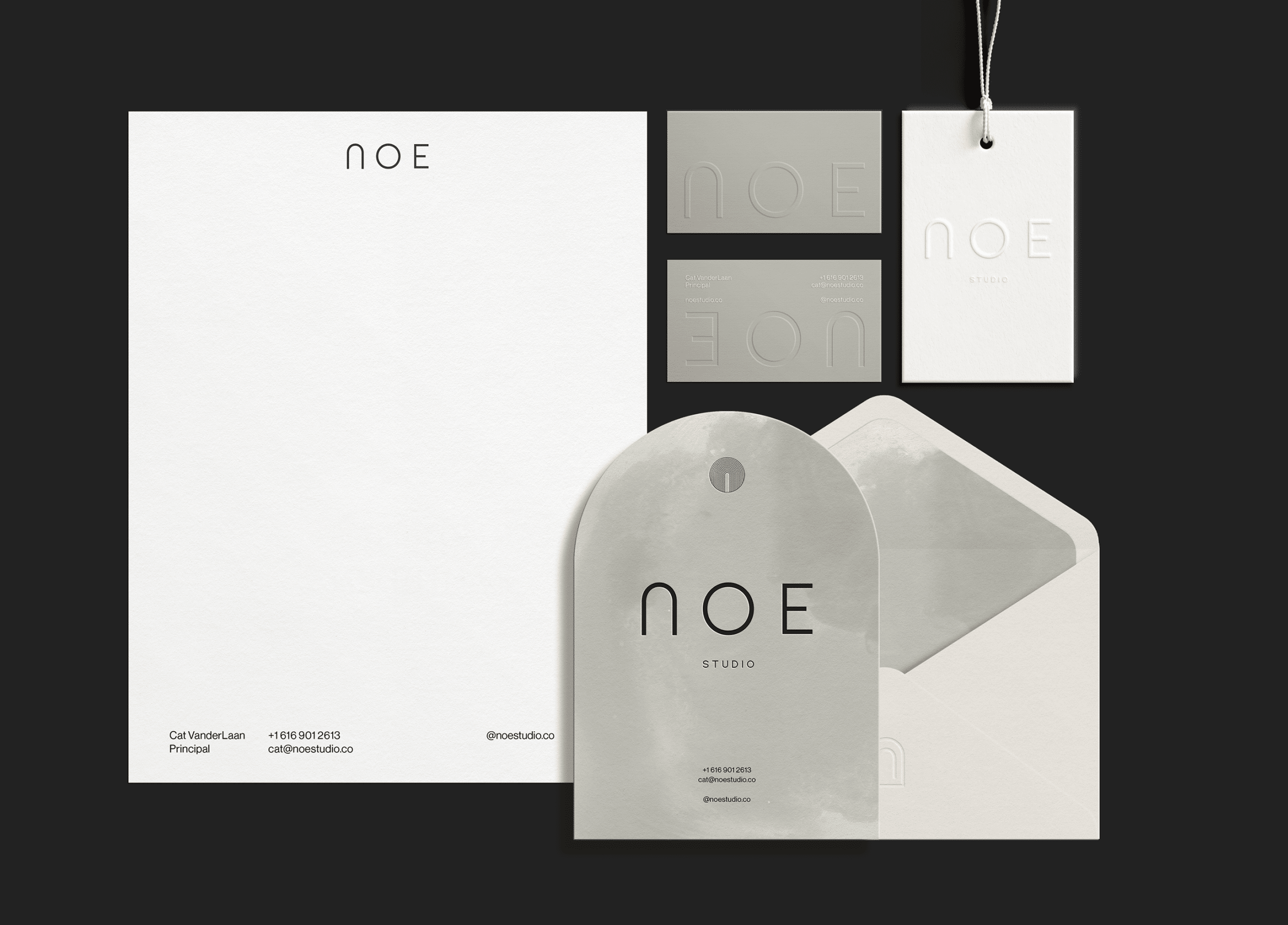
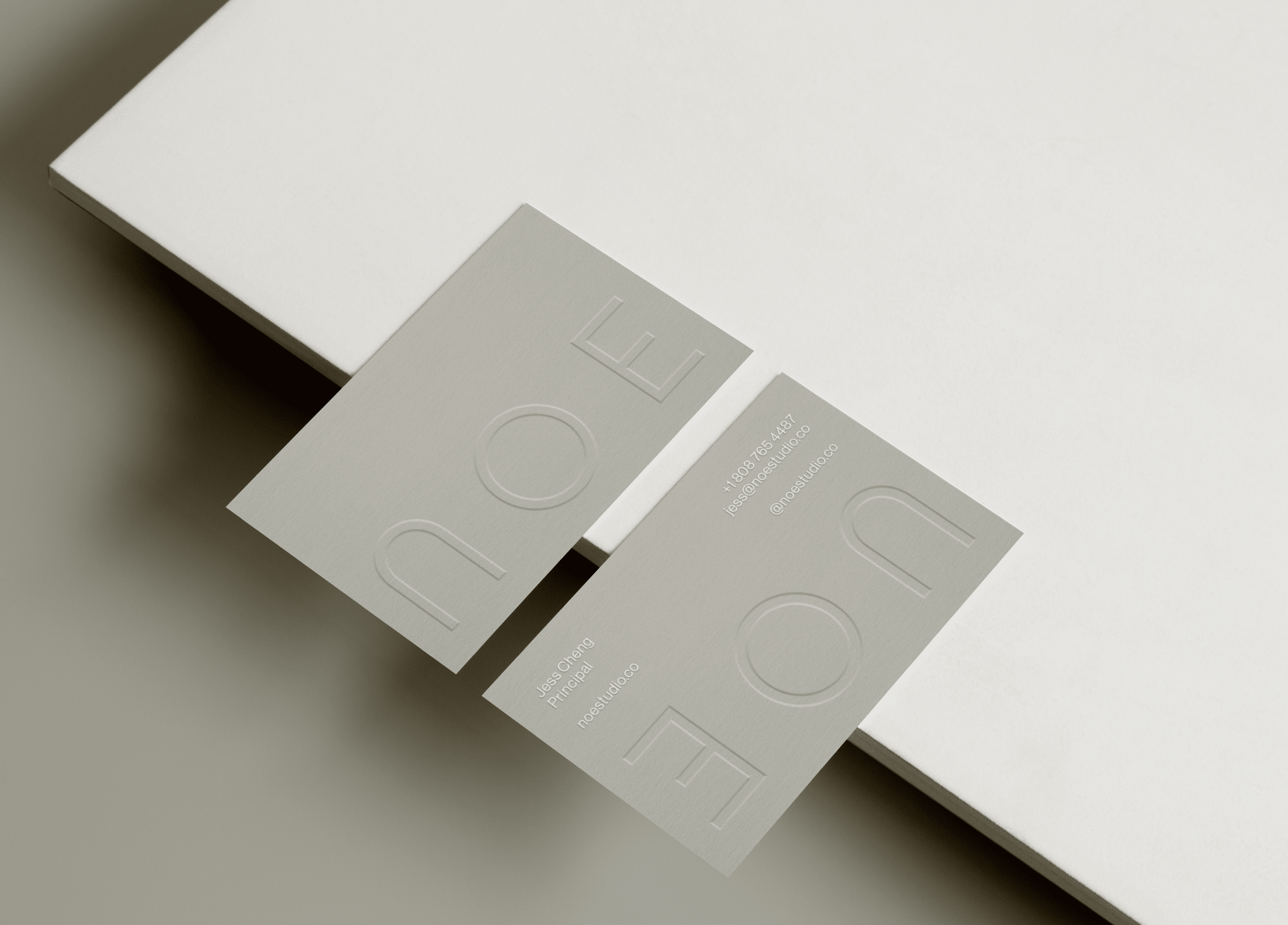
For Noe Studio’s print materials, we focused on creating elevated, sensory experiences that reflect the studio’s commitment to thoughtful, layered design. The business cards, printed on pebble-colored stock, feature blind embossing, with contact information finished in ivory foil for an elegant, understated touch.

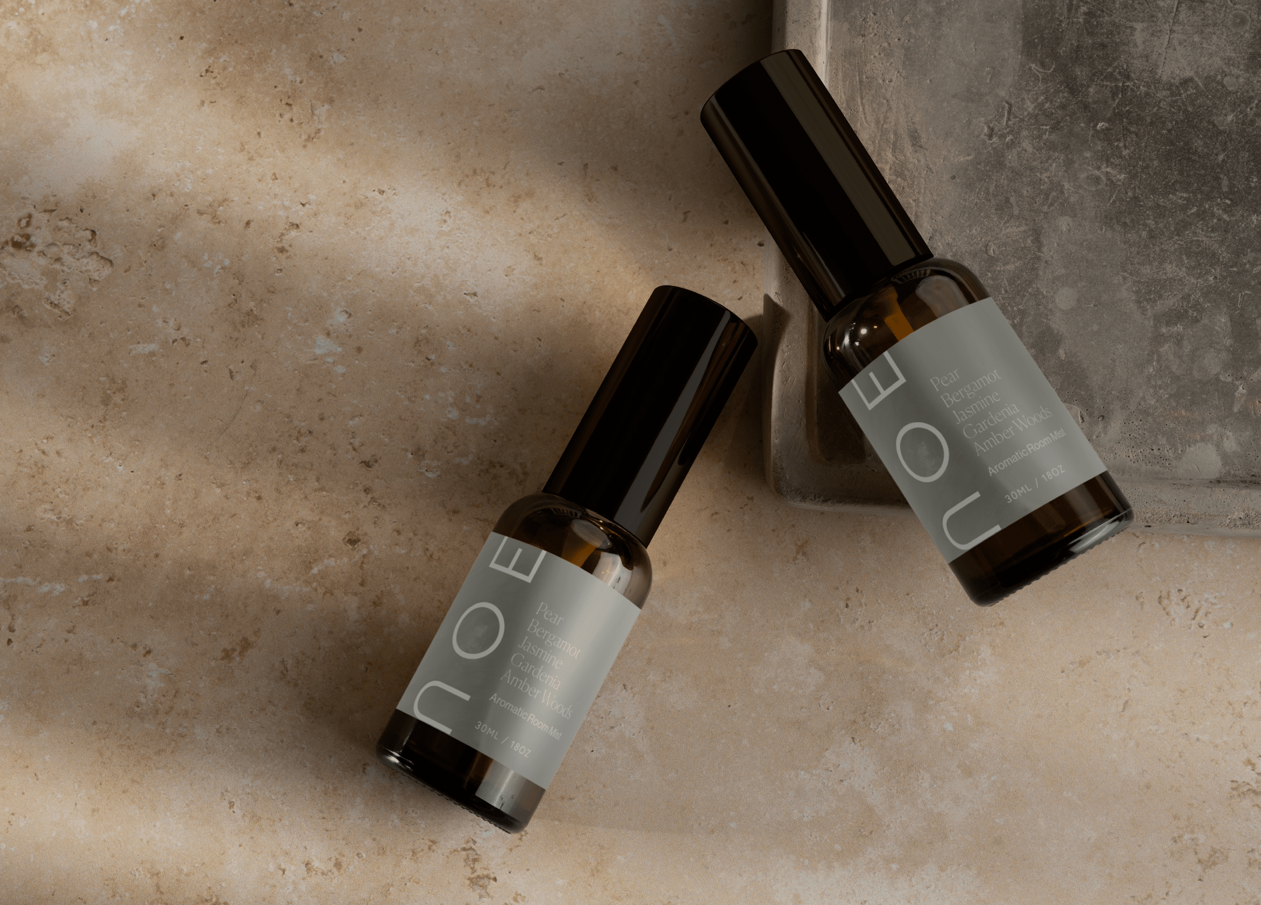
We also designed packaging for a room spray, which ties back to the meaning of “Noe” (meaning “mist” in Hawaiian). This product beautifully embodies the studio’s philosophy of creating sensory experiences, offering an ideal gift for clients or a way to bring a touch of Noe Studio into any space.

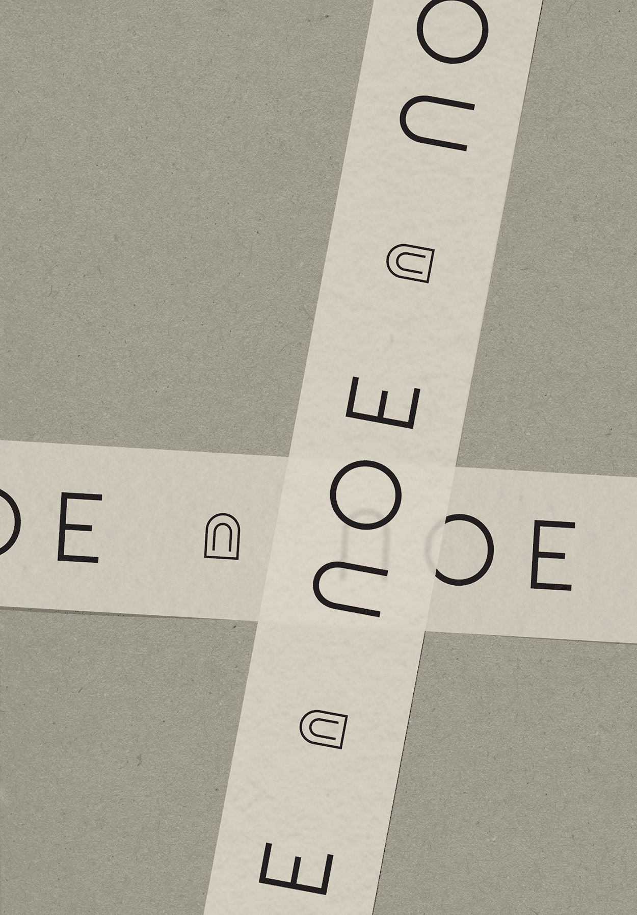
The brand pattern, inspired by the textures and rhythms found in Noe Studio’s work, was thoughtfully applied across various print materials. The brushstrokes evoke the fluidity and movement of mist, adding visual interest and depth to stationery and other collateral.

Digital Experience

The digital experience for Noe Studio was designed to showcase their portfolio in an elegant and engaging manner. The website utilizes vertical galleries to highlight their projects, with an emphasis on simplicity and flow. We also created a suite of social media templates that reflect the brand’s minimalist, earthy aesthetic. These templates allow the Noe Studio team to share testimonials, team updates, and project highlights while maintaining a consistent visual identity across all digital platforms.

Related Projects

View all work
Meladra Design
Brand Strategy, Brand Identity, Brand Naming, Print Materials, Packaging Design