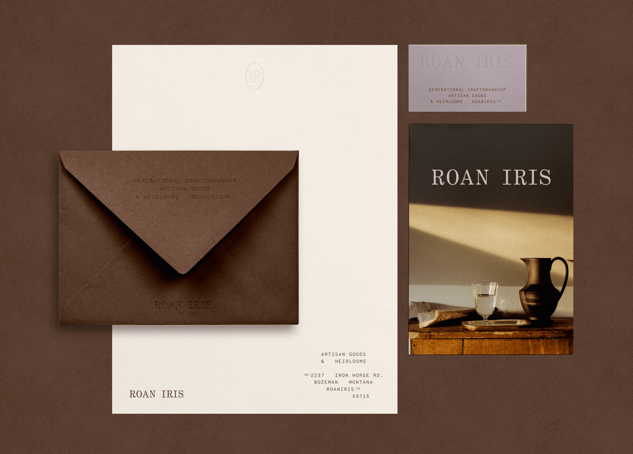
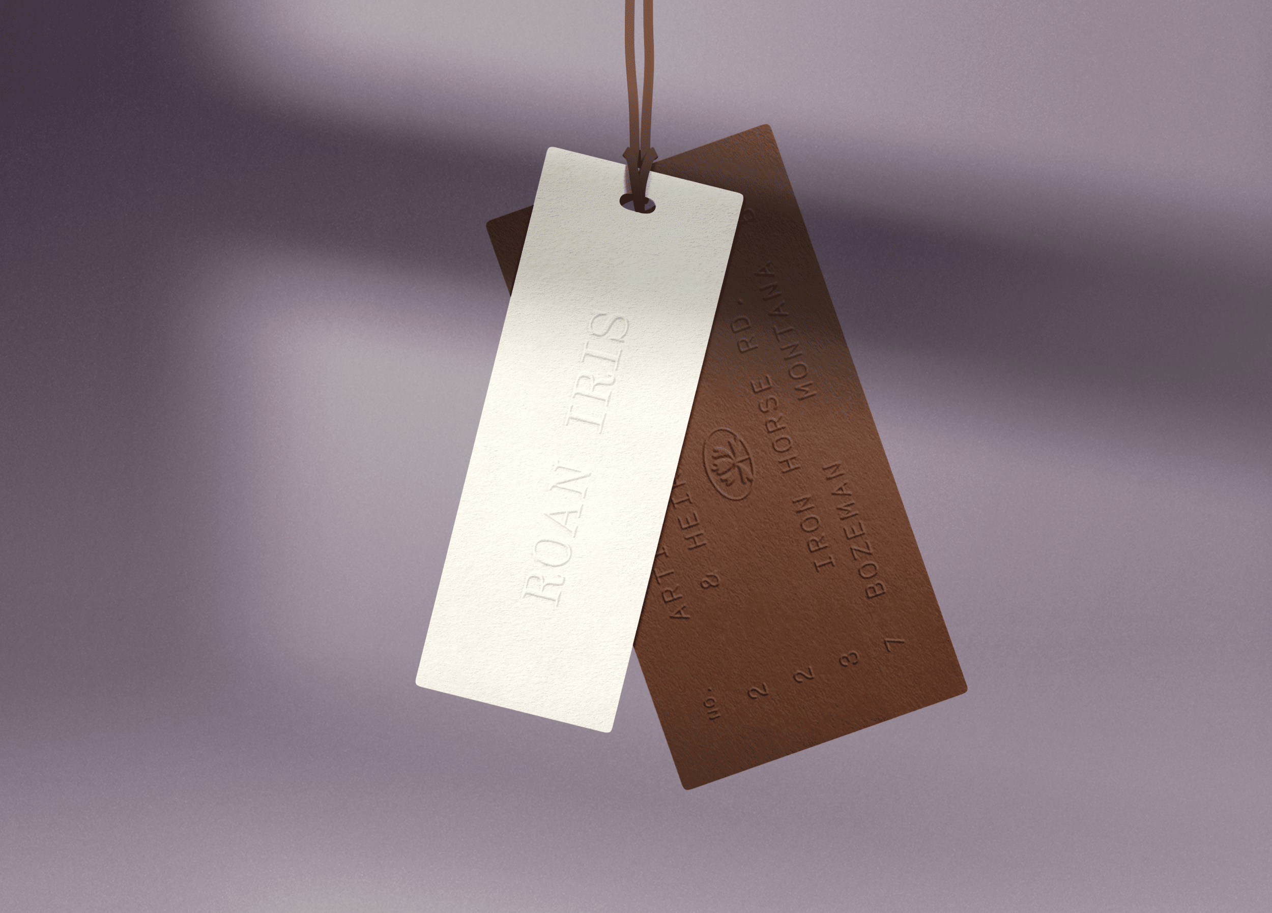
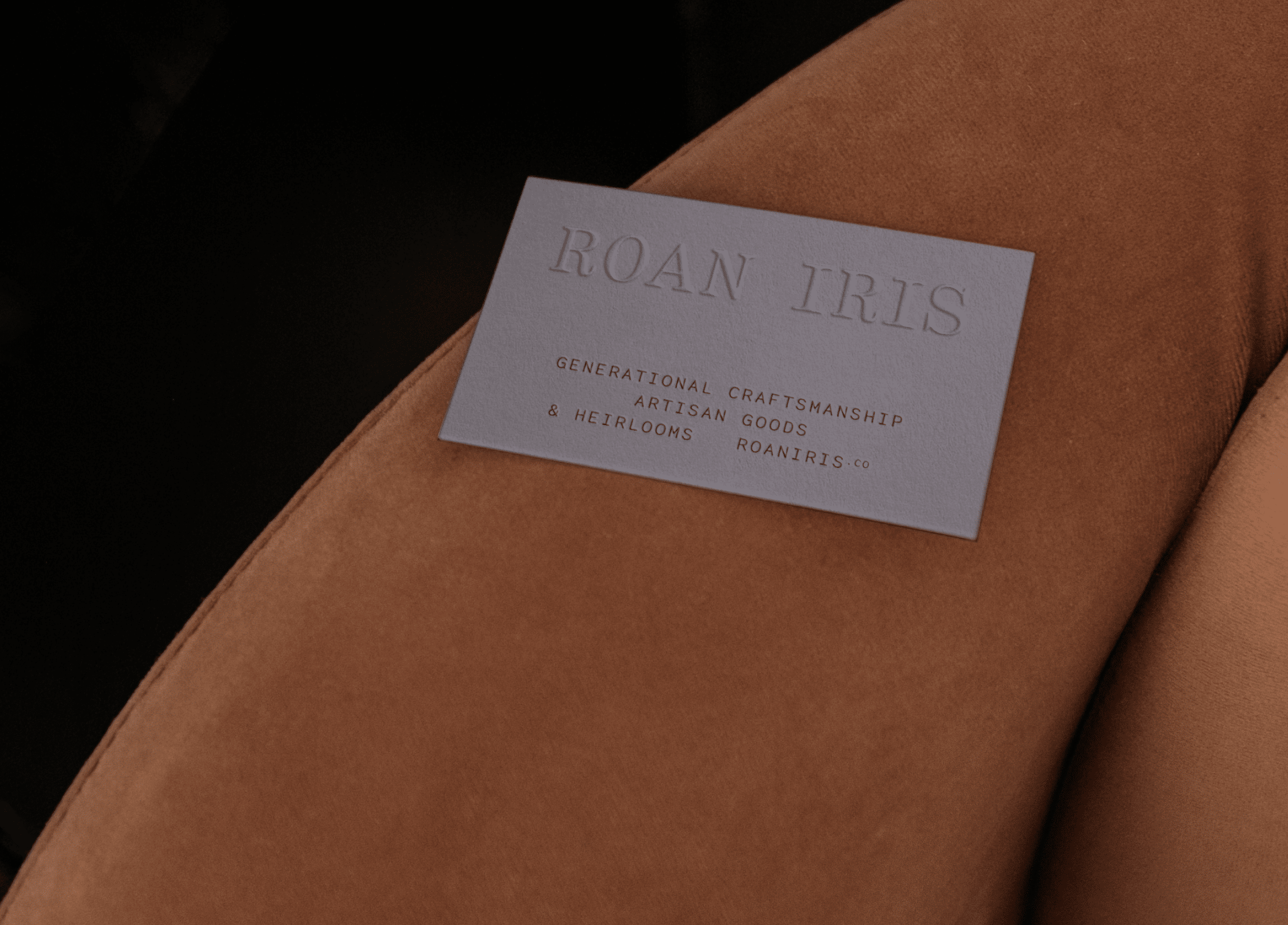
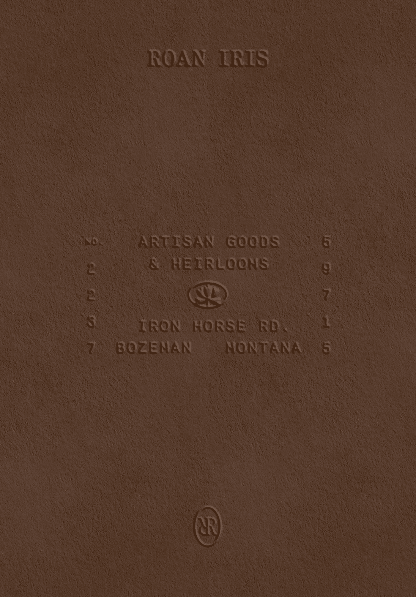
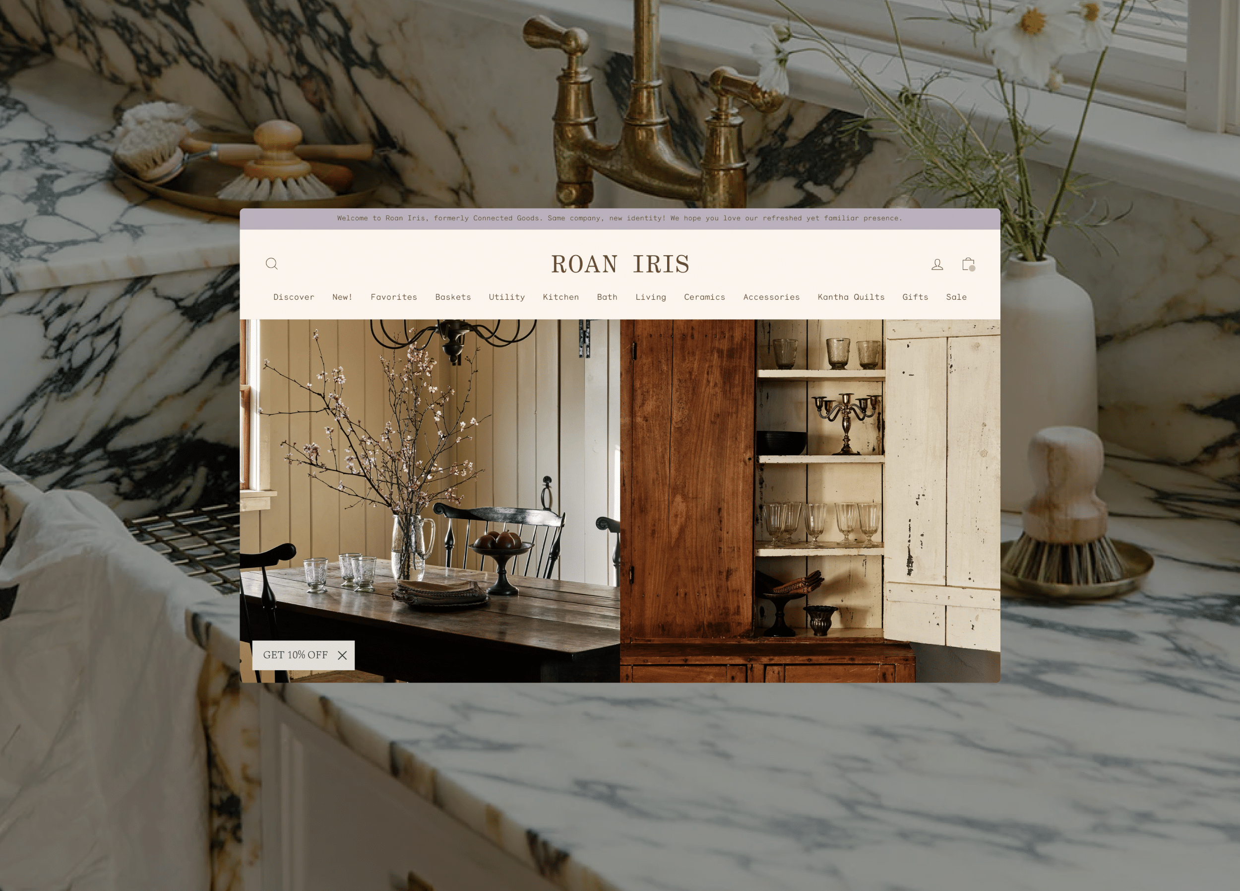
Year
2024
Services
Brand Strategy, Brand Naming, Brand Identity, Print Materials
Client
Roan Iris
Industry
Retail
Credits
Website Development: Alchemy & Aim
Photography: Nicole Franzen
Prop Styling: Brittany Albert

Crafting a tangible connection to the past through artisan home goods.

Roan Iris was born from a desire to create a space where heirloom-quality, handmade home goods could be celebrated for their history and craft. Founded by husband-and-wife team Nicole and Thomas, the brand is deeply connected to Nicole’s Montana roots, where authenticity, craftsmanship, and community were values instilled in her from a young age. Drawing inspiration from the natural beauty of Montana and the enduring nature of the products it offers, Roan Iris is a celebration of meaningful spaces, human connection, and the stories behind its handmade goods.

Previously known as Connected Goods, the brand had built a loyal following over a decade. As Roan Iris prepared to open its first brick-and-mortar store in Bozeman, Montana, it was time to reimagine its identity. We worked closely with Nicole and Thomas to refine the brand narrative, focusing on their vision for the future: a vision that honors their rich legacy while creating room for new growth. Our approach wasn’t just about a name change; it was about shifting from a product-focused brand to one that speaks more deeply to the relationships Roan Iris fosters—both with the artisans who craft each product and the customers who bring them into their homes.

Visual Identity

The visual identity for Roan Iris strikes a delicate balance between tradition and warmth. For the primary wordmark, we chose a custom, monospaced type with rounded serifs, combining a utilitarian sensibility with a soft, inviting touch. This unique typography choice embodies the brand’s blend of artisanal craftsmanship and accessible beauty. Alongside this, the submarks, inspired by Montana’s landscapes and the delicate iris flower, celebrate imperfection and natural beauty, evoking a sense of connection to the land and to the hands that created each piece.

Color Palette

The color palette draws from the rich hues of Montana’s natural surroundings, pairing earthy tones like roan brown and ivory white with a pop of iris purple, adding both uniqueness and depth. These colors offer Roan Iris a distinct and ownable palette within a marketplace filled with mass-produced goods.

the name

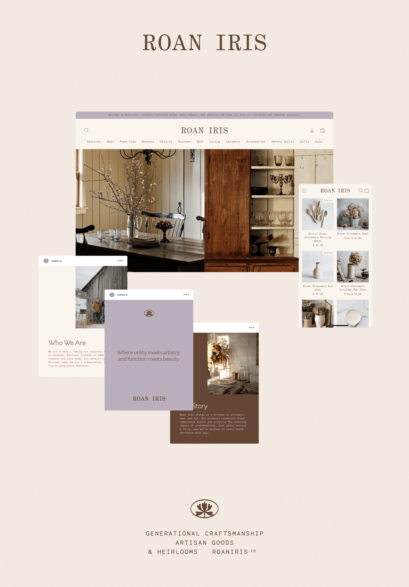
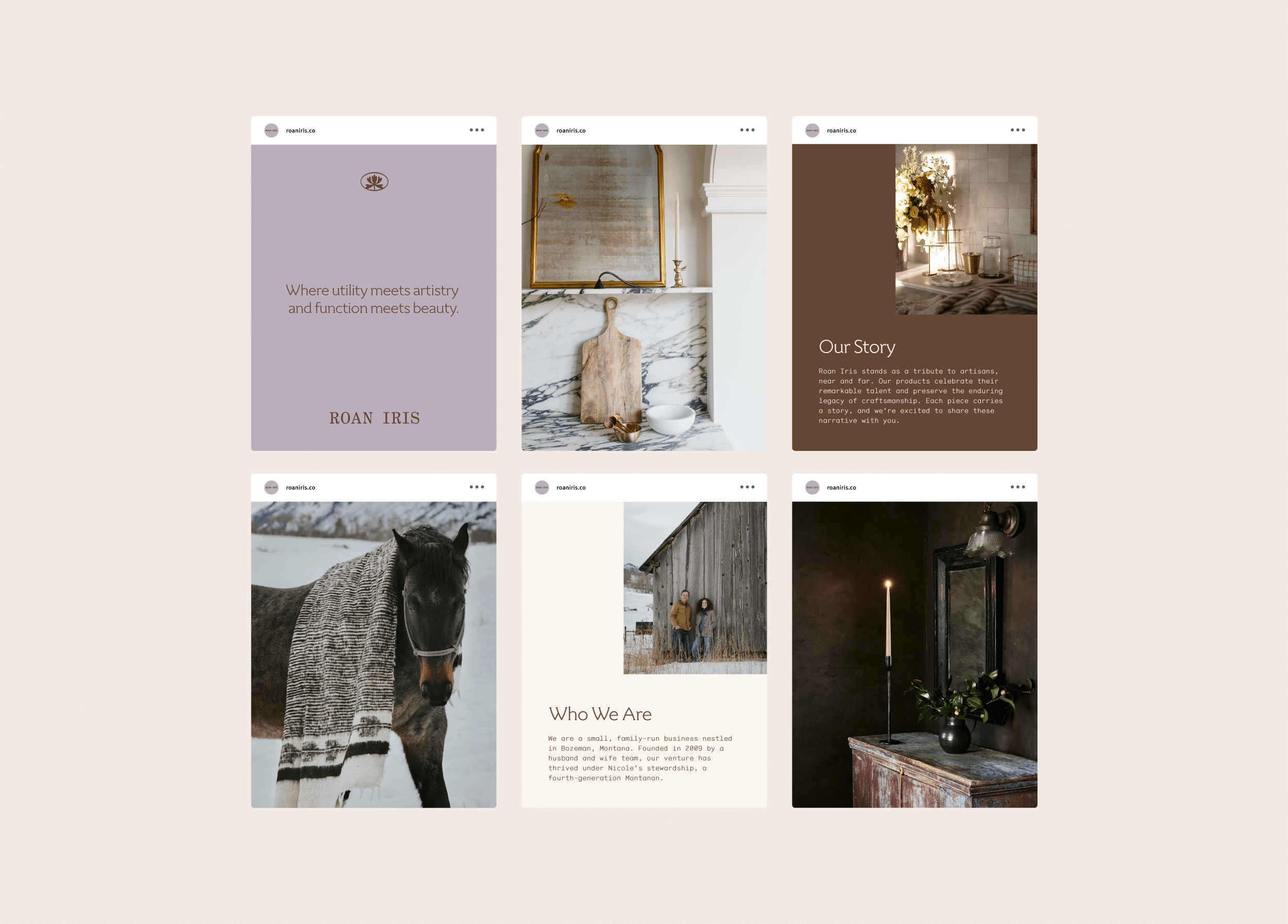
The name Roan Iris was thoughtfully chosen to reflect both personal and brand significance. The word “roan” alludes to the unique intermingling of colors found in the coats of horses—a nod to Nicole’s Montana roots, evoking memories of her family’s horse and the landscape that shaped her. “Iris,” a flower native to Montana, where both the Rocky Mountain Iris and Yellowflag species thrive, symbolizes wisdom, friendship, and passion. These two words are also an anagram of Nicole’s mother’s name, whose love for creating meaningful spaces lives on in Nicole. Together, these elements form a name that bridges the past and the present, creating a sense of continuity and depth that aligns with the brand’s values of authenticity, beauty, and human connection.

Print Materials

For Roan Iris’ print materials, we crafted a cohesive suite that extends the brand identity across a variety of touchpoints. The letterhead, envelope, and business card designs are unified through a blind embossing technique and the primary color palette of roan, iris, and ivory white, creating a tactile representation of the brand’s authenticity. The postcard, included with every e-commerce order, not only introduces customers to the brand’s story but also showcases the rich, still-life imagery we developed as part of the rebrand’s art direction.

in-store Packaging

For the in-store experience, we developed a series of branded materials including hang tags, packing tape, tissue paper, and stickers. The RI monogram, designed for smaller applications like textile tags on pillows or tea towels, will serve as a key signifier as Roan Iris transitions into creating their own line of goods in addition to the curated offerings from global artisans. The iris flower submark is used as a graphic element, paired with the wordmark, or on its own for more decorative applications, such as stickers for in-store gift wrapping or packing products at checkout.

digital experience

The digital experience for Roan Iris centers on a redesigned website that enhances the e-commerce journey while staying true to the brand’s welcoming and authentic tone. The site’s design focuses on large, rich imagery that invites customers to explore the products and the stories behind them. A well-structured space for product descriptions ensures each item’s unique craftsmanship is highlighted, while templates for social media allow Roan Iris to share its narrative and new identity in a visually cohesive way. This digital touchpoint is essential for introducing the new brand moniker and ensuring that the brand message resonates with both current customers and new visitors.

Related Projects

View all work